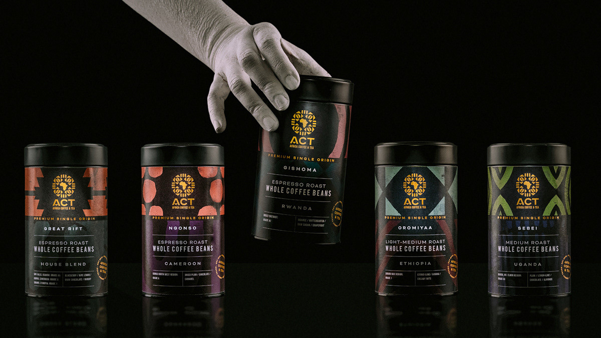
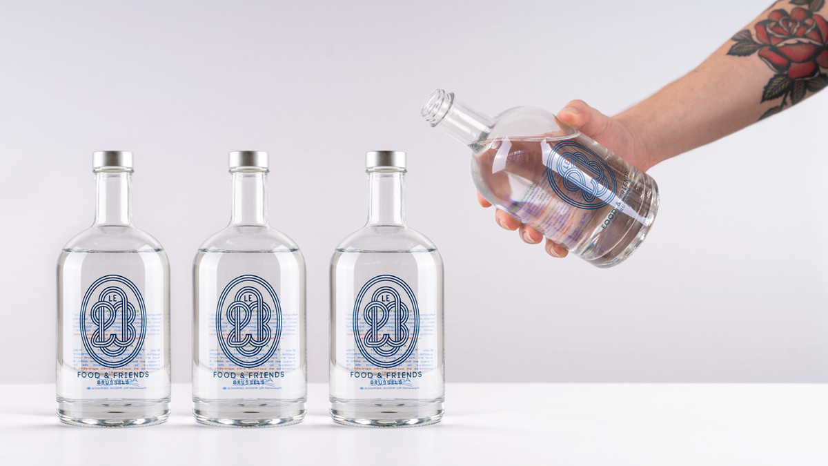
This self-initiated study is an ode to the Internet. A place of many wondrous things but more importantly, a place of very many bad and often useless images. As a creative, I think about adding to the waste, the data dumping ground of pixel shit.
In typical 2020 zero-waste style, I wanted to try to upscale, recycle and reuse low quality silhouettes in a simple way to create images of slightly higher value. Each illustration was created almost completely at random and combined in the way you would communicate in emojis, in the hopes of somehow developing retrofitted meaning. Trusting the process, that’s how art is made, right?
Some images are more poignant than others and speak to topics that were perhaps looming in my subconscious at that moment.
I wanted to then apply the catalogue of work to something that is a bit more accessible and tangible. Risograph printed postcards seemed like an honourable enough application for this.
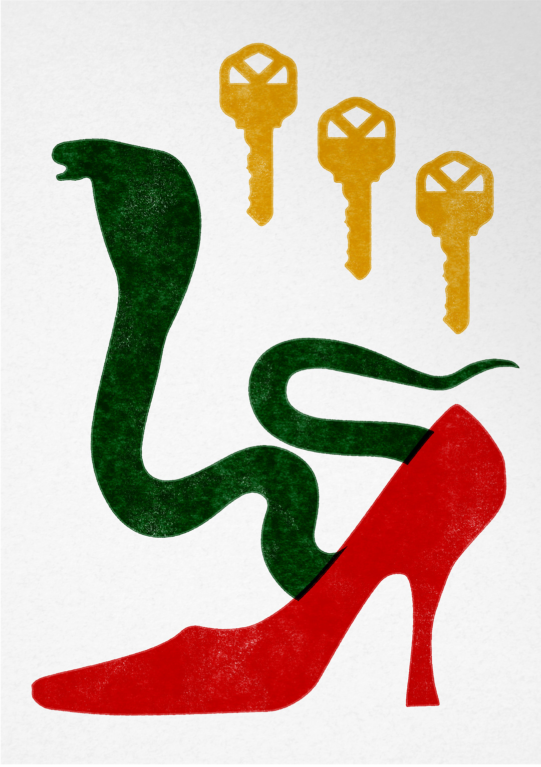
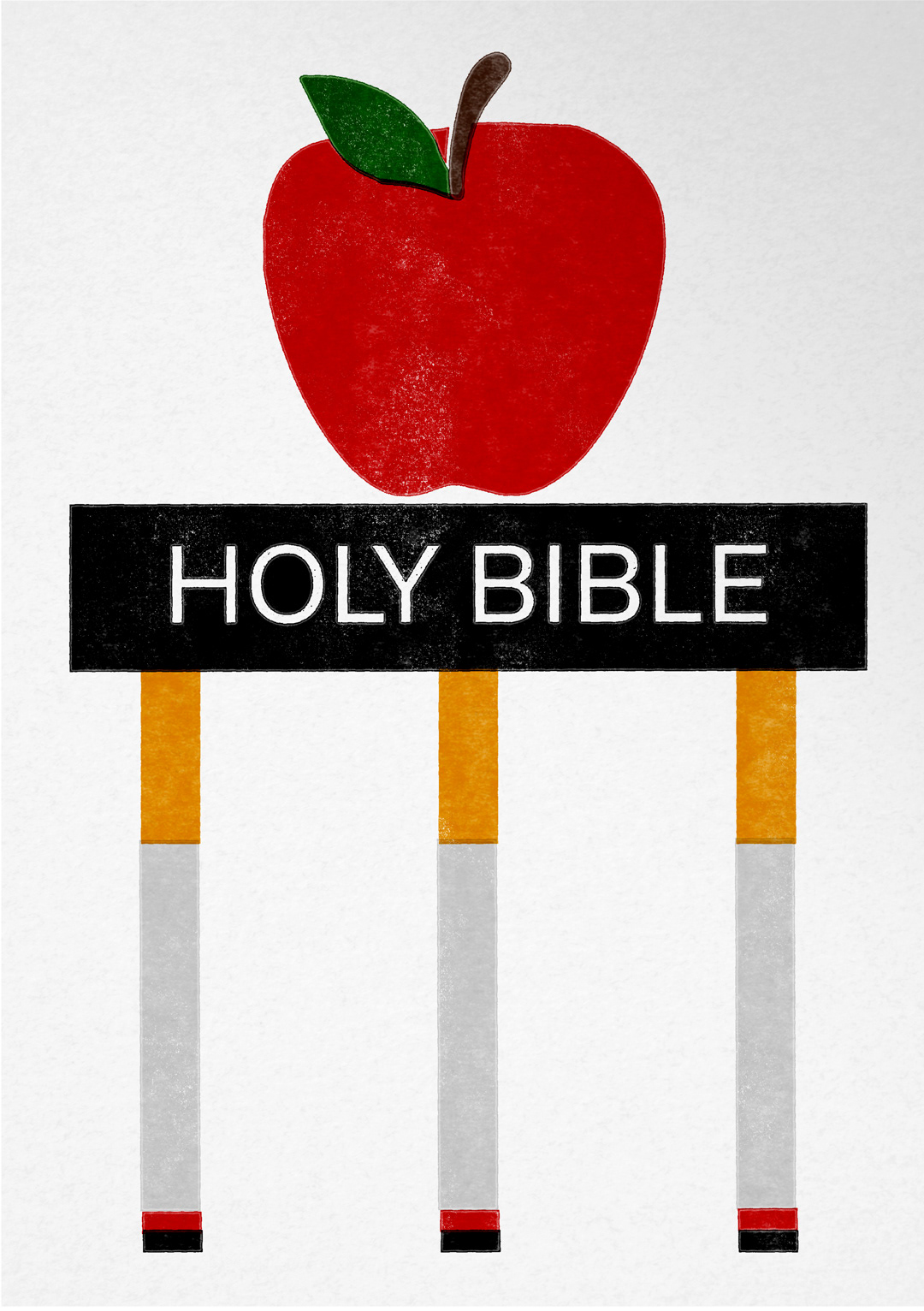
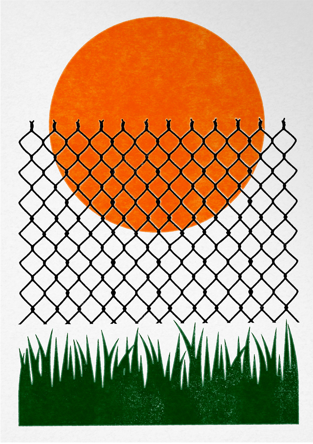
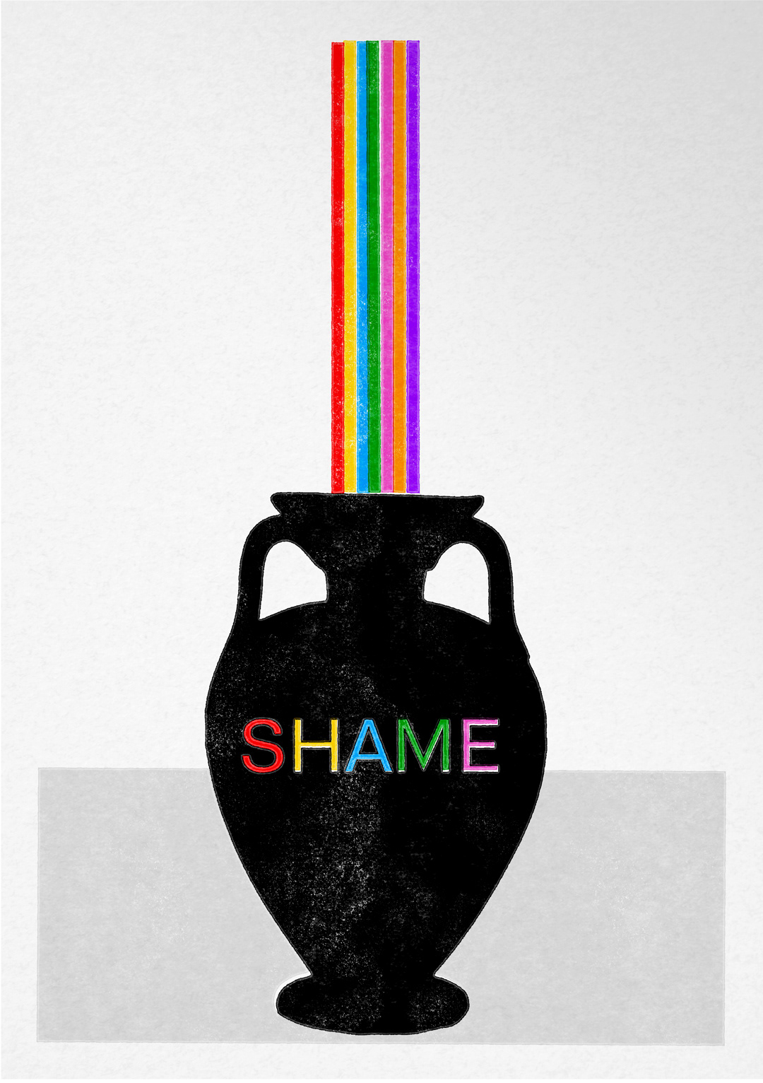
Some details of the postcards. The texture from the printing application pushes the simplicity of the illustrative forms to take on a warm sense of tactility with each print being different to the next.
Below is the whole body of work that was designed over several months in my spare time.
The graphic below was applied to a faux silk banner that was used during a design exhibition, DTBY (Be There), in Hong Kong in 2019.
Thank you for looking!
