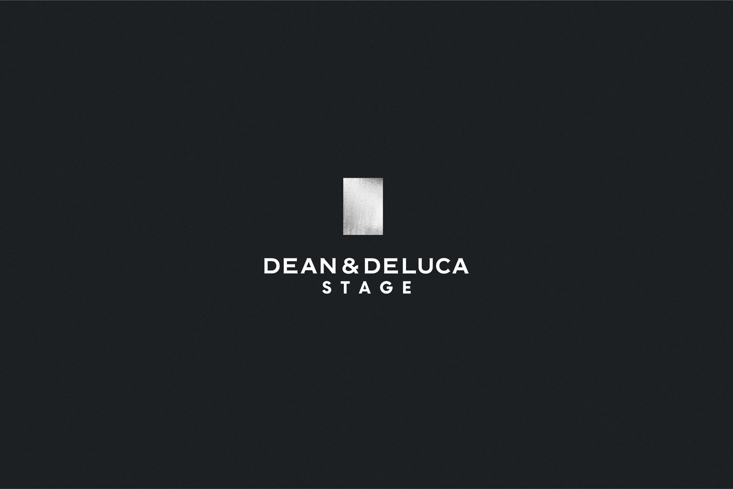
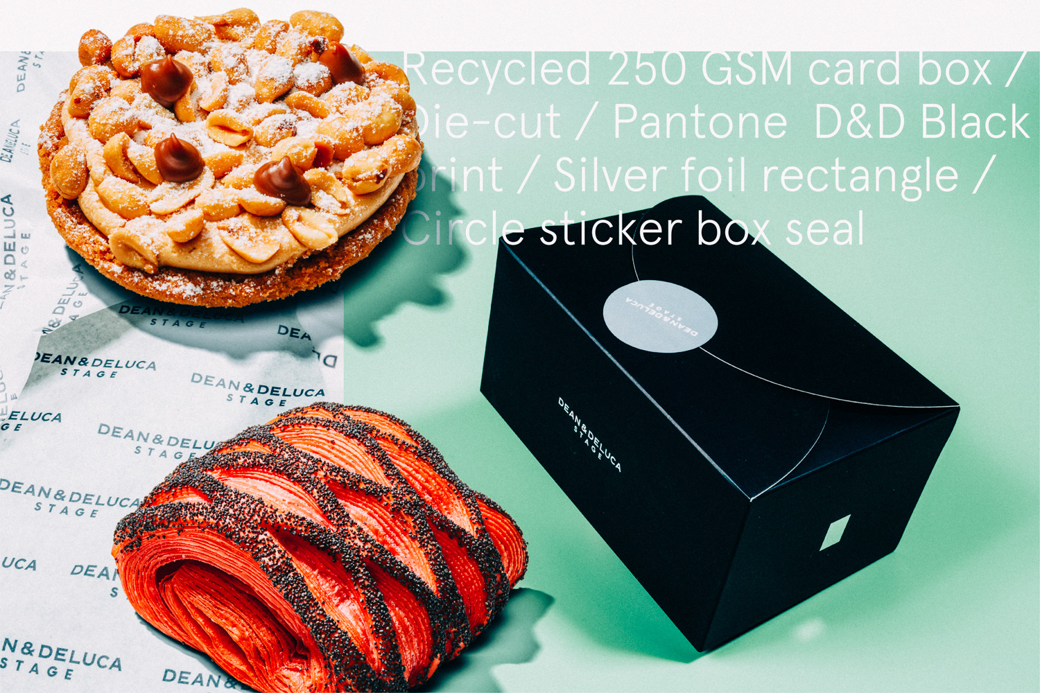
The word mark that was developed for this project had to remain consistent within the greater ecosystem of Dean & Deluca's branding guidelines, as a result we carefully and intently paired the word "STAGE" with the original word mark.
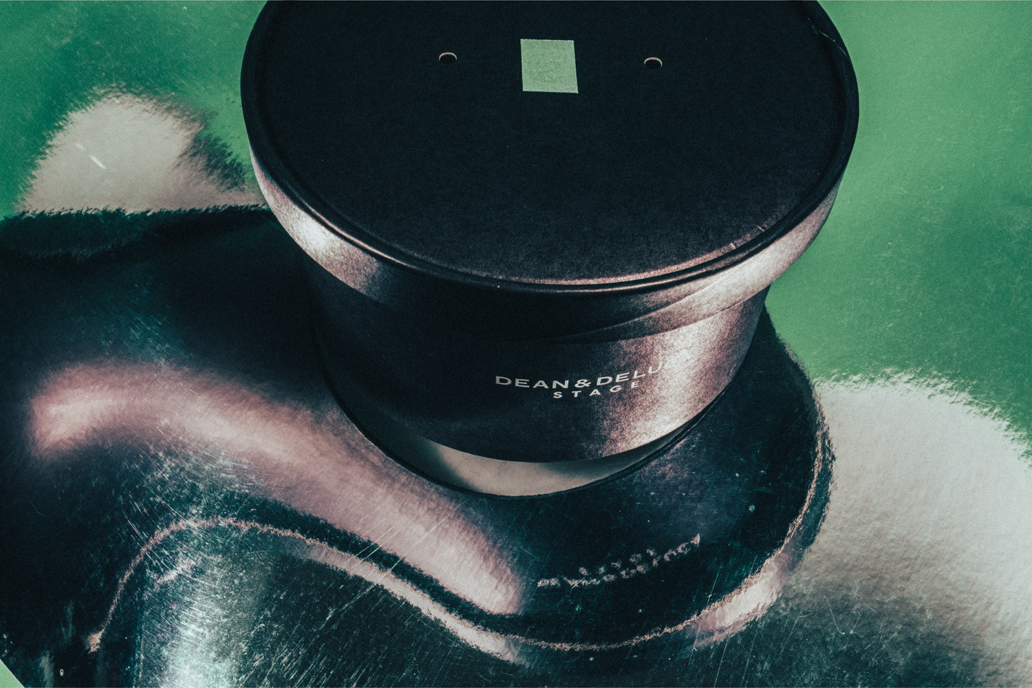
In the spirit of keeping things simple, functional and structured, our desire to add a spin to the branding came in the form of a simple, silver rectangle that symbolises the actual form of Buro Ole Scheeran's STAGE. The shape was extracted from the many architectural drawing supplied by Ole Scheeran's team.
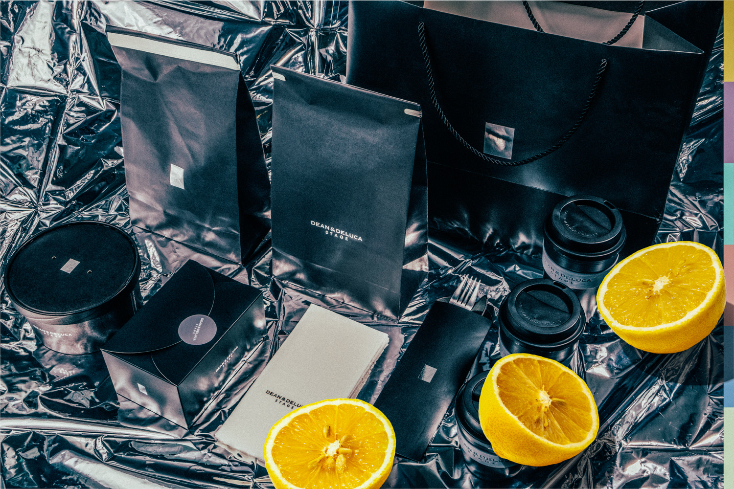
We also decided that only when necessary, we would apply both the rectangle and word mark. Although very simple, we found that adding in a silver rectangle to packaging and other branded elements serves as a form of obnoxious, high-end nod to the argument that often arises between art and design.
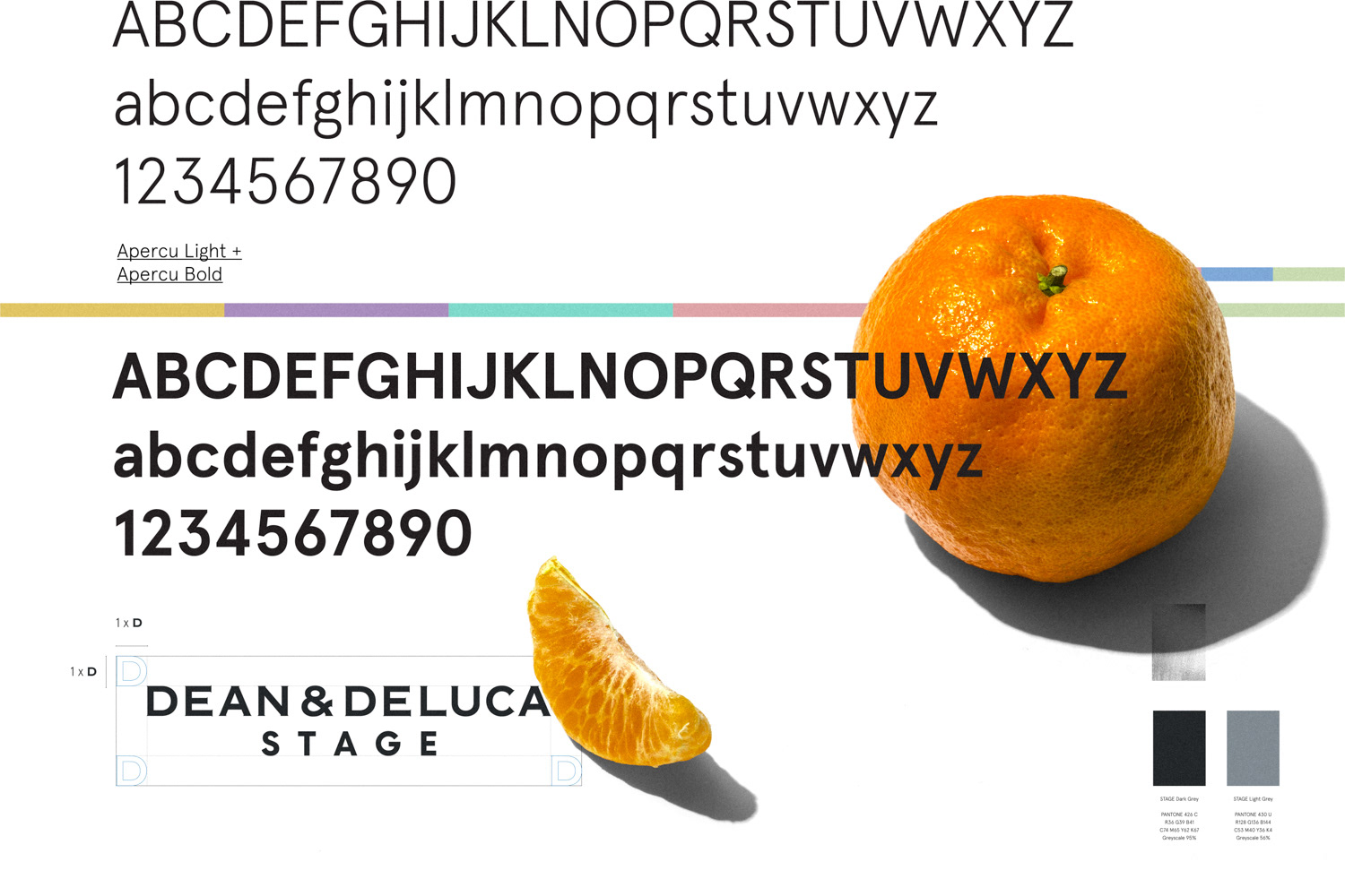
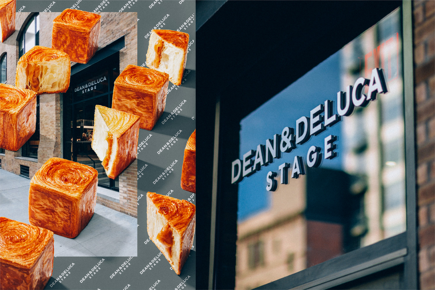
We then paired the brand with a typeface that speaks quite boldly of New York at this moment. Apercu is a distinctive san-serif typeface that pairs comfortably with the idea and aesthetic of the STAGE. Bold clean lines, hard angles and beautifully constructed weights allowed us to create simple, elegant or impactful statements where needed.
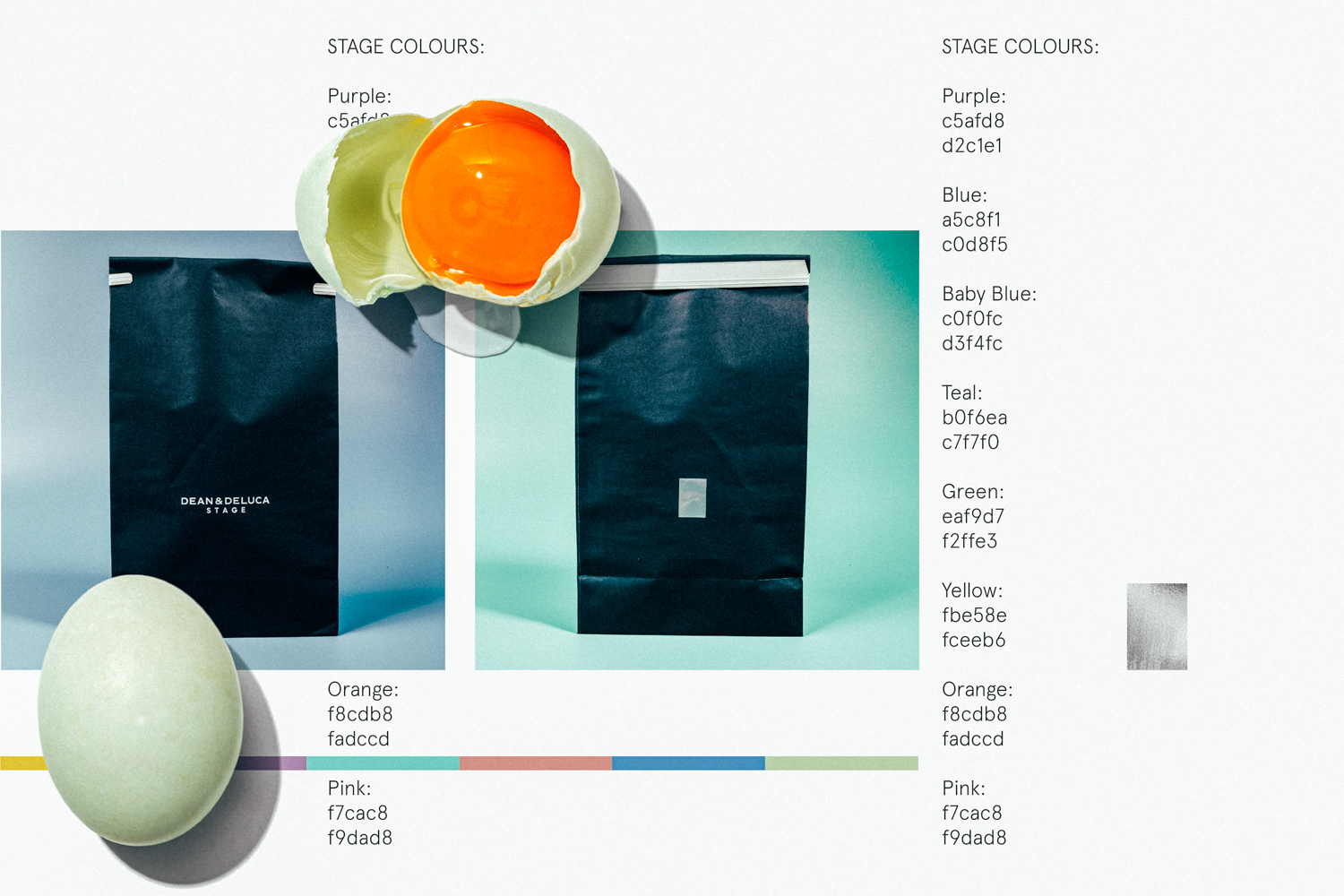

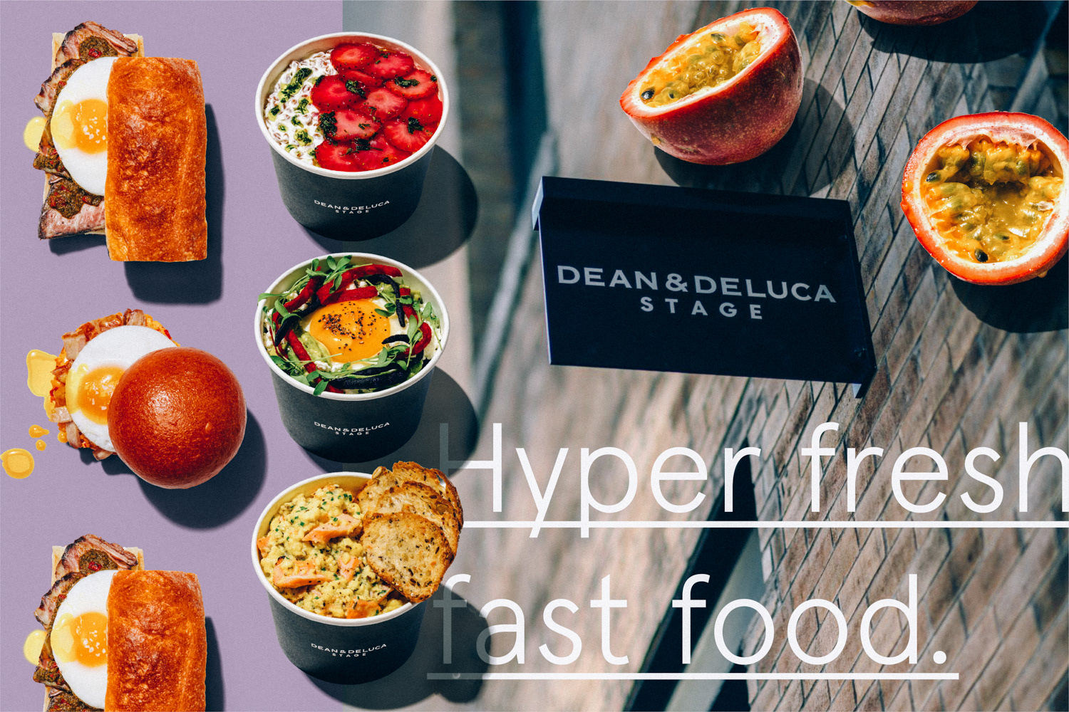
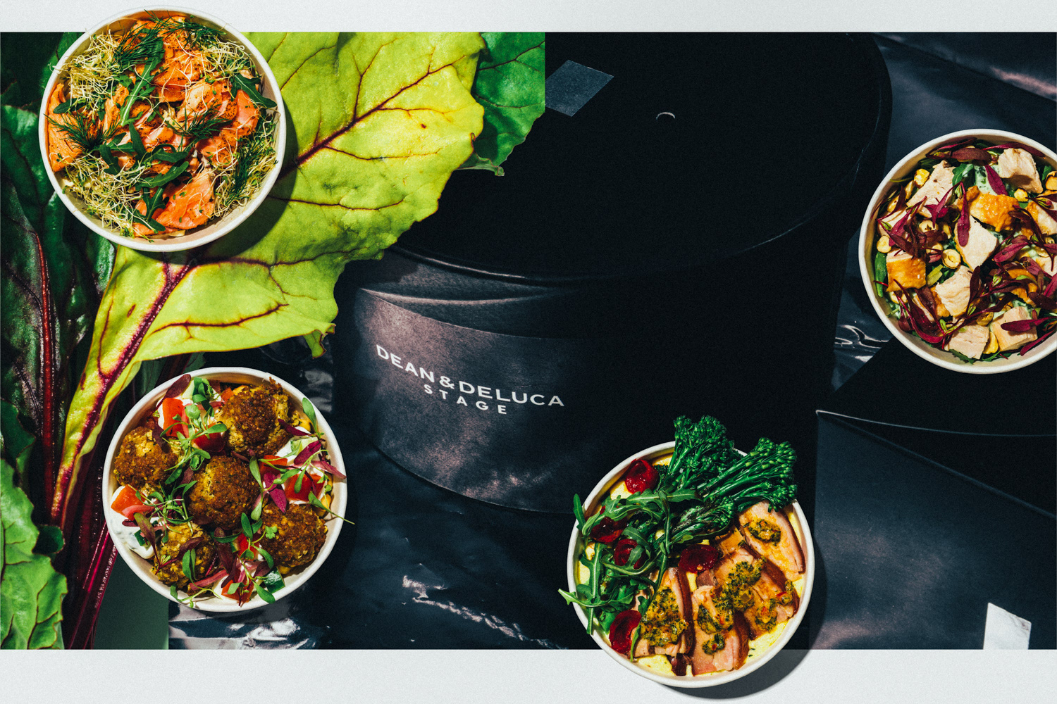
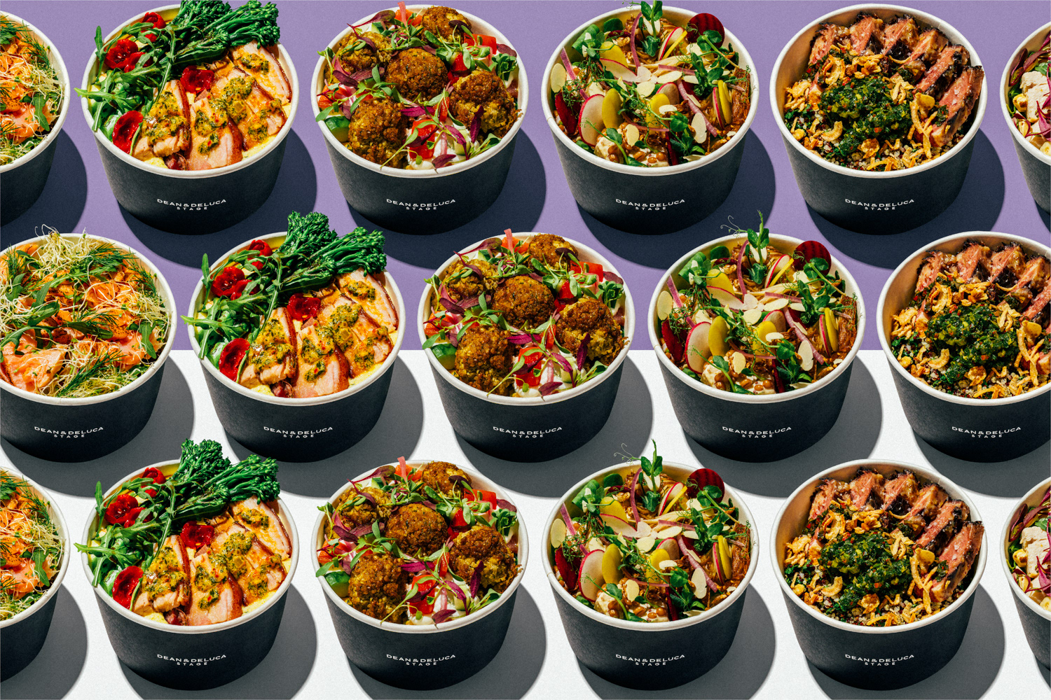
Packaging for the STAGE was also heavily influenced by the existing Dean & Deluca look and feel. Although Dean & Deluca usually go for light and homey, we decided to flip the main colour palette to create a dark, yet clean look to all the packaging, uniforms and menu screens. This helped our photography shine through to portray rich, fresh and diverse flavours.
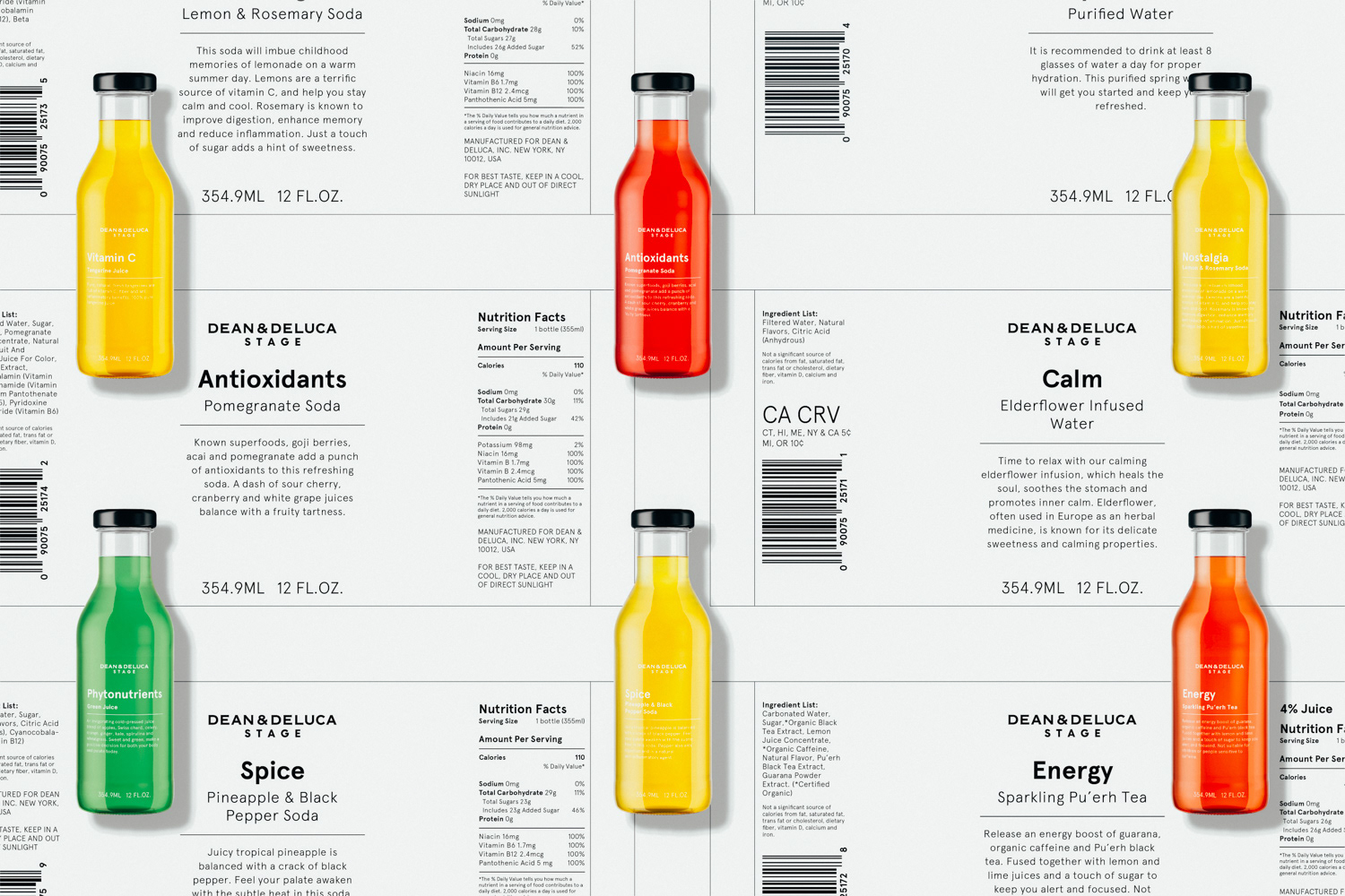
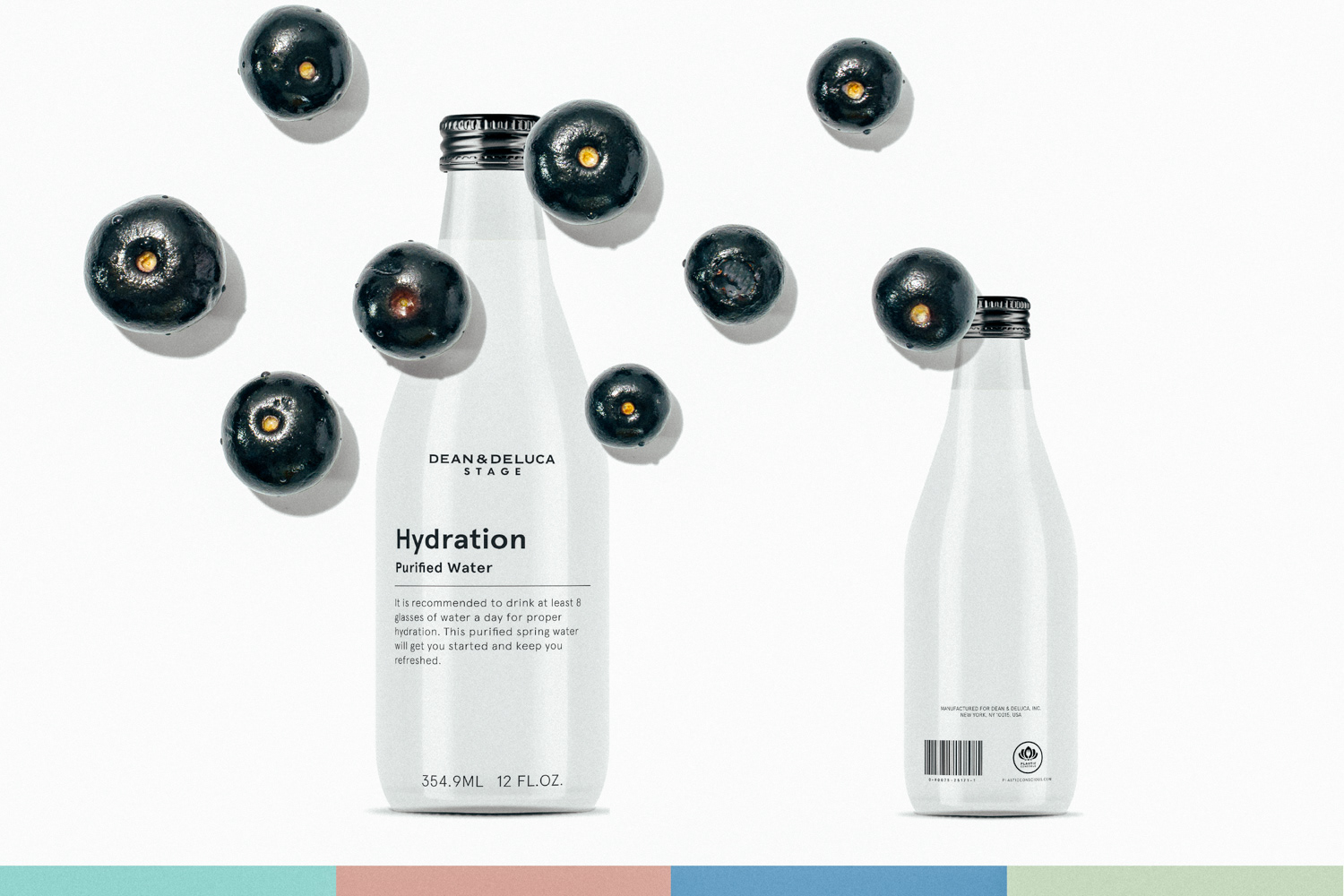
In addition to packaging freshly made items, I was briefed to design new packaging for the many fresh pressed juices and water products that the STAGE was producing. Once again, simple, clean lines and materials were used to continuously speak of function and necessity.
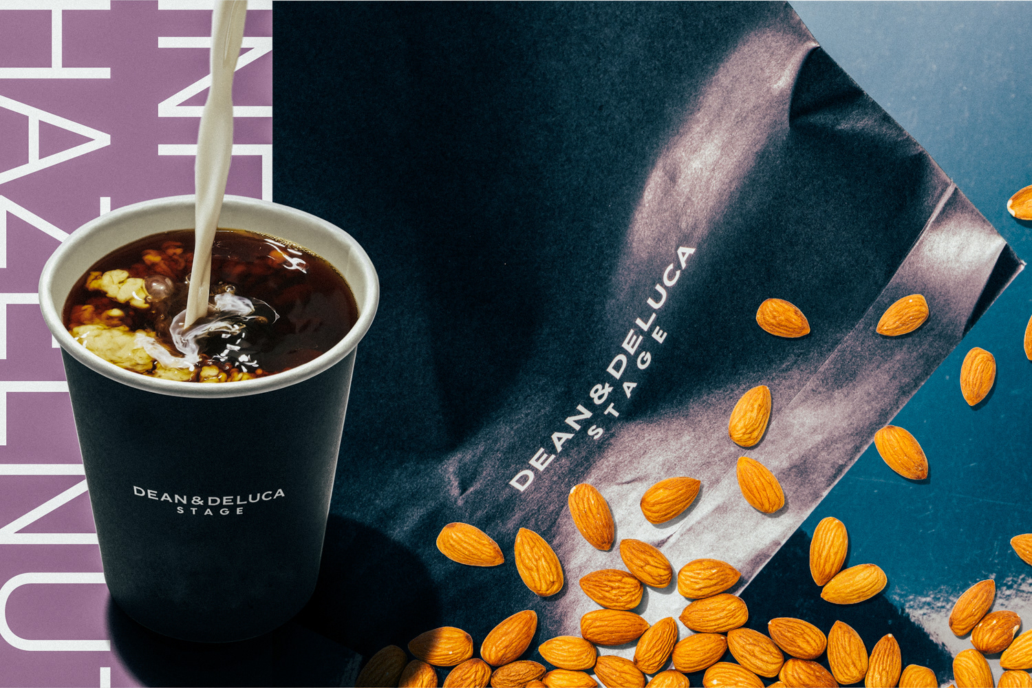
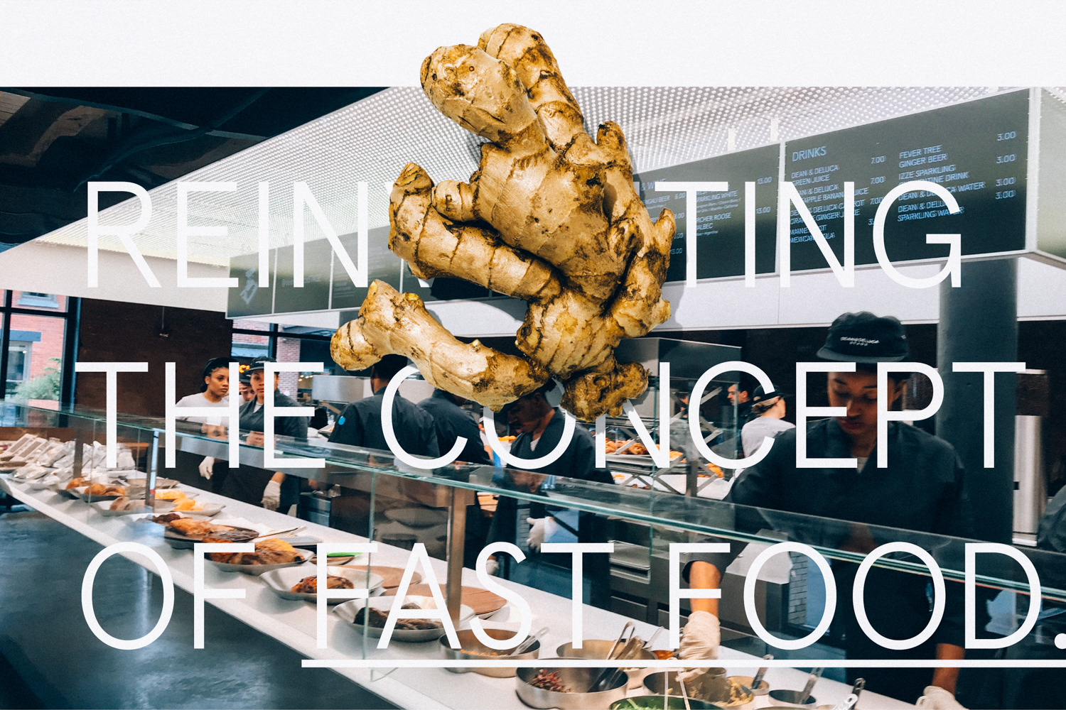
As with all the packaging and signage, it felt necessary to carry out a cohesive look and feel throughout the environment, uniforms and electronic menu boards. All to be kept in our specially formulated Dean & Deluca black as a base, with either the word mark, the STAGE rectangle or messaging applied in Apercu.
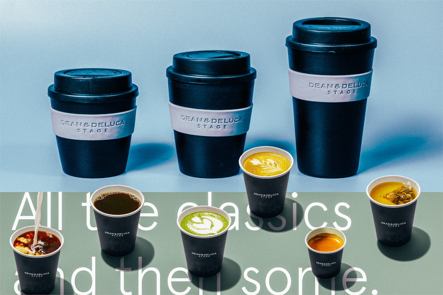
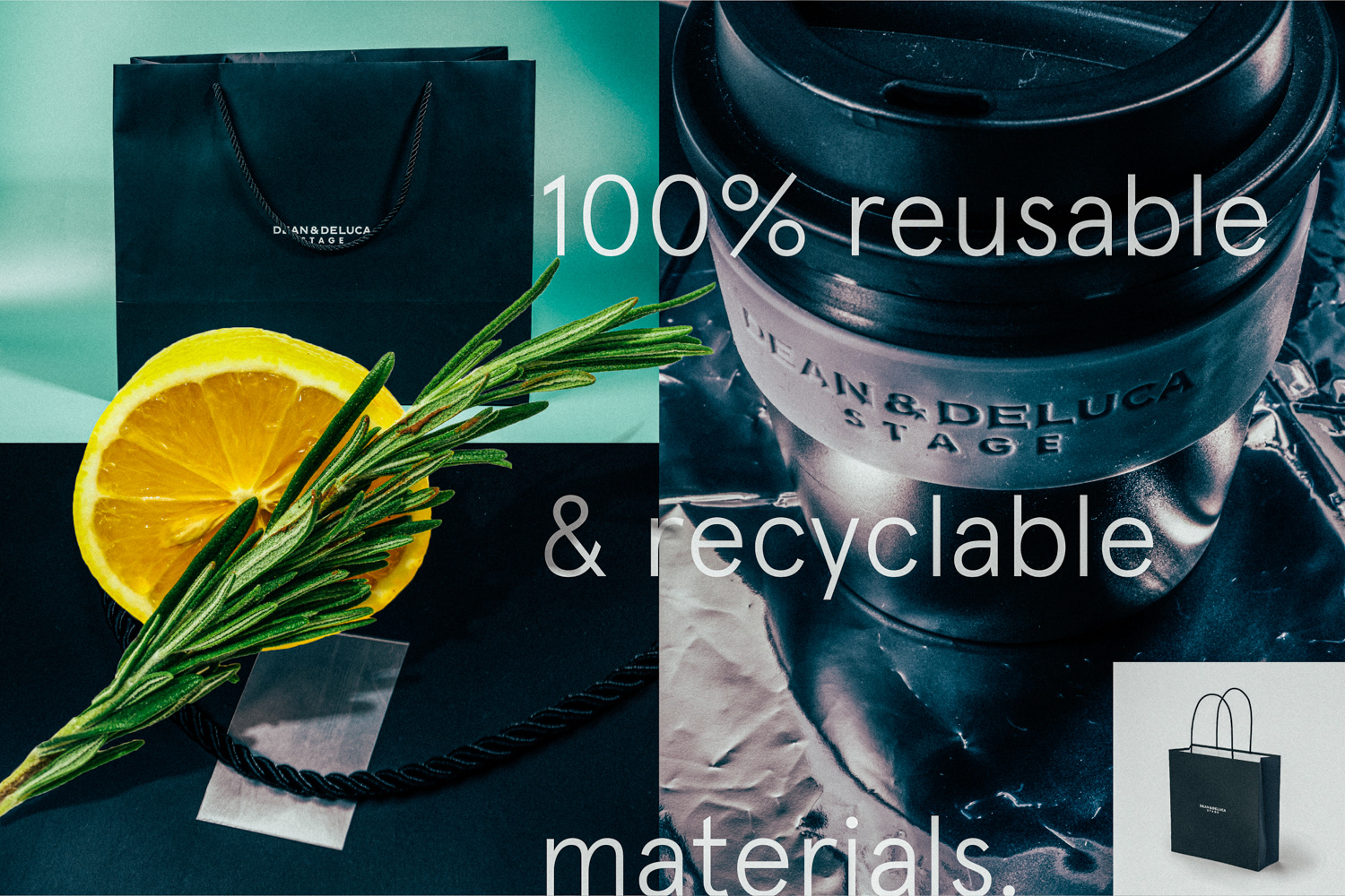
Another aim of the project that was driven forward was the intention of making as many items as eco-friendly as possible. Our motives, driven by Plastic Conscious ambassador Matt Reid granted us leeway in producing reusable coffee cups that could be taken home, deposited in store for reuse or recycled.
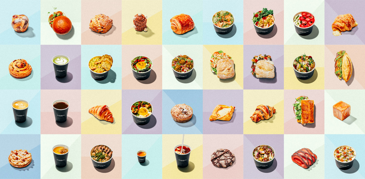
Although the brand had been predominantly developed in black, white and silver, we wanted to push the idea of "Hyper Fresh Fast Food" which was the motto of the STAGE. Freshness spoke to us through colour and lightness. Post production on all photography saw us applying hundreds of items including baked goods, bowls, sandwiches and drinks.
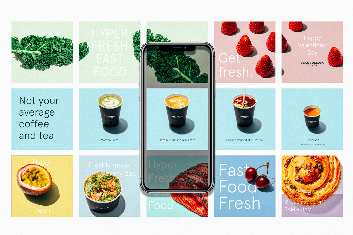
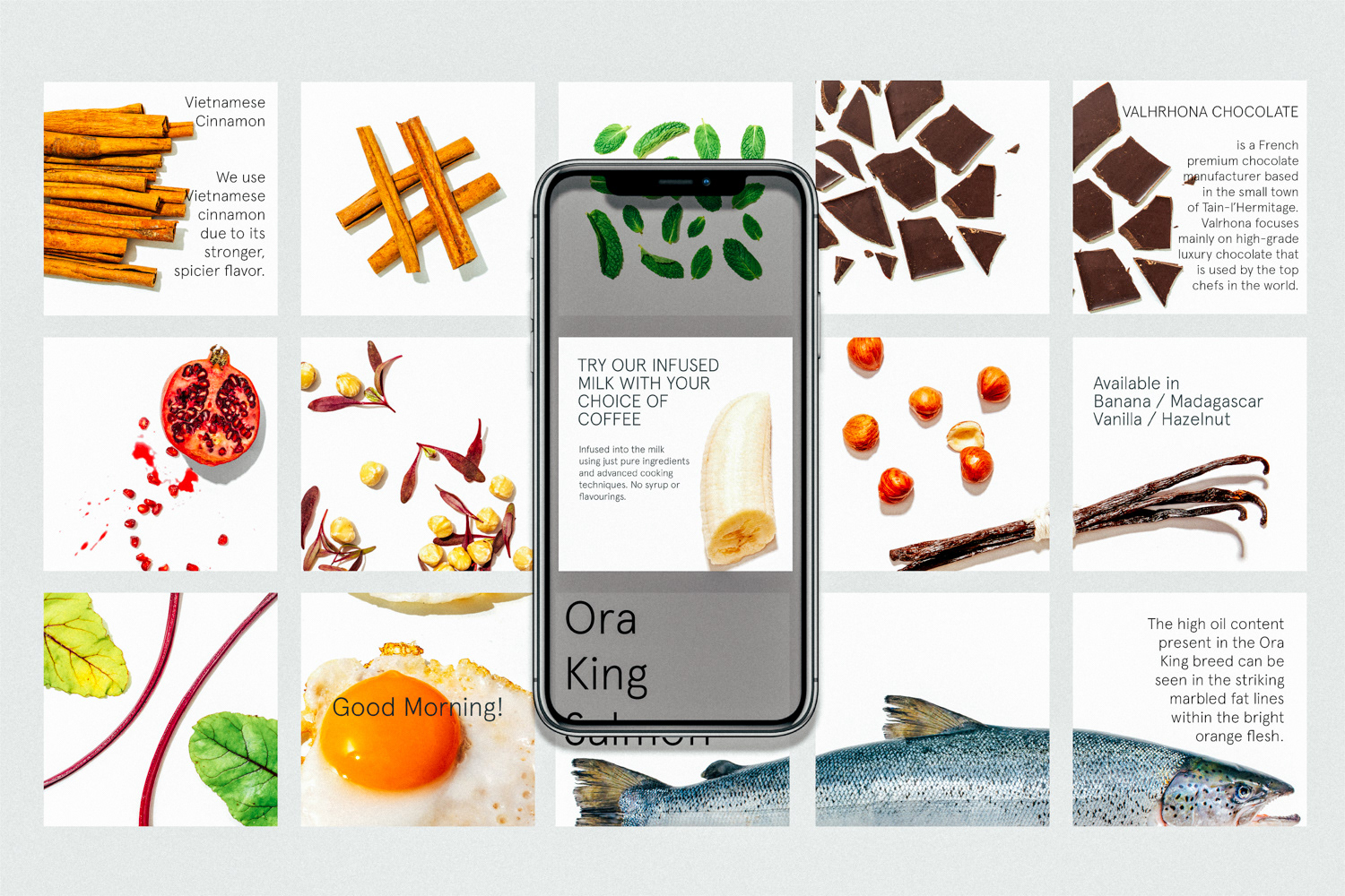
The final stages of this project saw us take control of all social media direction, and production. We collaborated closely with the Dean & Deluca photography team in New York to produce the shots of the baked items, while all ingredients, bowls, cups and post production work was carried out by my team.
Thank you fo looking!
Art Direction: Dustin Holmes, Matt Reid
Graphic Design: Dustin Holmes, Jenna Tupin, Stephanie Handley
Photography: Gideon de Kock, Michelle Snyder
Post Production: Dustin Holmes, Jenna Tupin, Stephanie Handley, Gideon de Kock
Copywriting: Dustin Holmes, Jenna Turpin