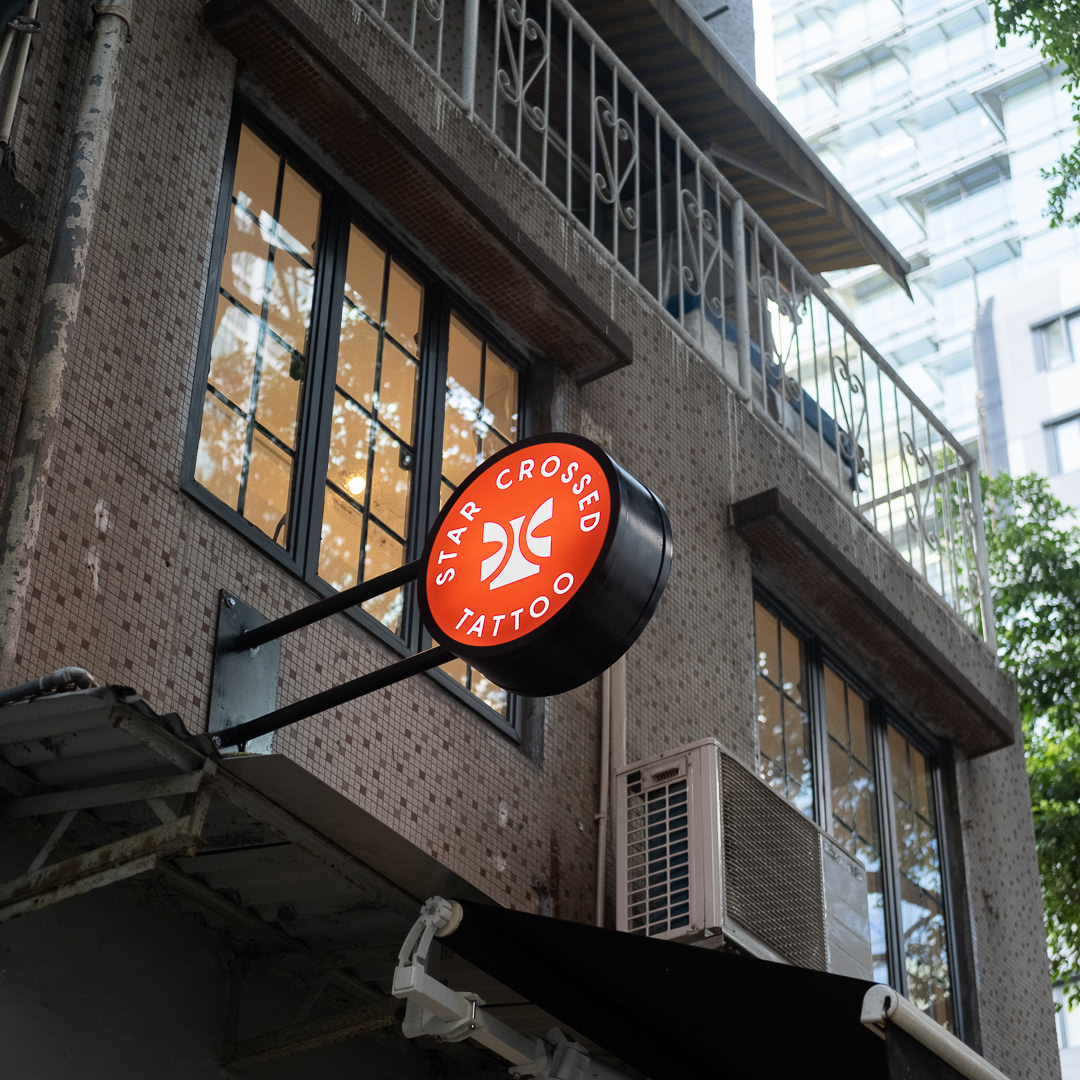
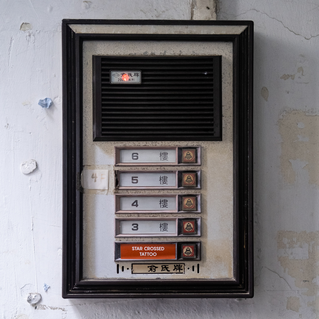
This was a personal project as I helped close friends at Star Crossed Tattoo, Hong Kong to rebrand their shop. After ongoing social unrest and the onslaught of Covid '19, Star Crossed decided it was time to relocate the shop and undergo a transformation from a less "traditional" tattoo space, to a private, high-end, minimal environment and accommodate for bookings only.
The design task was to create a visual identity that is unique, refined, and speaks to the type of clientele they are seeking moving forward. I was able to jump right in with a few concepts, but the ultimate decision was to go with the concept of "time". My observation of tattoos and those who get them often relate to time, commitment and spontaneity. Common sayings like "you only live once", "life is short", or "be careful, tattoos are forever" came to mind and inspired the main mark of the brand.
The other major influence that is folded into the identity is the owners' beginnings in South Africa and their journey that brought them to Hong Kong.
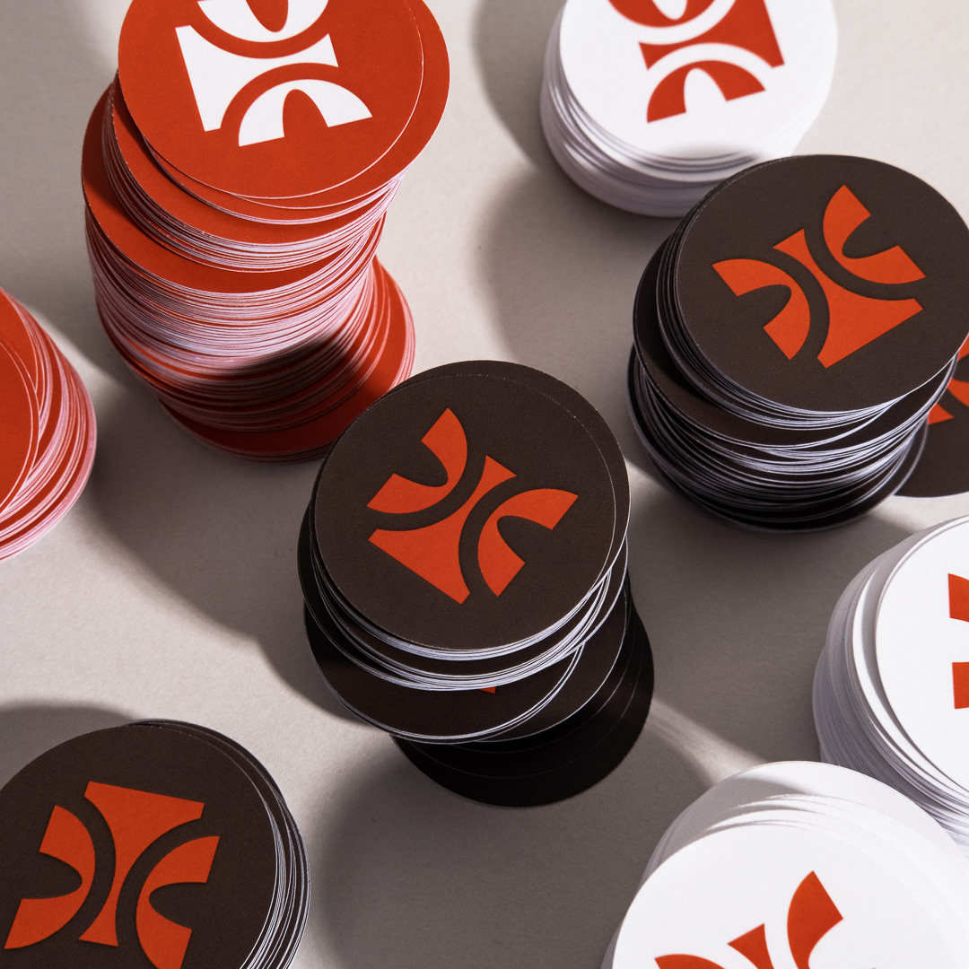
With the idea of "time" I created an African inspired motif that holds the image of an hourglass emptying in the centre. I wanted to create something recognisable and different to other tattoo shops. Many other shops indulge in the stereotypes of using tattoo imagery and script logotypes, but my idea was to create something neutral that is its own thing that can work with whatever the artists make. The identity serves as a carrier, rather than artistic expression.

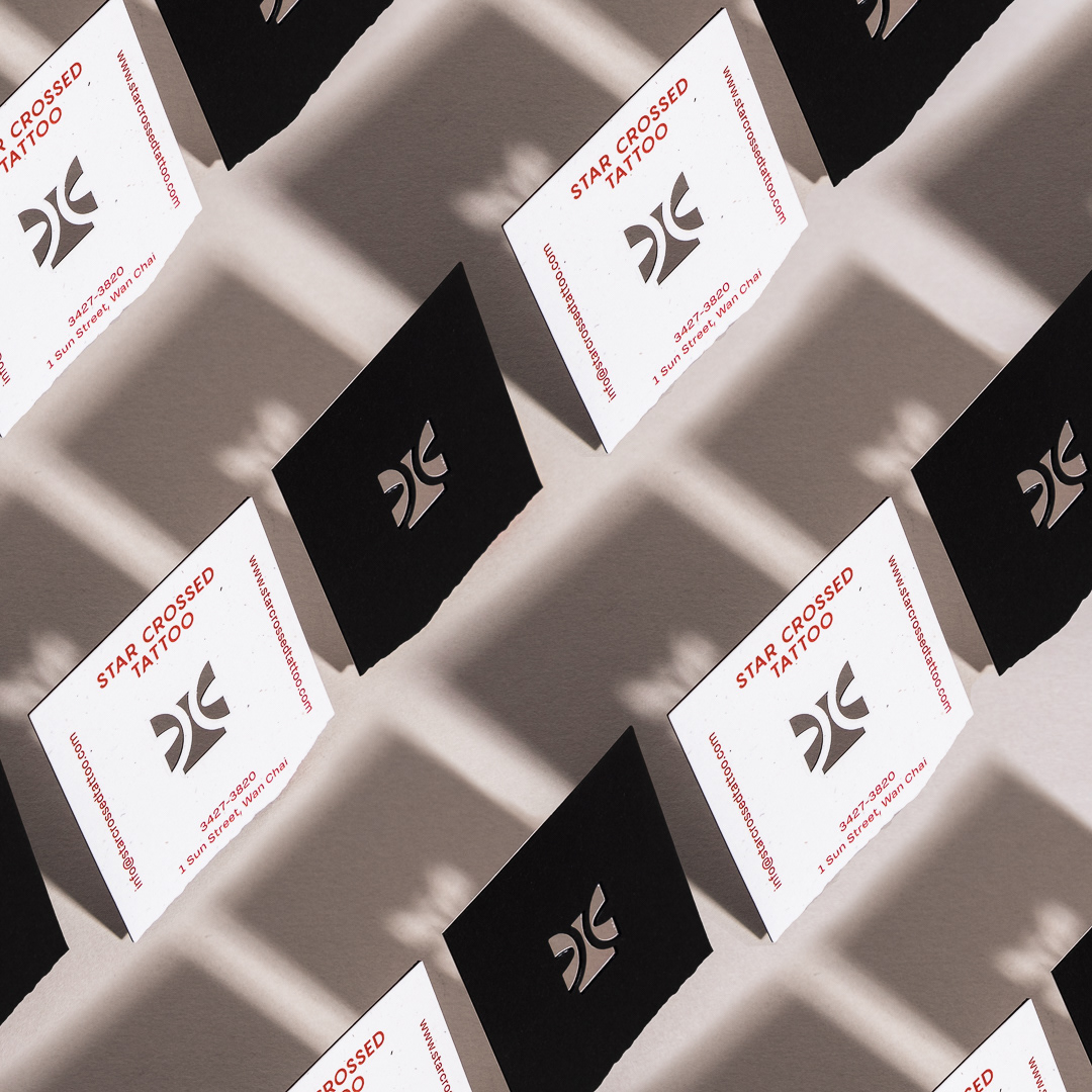
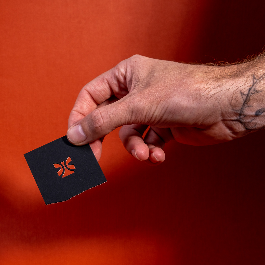
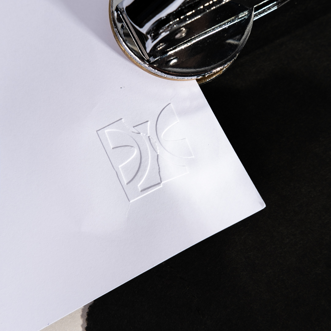
An influential aspect of the visual identity was the nature in which the artists at the shop create stencils for tattooing. The paper is often haphazardly cut or torn around the artworks to create interesting shapes and rough edges. I wanted to keep this loose energy in the identity, so you will notice die-cuts, illustrations and foiling that carry this torn edge throughout the print items.
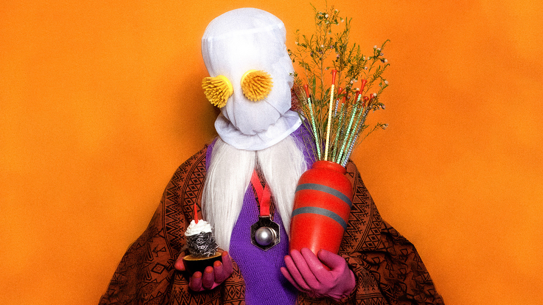
Photography in collages by Rochelle Phipson
Above are custom made rugs for the front and back door of the shop using the torn paper application to carry the visual concept throughout.
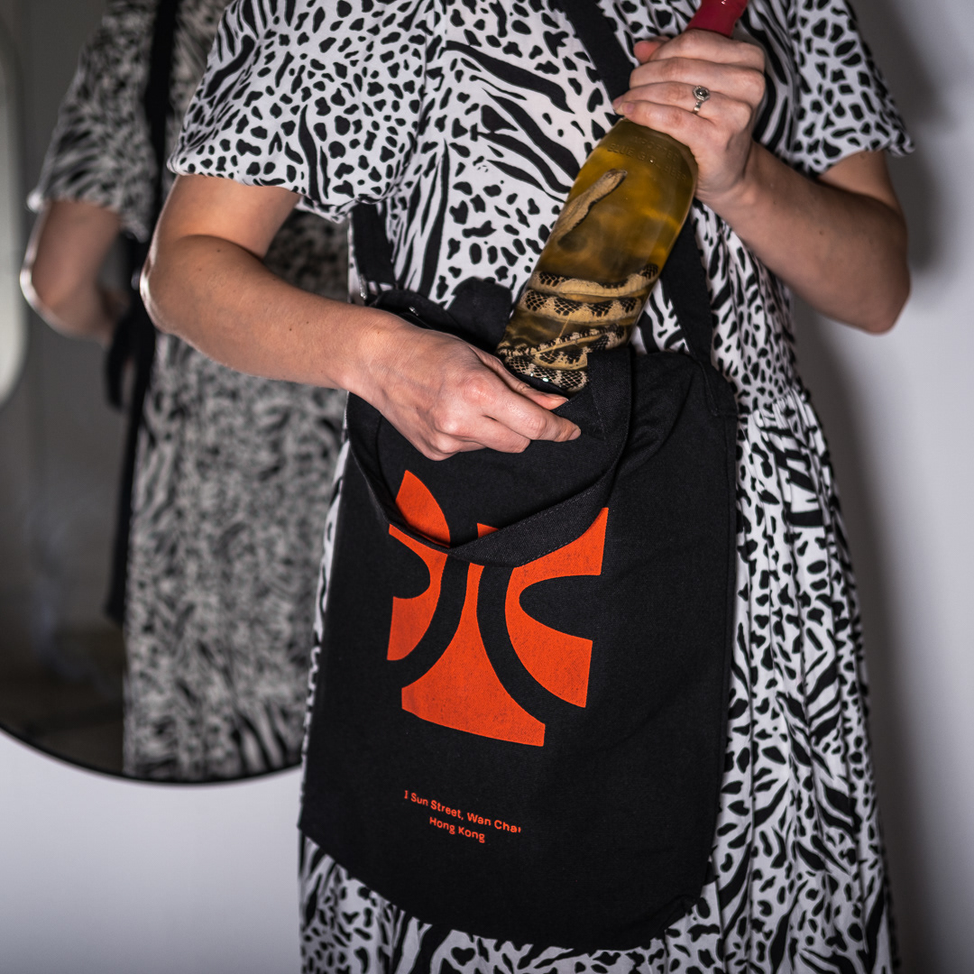
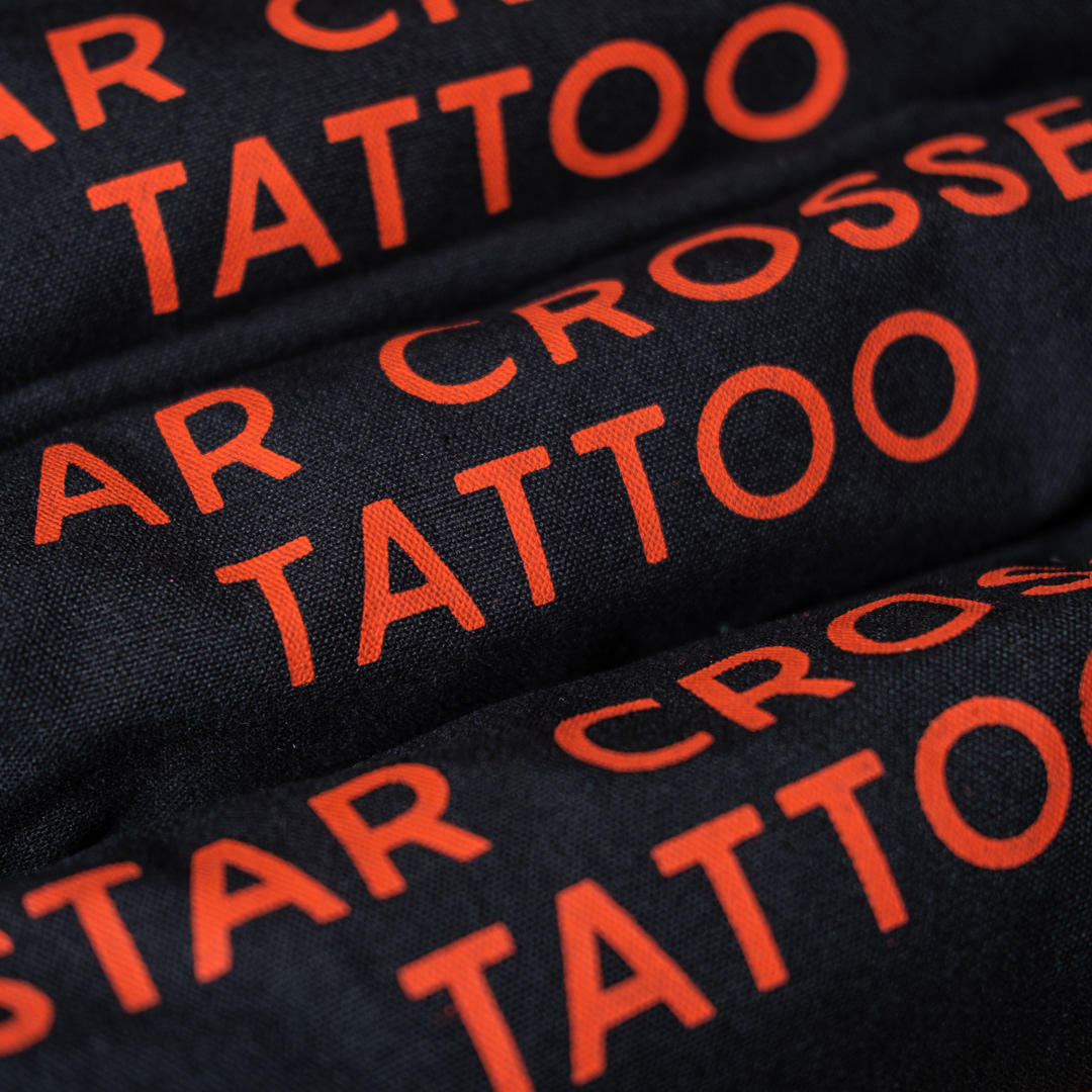
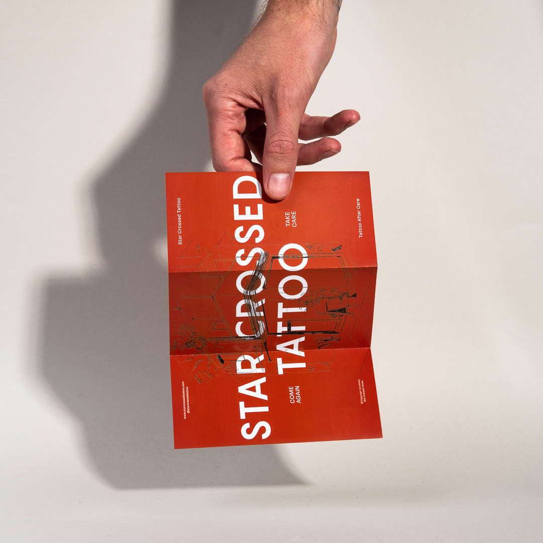
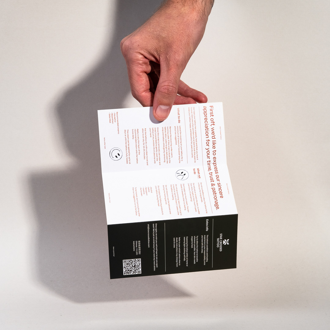
Along with updating the aesthetics for Star Crossed, I also wanted to help create items that would be useful for customers and the shop. A suggestion here was to create an aftercare pack for clients to take home. Each pack includes care instructions, lotion and stickers. All these items are packaged inside custom branded, biodegradable zip-bags.
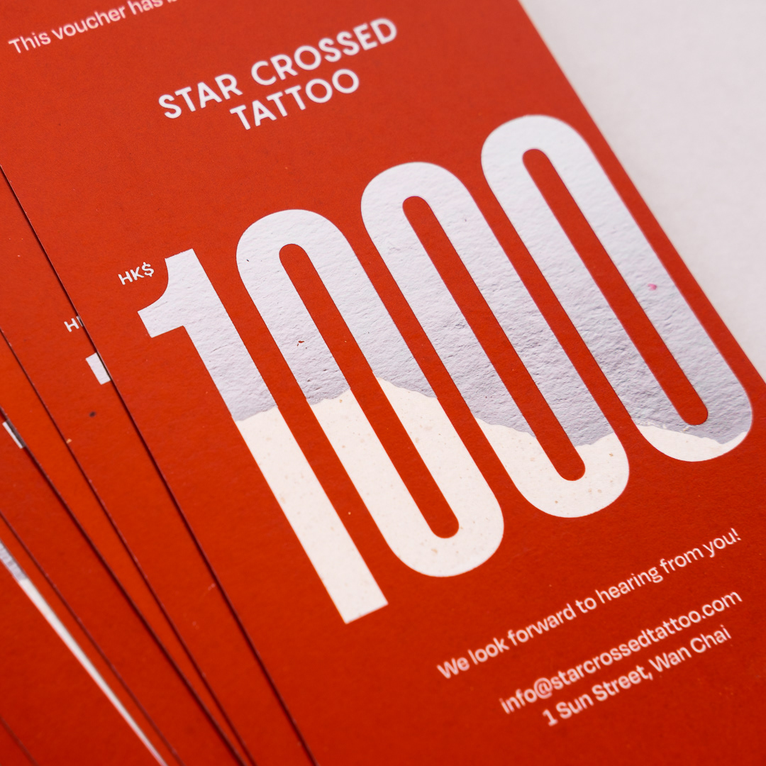
Another item I helped out with was the suggestion of creating tattoo vouchers that could be sold to generate revenue for the shop during times of Covid lockdown. Here, we pushed the production value to create something special that could be given to a loved one as a gift.
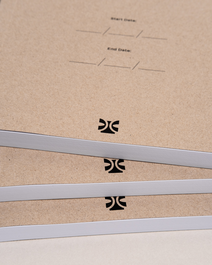
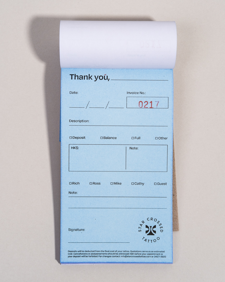
Finally, we collaborated on refining and customising the shop's consent and receipt books to make day-to-day operations easier and clearer for customers.
Thanks for looking!
