I was approached by the New York based team at Myosin to help design a visual identity that represents their core vocation as data science specialists, dealing mainly within B2B and B2C retail.
In nature, myosins are a superfamily of motor proteins best known for their roles in delivering and processing signals responsible for muscle contraction as well as a wide range of other motility processes. Inspired by the function and purpose of these proteins, the team was keen to move forward with the name, and to develop a brand that expresses this type of efficient delivery of vital data.
In nature, myosins are a superfamily of motor proteins best known for their roles in delivering and processing signals responsible for muscle contraction as well as a wide range of other motility processes. Inspired by the function and purpose of these proteins, the team was keen to move forward with the name, and to develop a brand that expresses this type of efficient delivery of vital data.
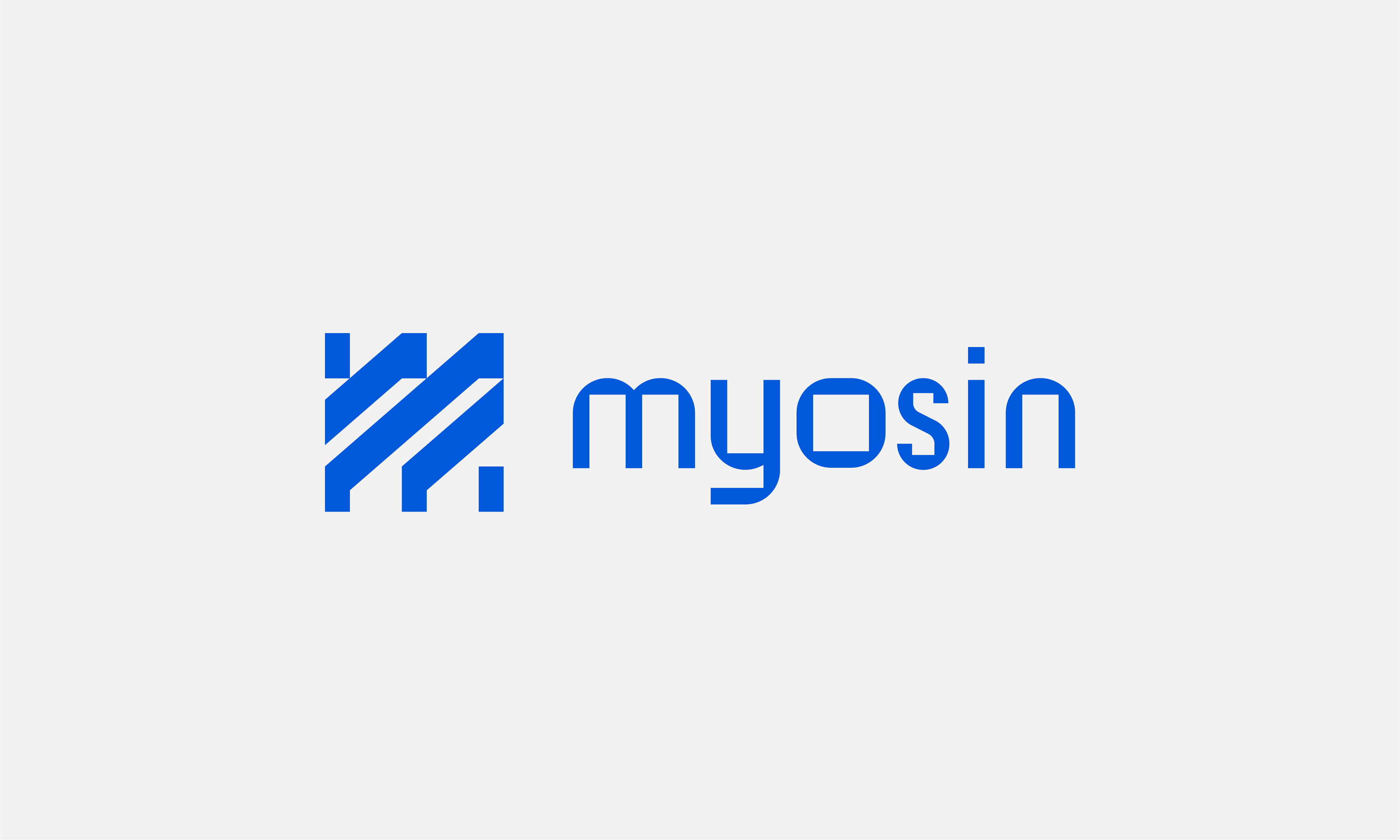
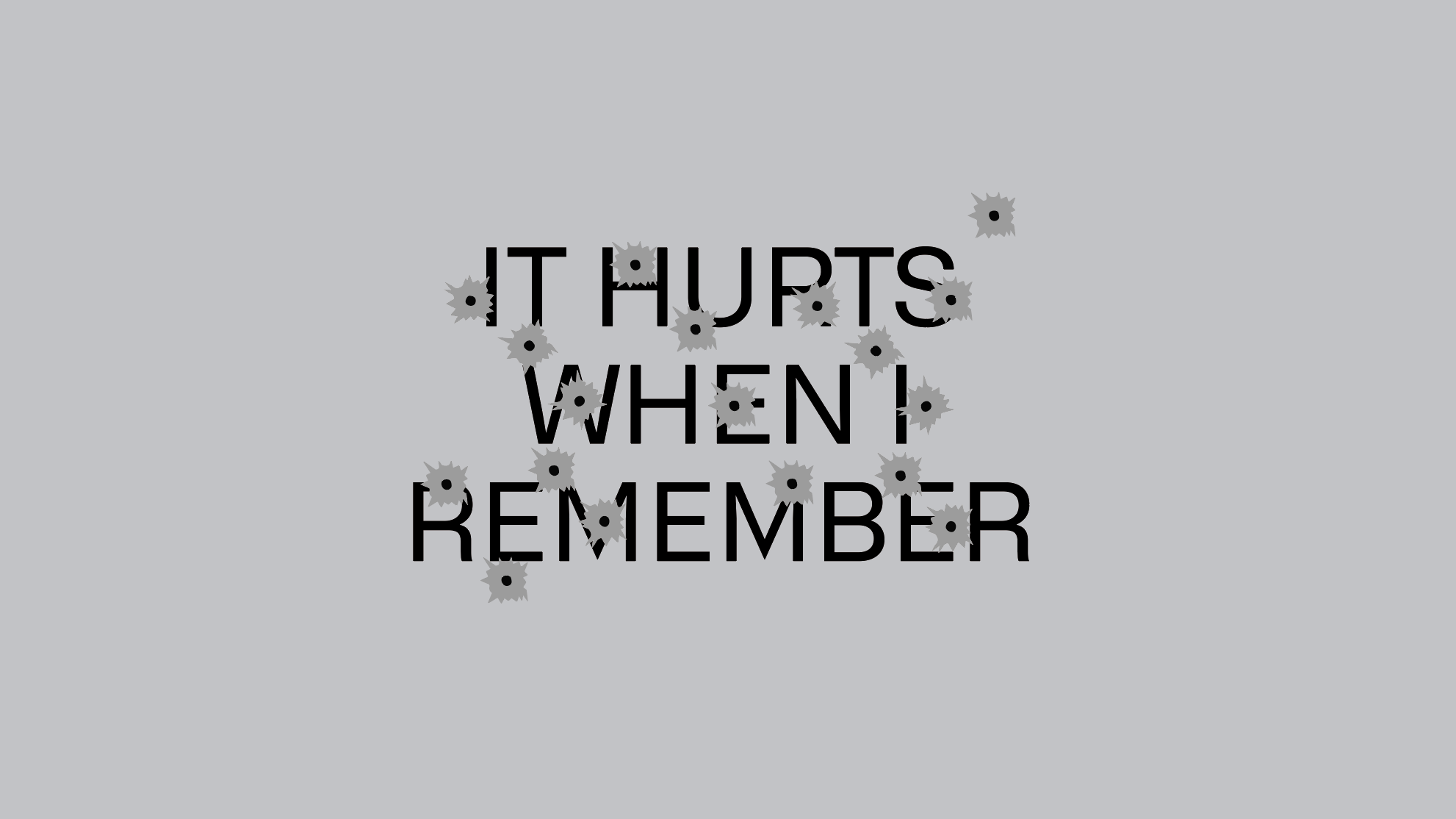
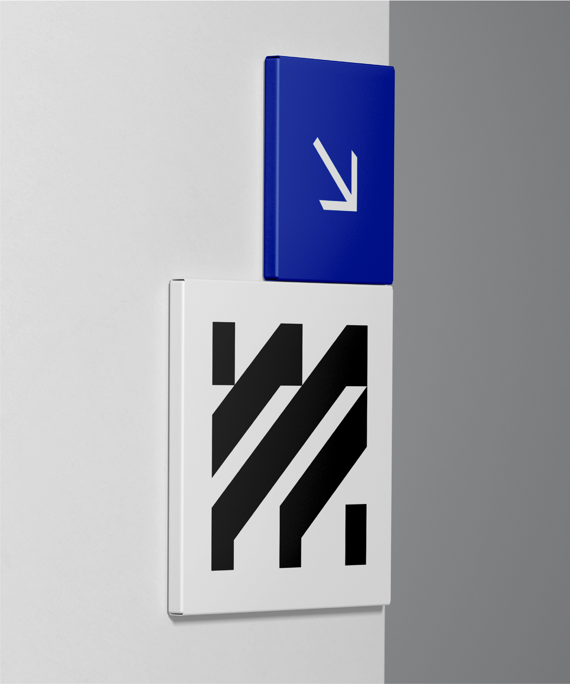
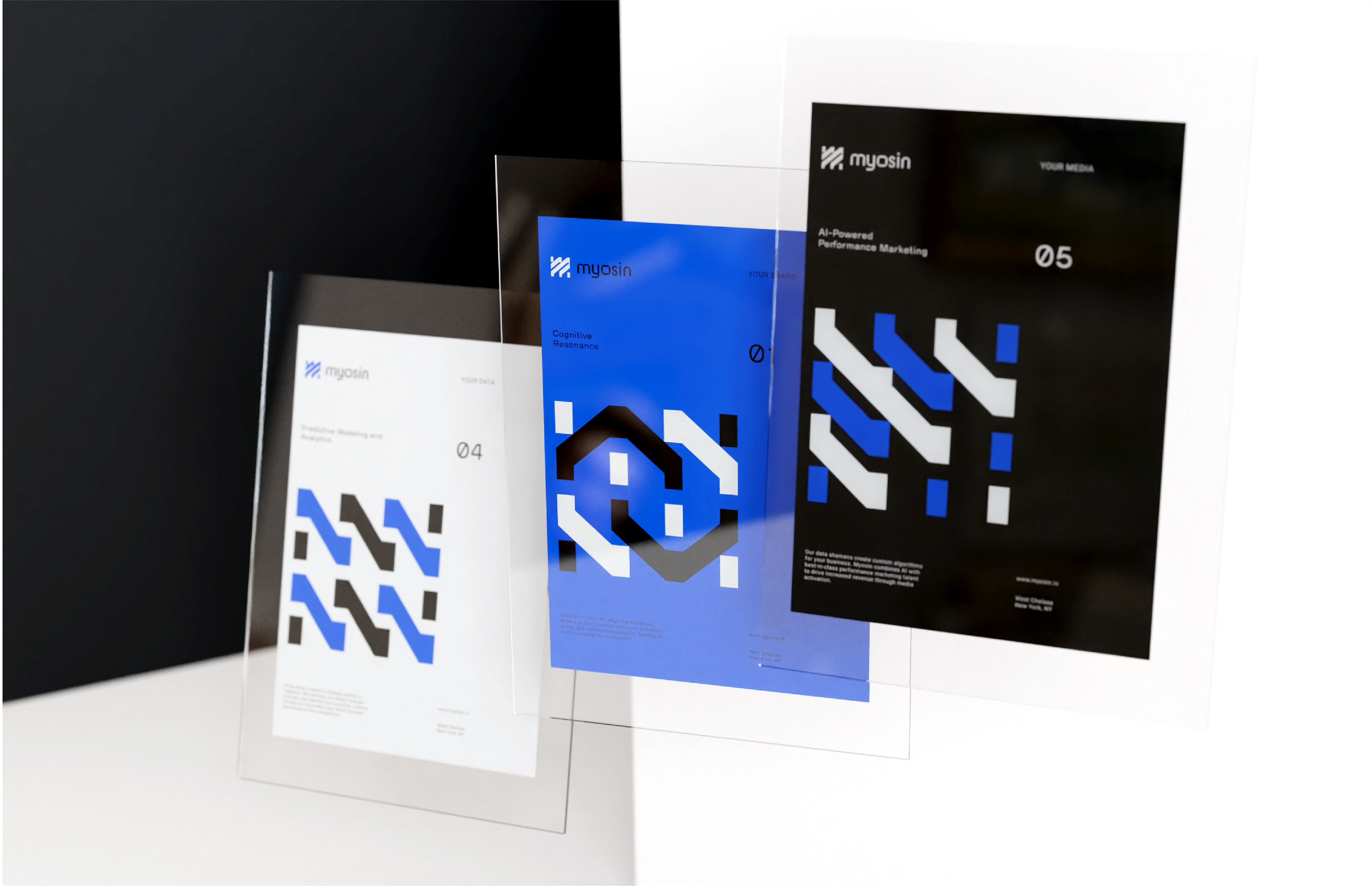
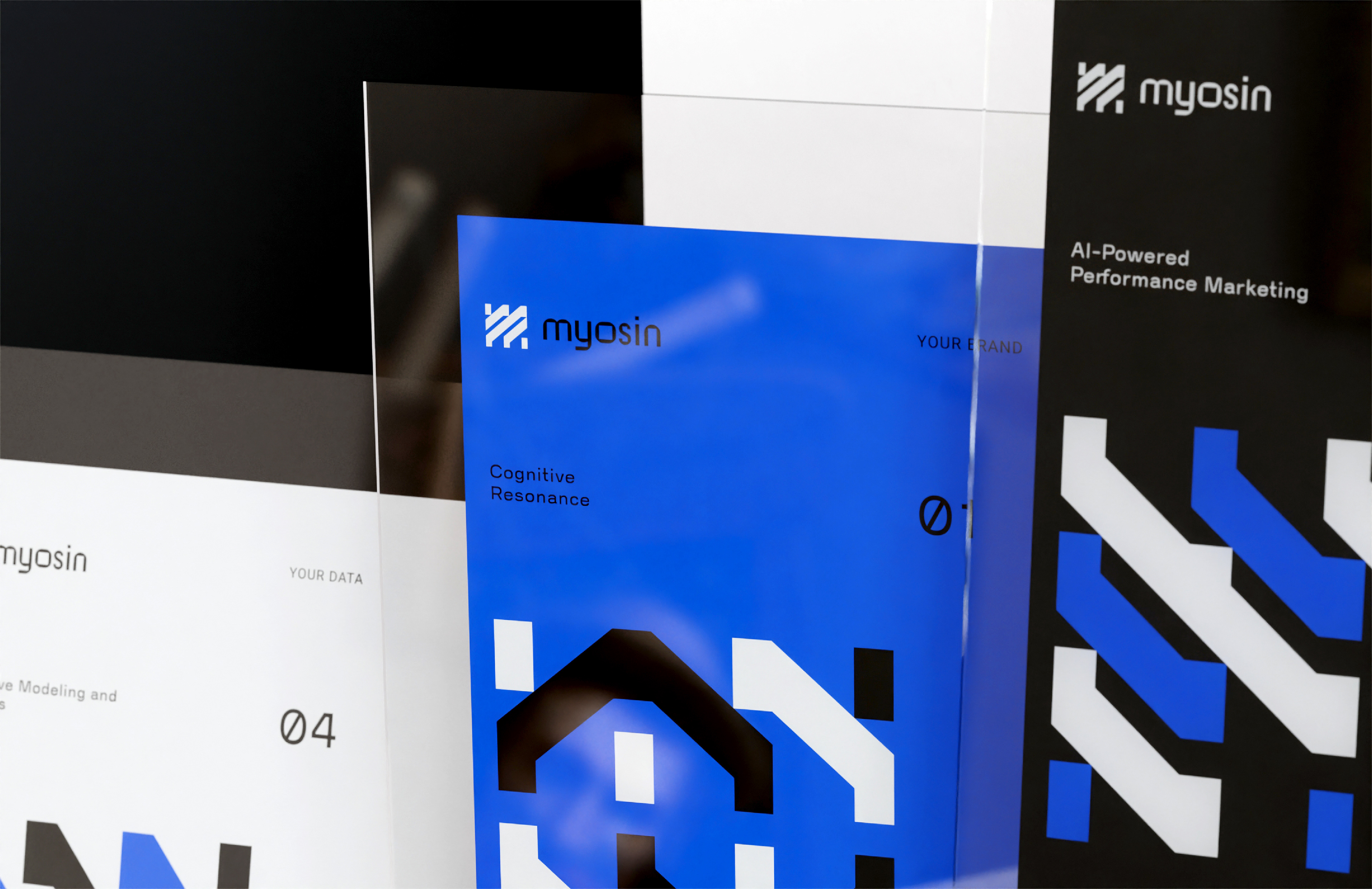
The team, inspired by sci-fi and all things 80's, wanted to pay homage to the history of processing data while aspiring to a clean and powerful visual identity. I decided to draw visual references from old data punch cards, and create a logo mark and icon system from joined sequential rectangles, reminiscent of the recurring punch marks.
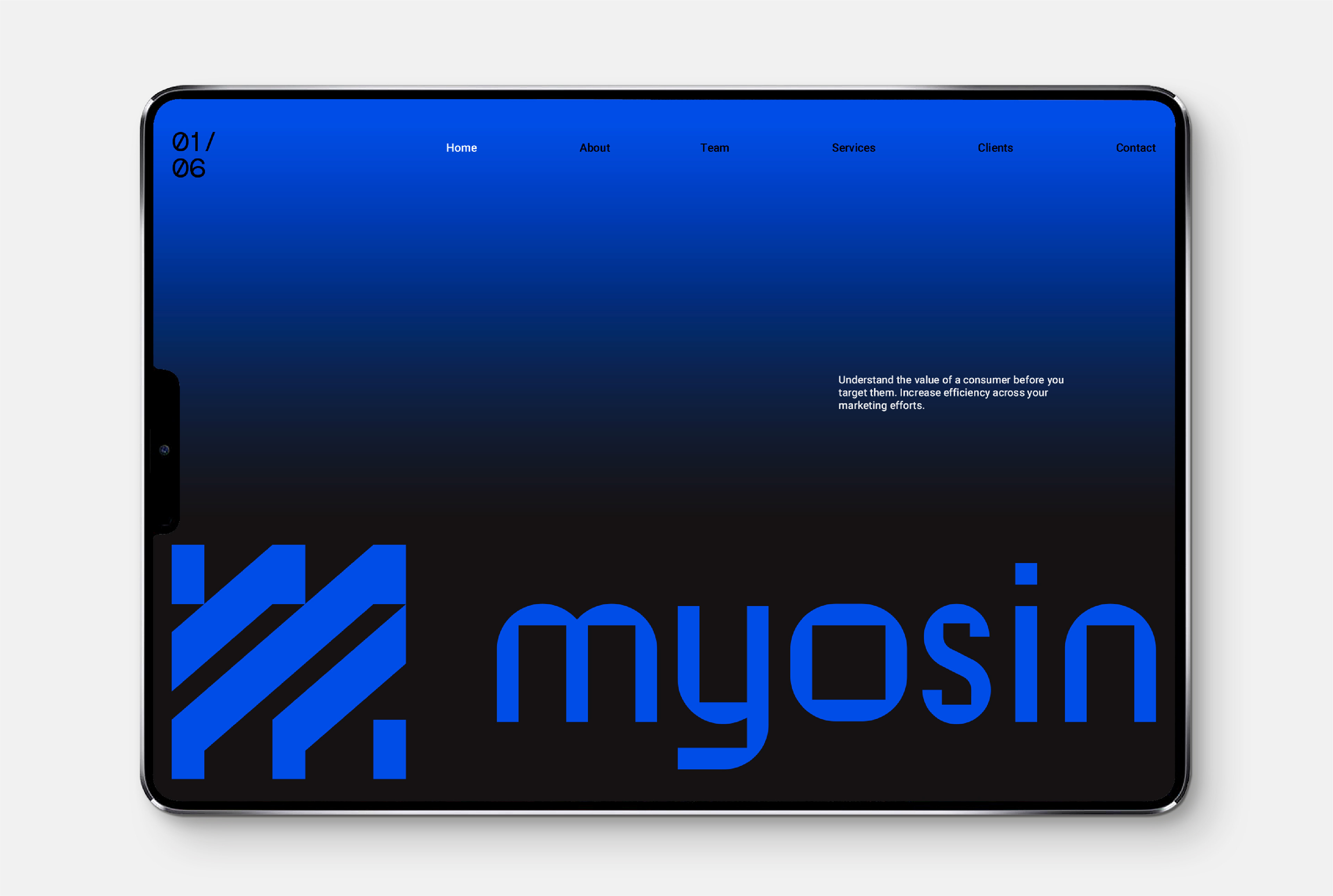
A logo mark consisting of a "M" letterform made up of connected punch marks, was paired with a bespoke logotype that borrows it's negative space from the shapes used to make the mark.
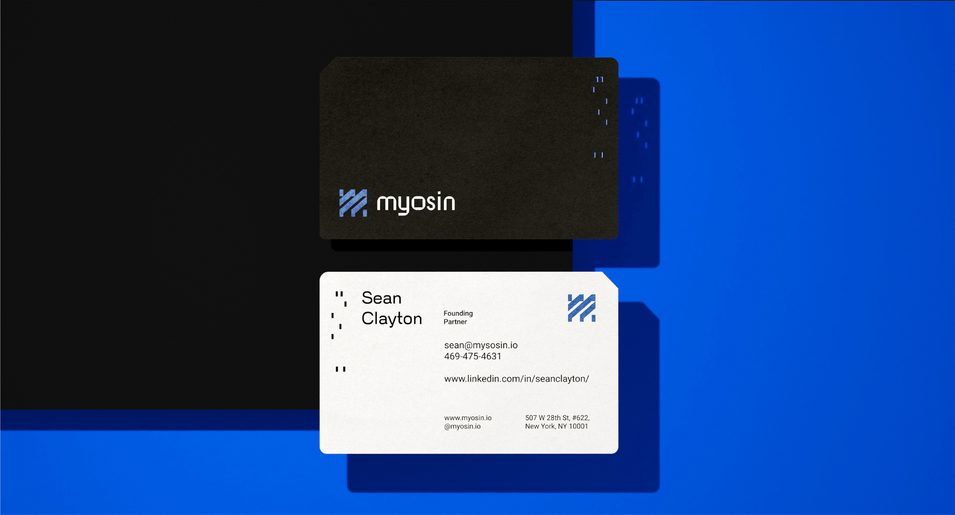
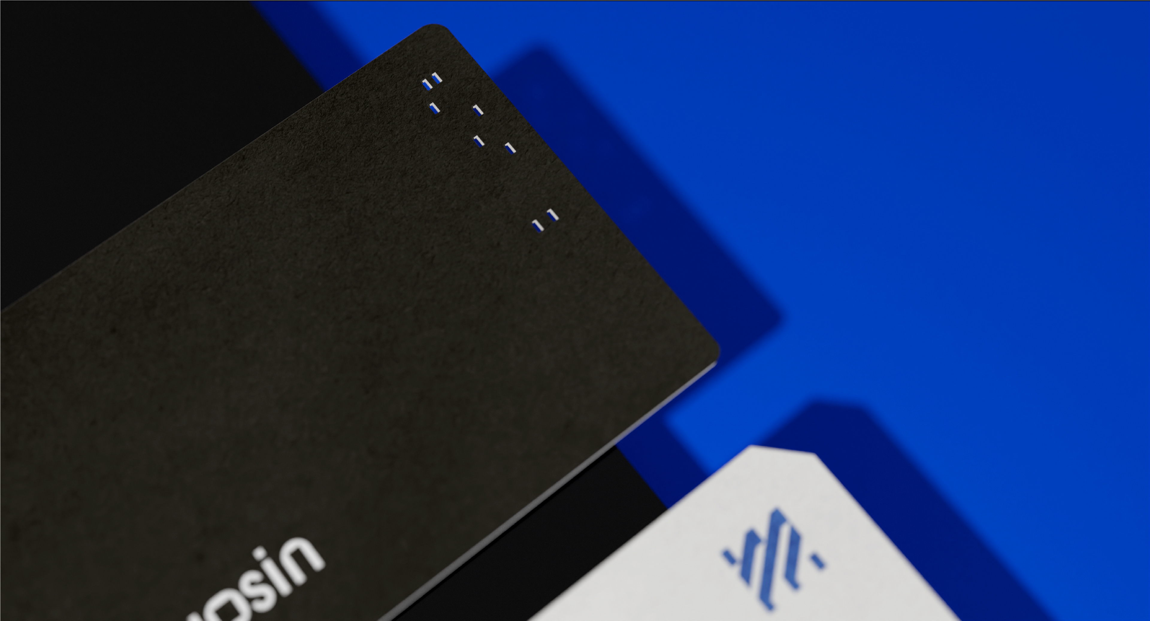
The aesthetic and form factor of physical punched holes and bevelled corners was a strong point of reference and carried throughout the visual identity.
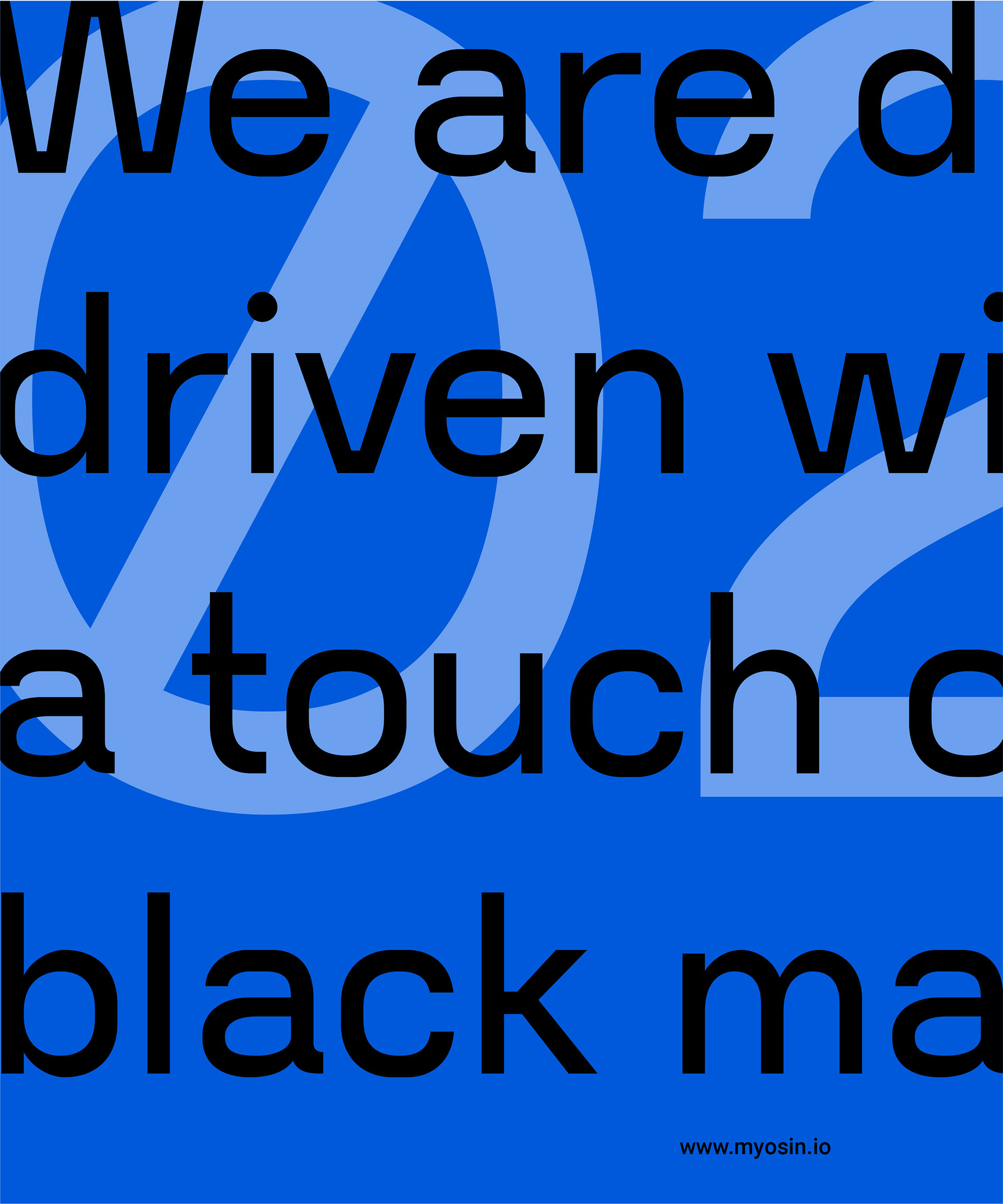
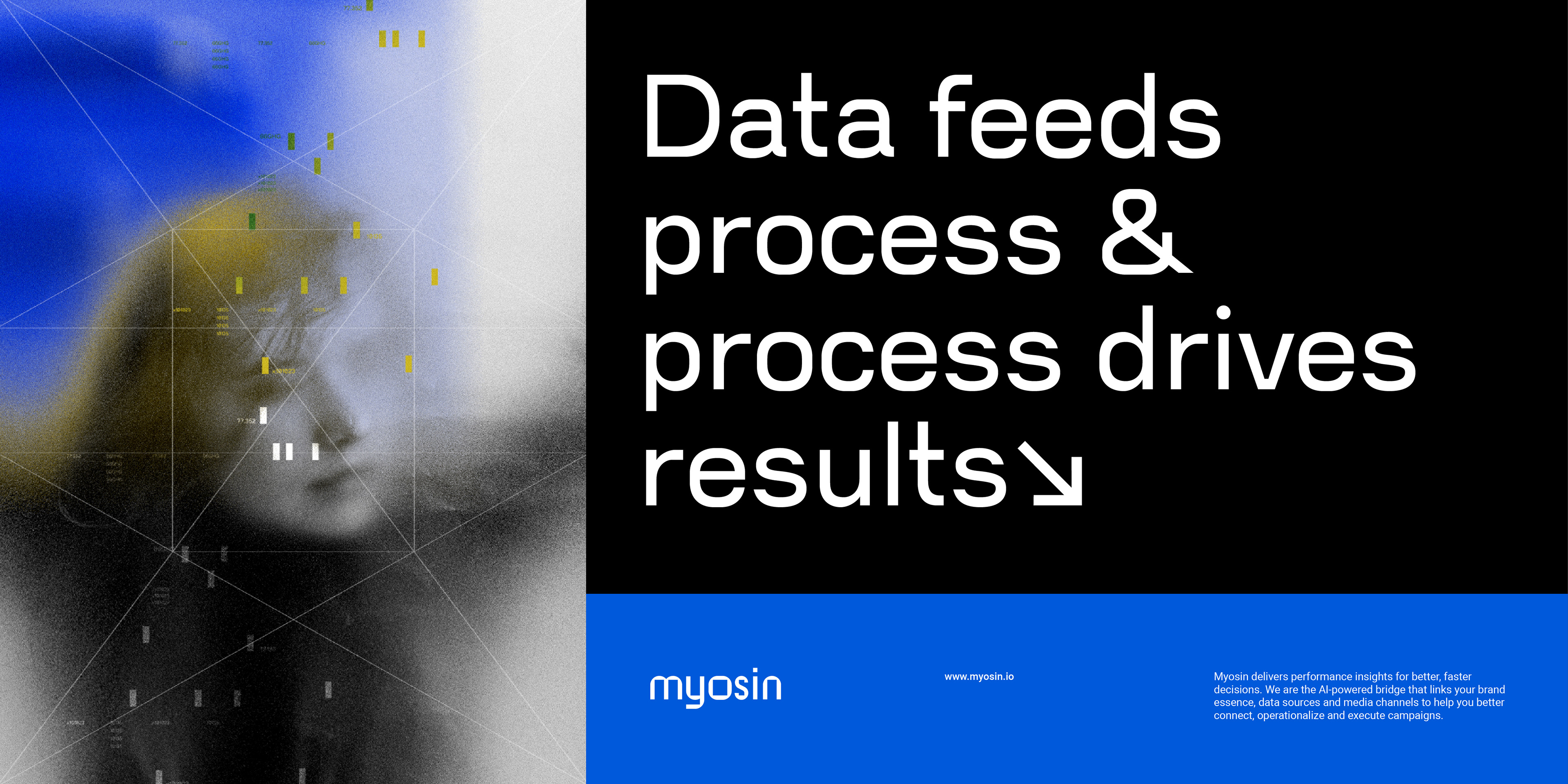
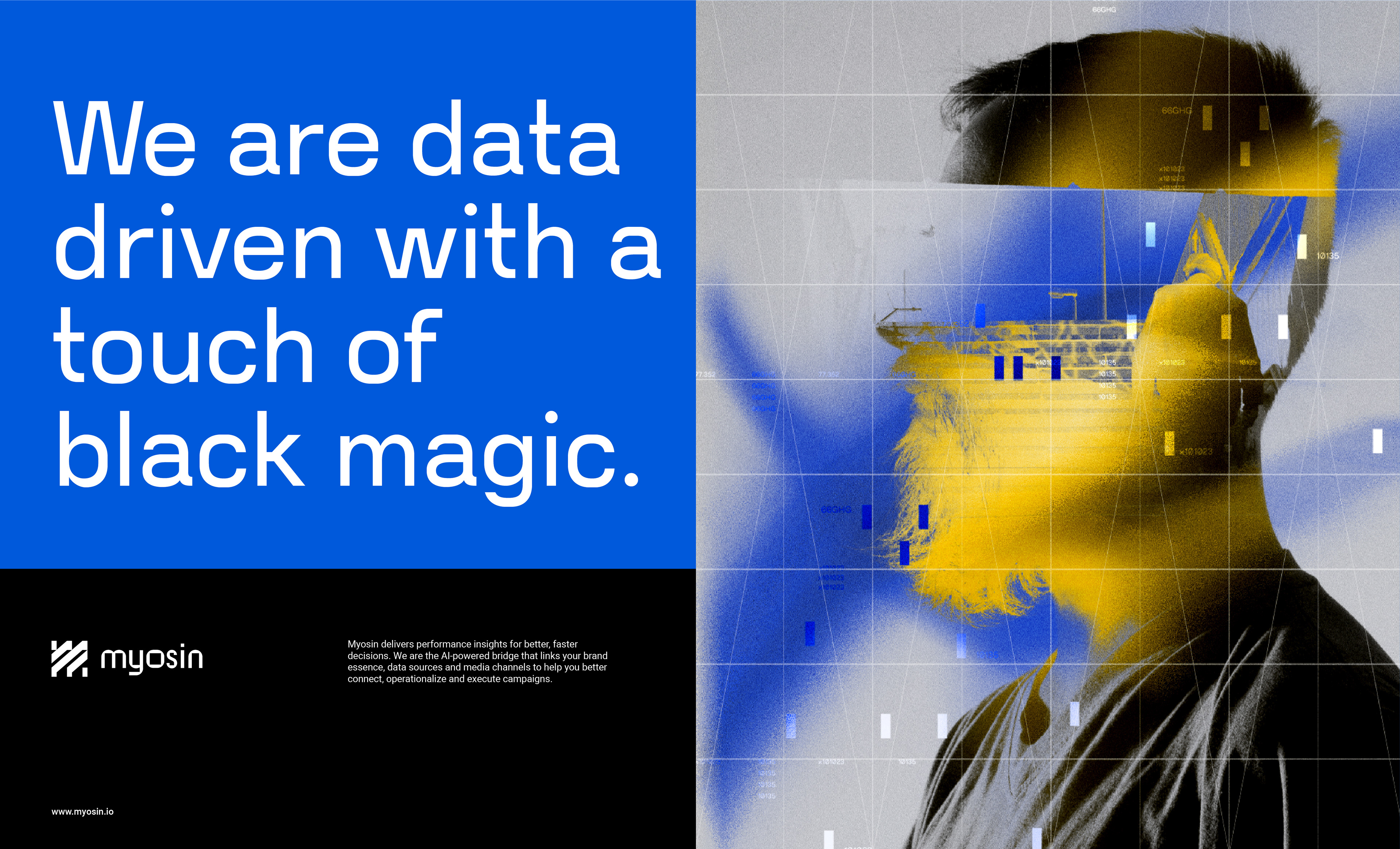
Etherial illustrative artworks were also designed to add visual interest to presentations and the website.
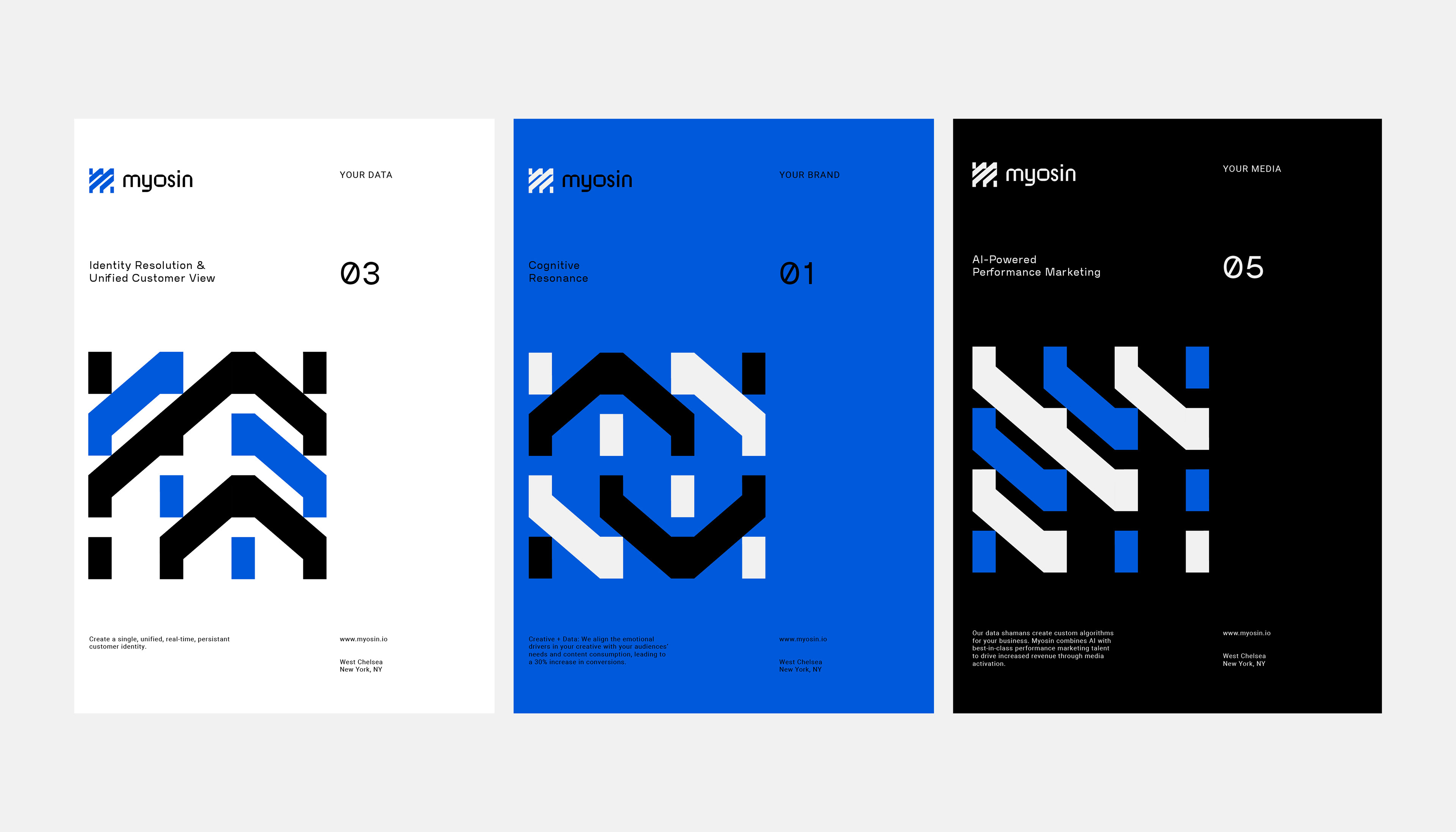
Additionally, twelve unique icons were designed to represent different services and focus points of the business. The task here was to keep the iconography looking futuristic, bold and adaptive at a varied range of sizes and applications.

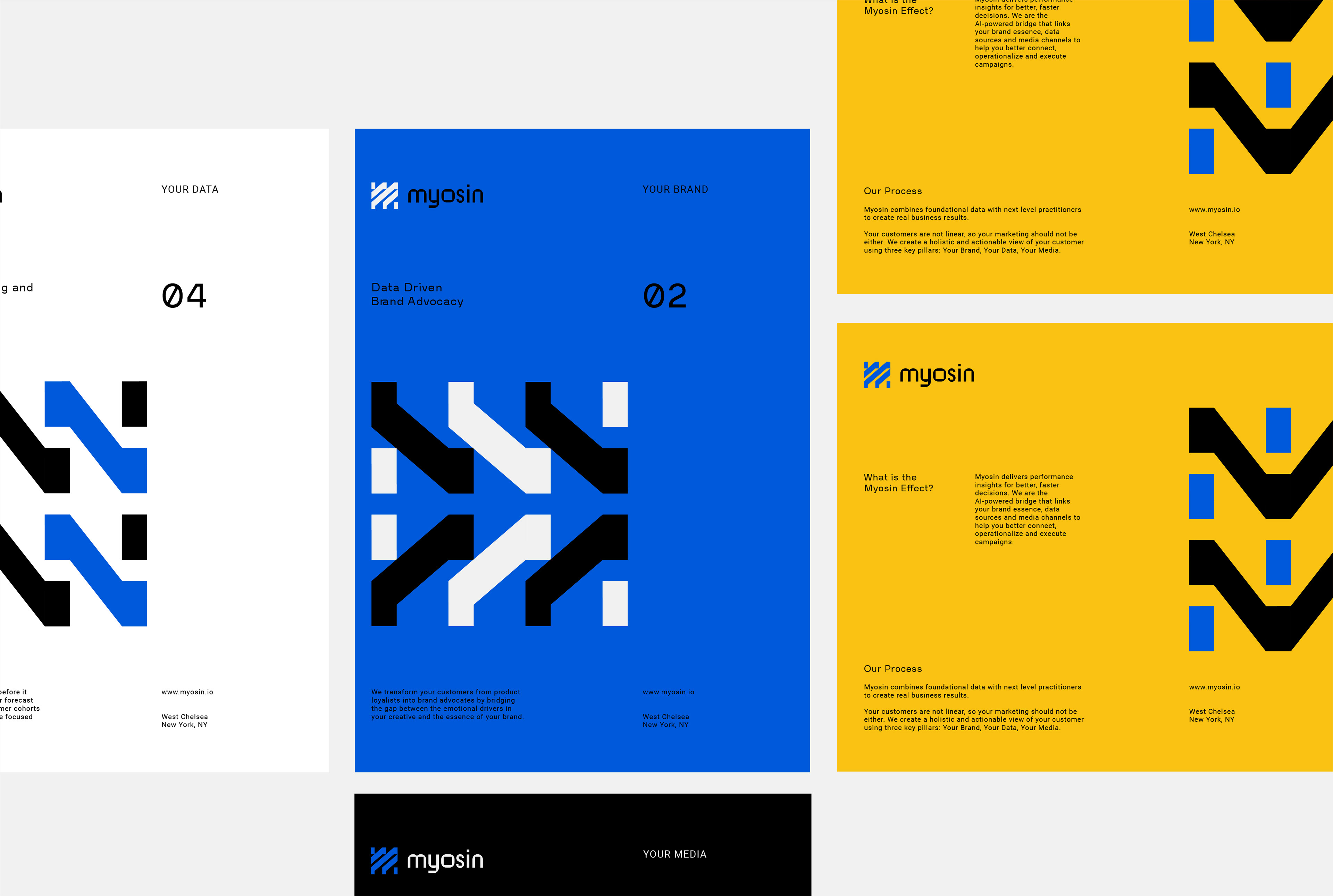
Above is an example of the flexible nature of the iconography, used to frame brand related footage. This application allows the visual identity to express movement and energy when necessary.
Thanks for looking!