Tipico Italian Grocer is the heartfelt effort of husband and wife duo, Zeno Bevilacqua and Anna Chan. They approached me at the start of the business knowing that they needed help with everything, from naming the business and formulating a brand strategy, to developing the visual identity and website. That's where we able to come in and help them step out on the right foot.
After days of deliberation and brainstorming Zeno and Anna were elated to announce that the name Tipico really spoke to them and the type of business they wanted to run. Tipico translates to 'typical', which speaks of the company's desire to make Italian food a more common occurrence in the home kitchen in Hong Kong. In the region, imported Italian goods can sometime cost four times as much as a regular groceries but Tipico aims to change that over the coming years by offering super authentic Italian goods straight from the source.
The direction pursued for the brand involved referencing and studying the current market in Hong Kong. The overall task was in creating something that indicates affordable, accessible and independent but a hint of a commercial feeling. A lot of this project owes thanks to the retro Sainsbury's labels and branding that really popularised own brands over the 50's, 60's and 70's.

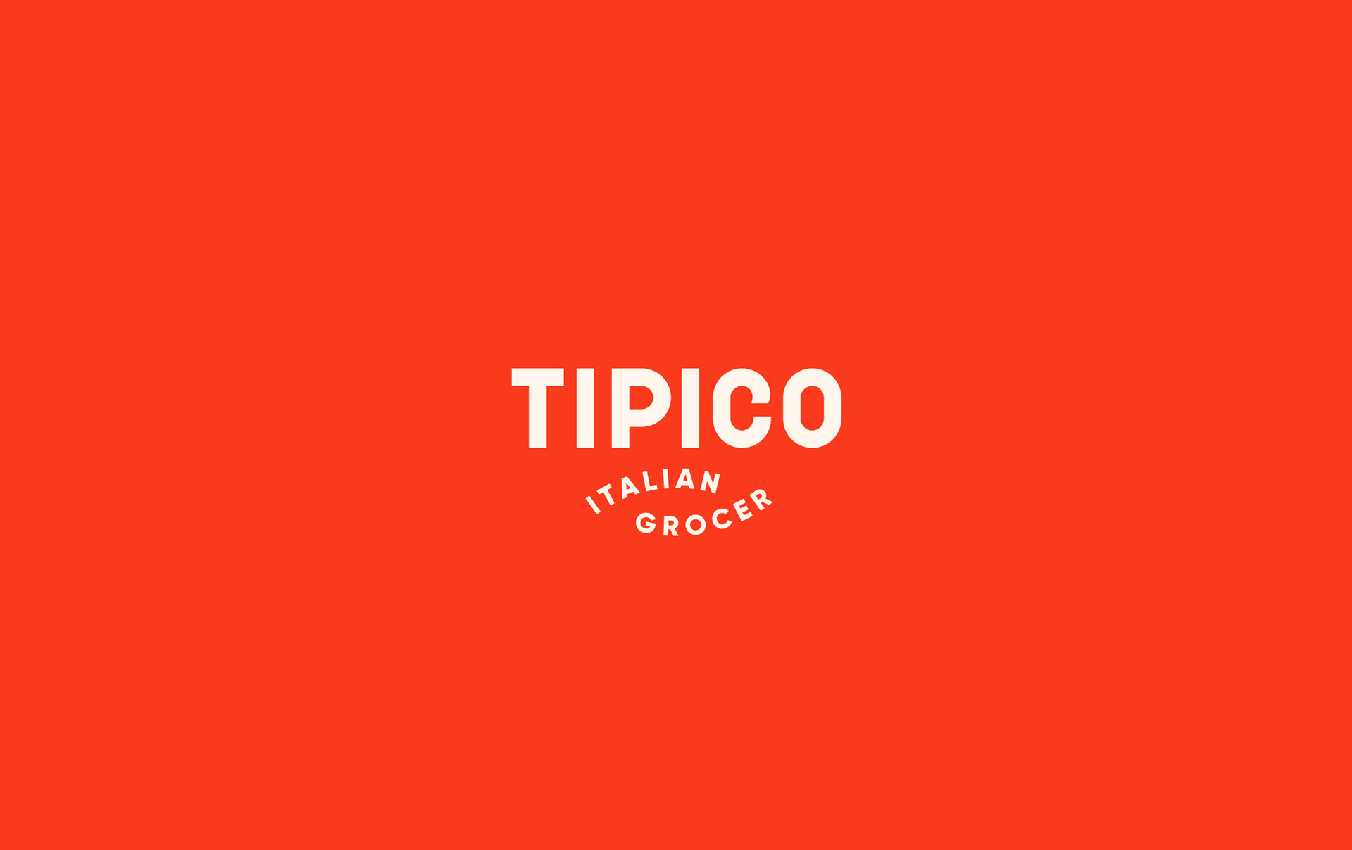
The logo needed to be strong, legible, trustworthy and sure of itself. In the end a bespoke logotype was designed as the primary mark. The decision to avoid any frills or iconography was inspired by a conversation with the owners about their love for old shop fronts, bold Italian typography and signage Zeno remembers from growing up in Verona.
To add a bit of character to the mark, "Italian Grocer" was placed beneath in a playful interlocking shape that plays off of the rounded parts of the lettering. There is also the tiniest bend on in the upper part of the 'C' that just adds a bit of humanisation and uniqueness to the overall feel.
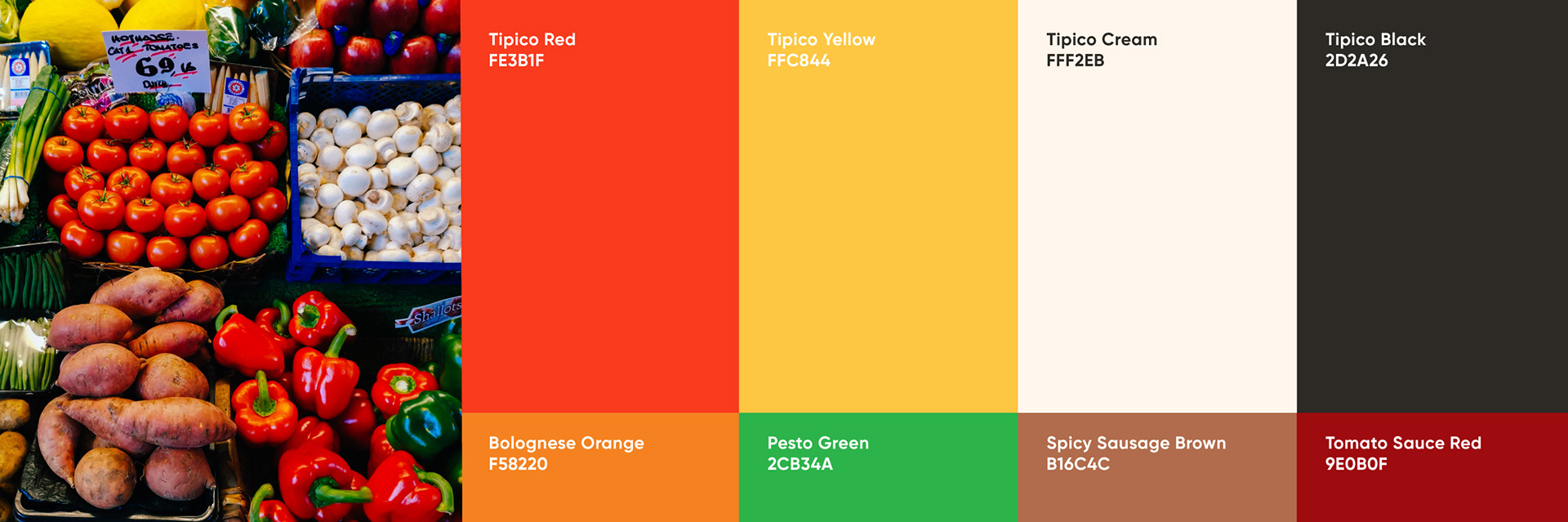
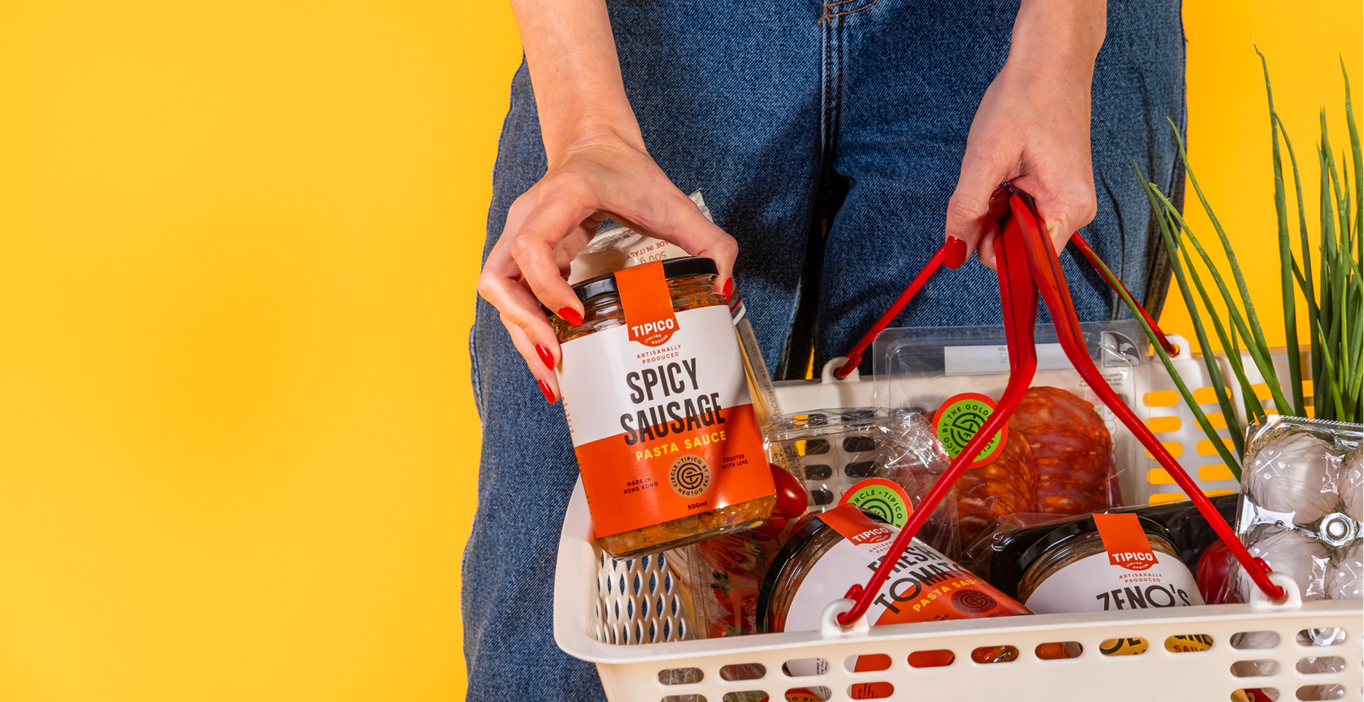
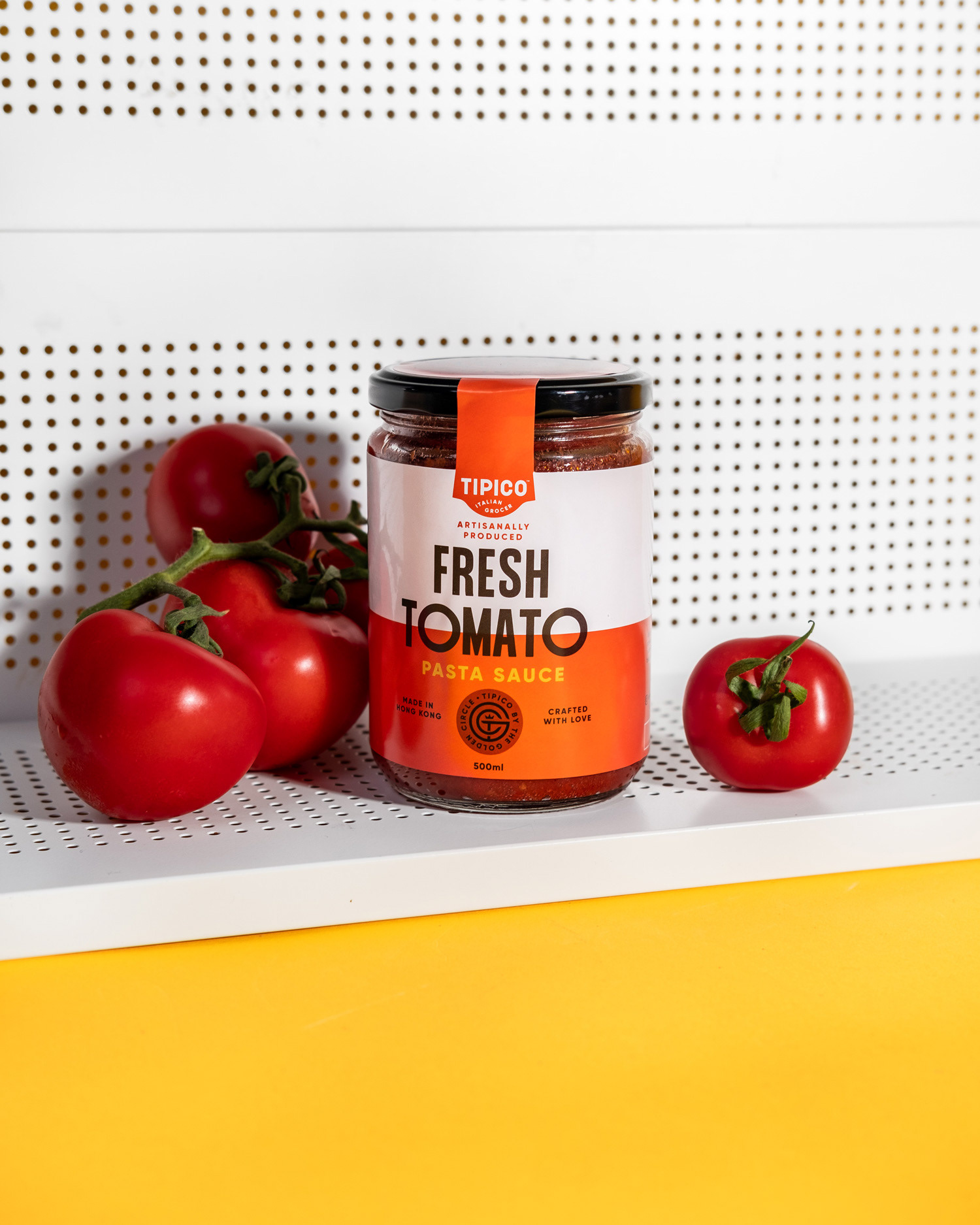
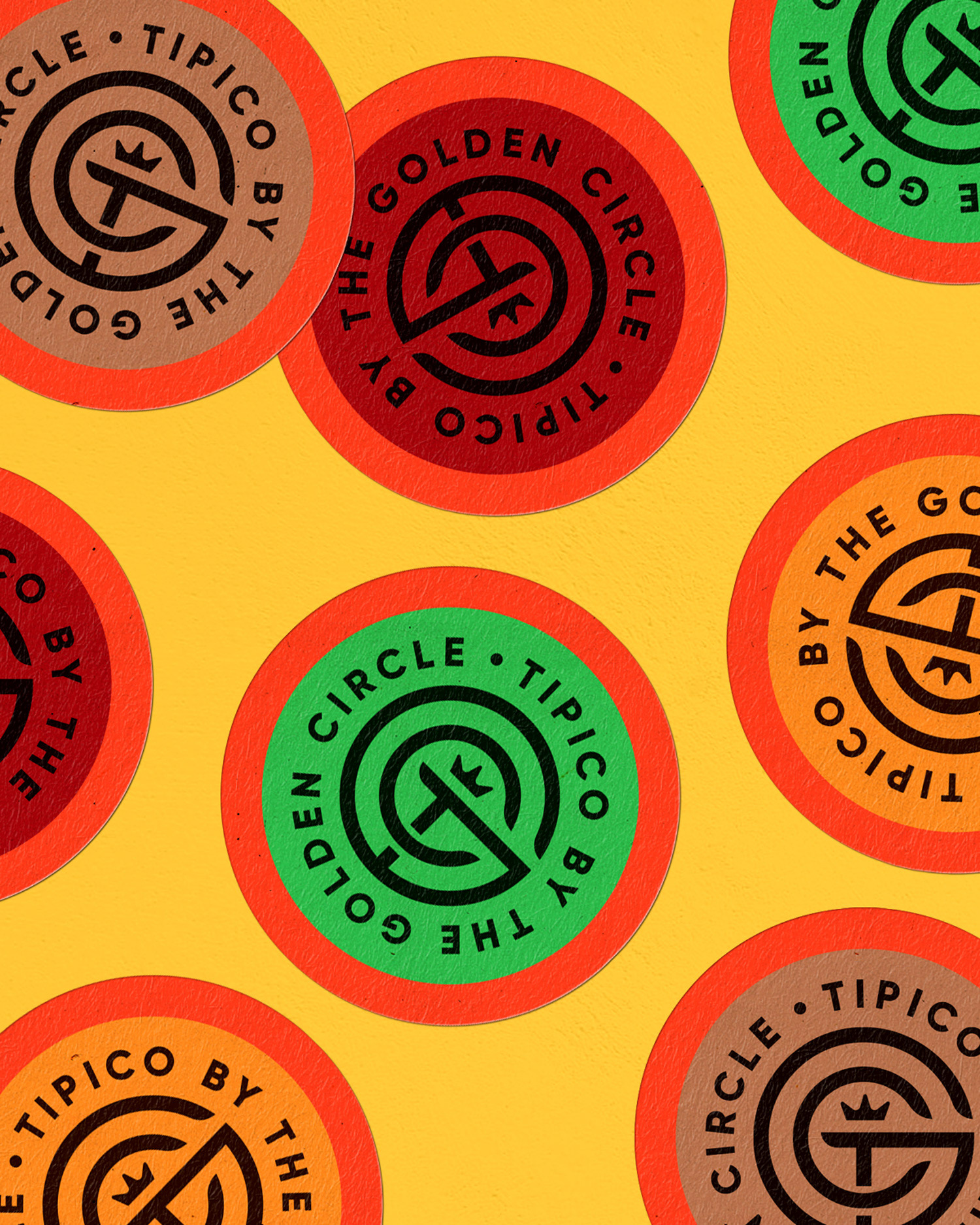
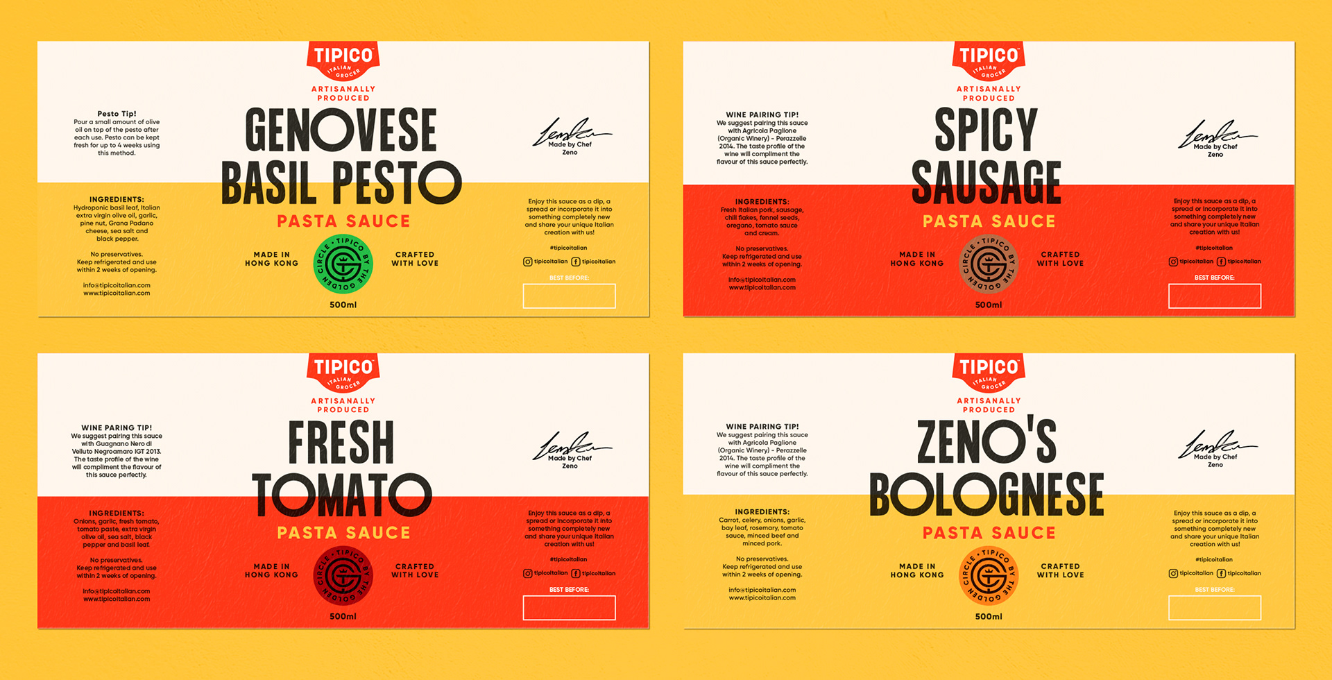
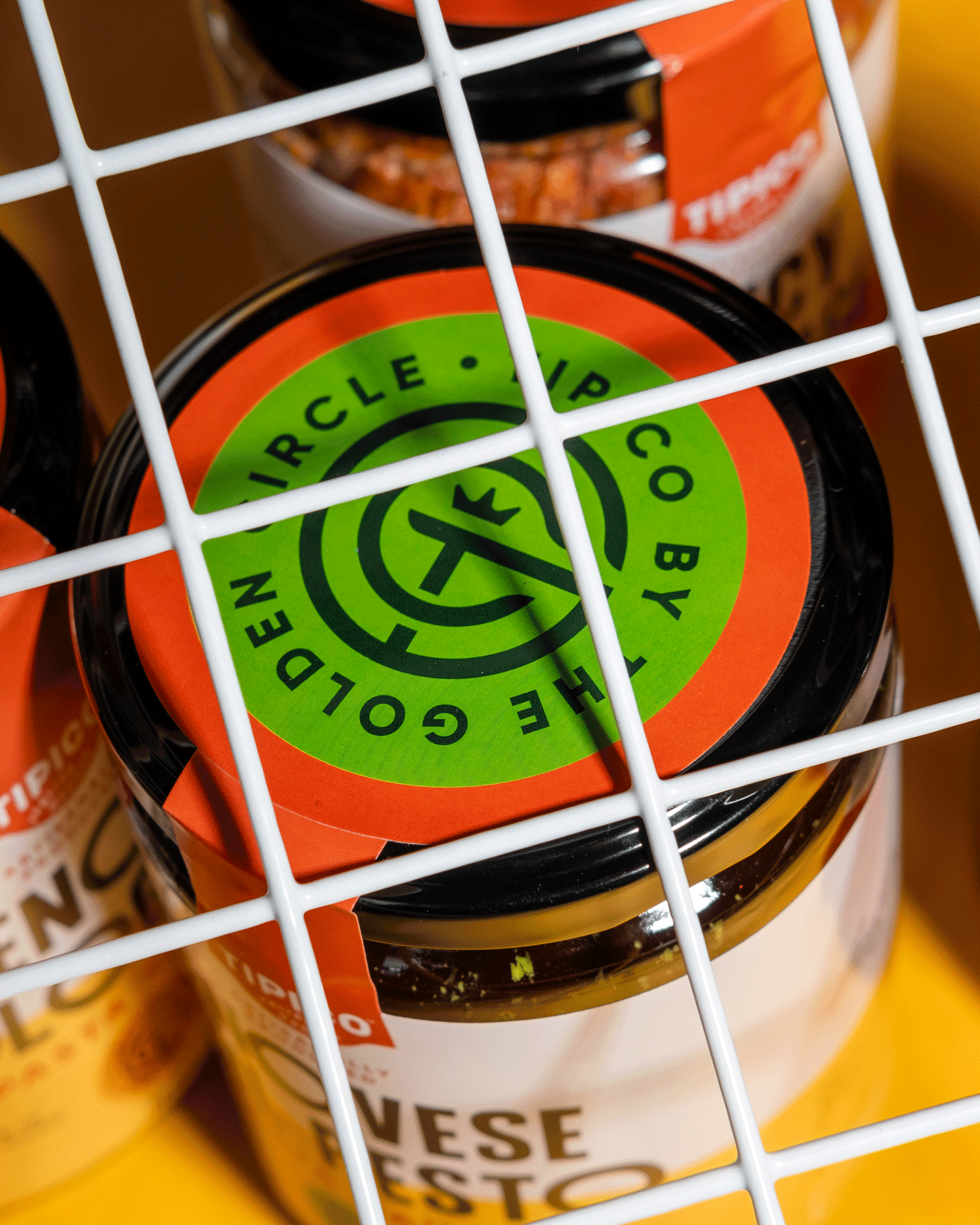
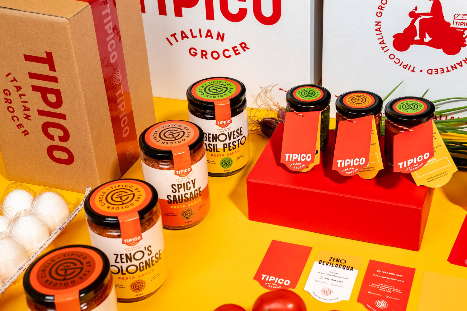
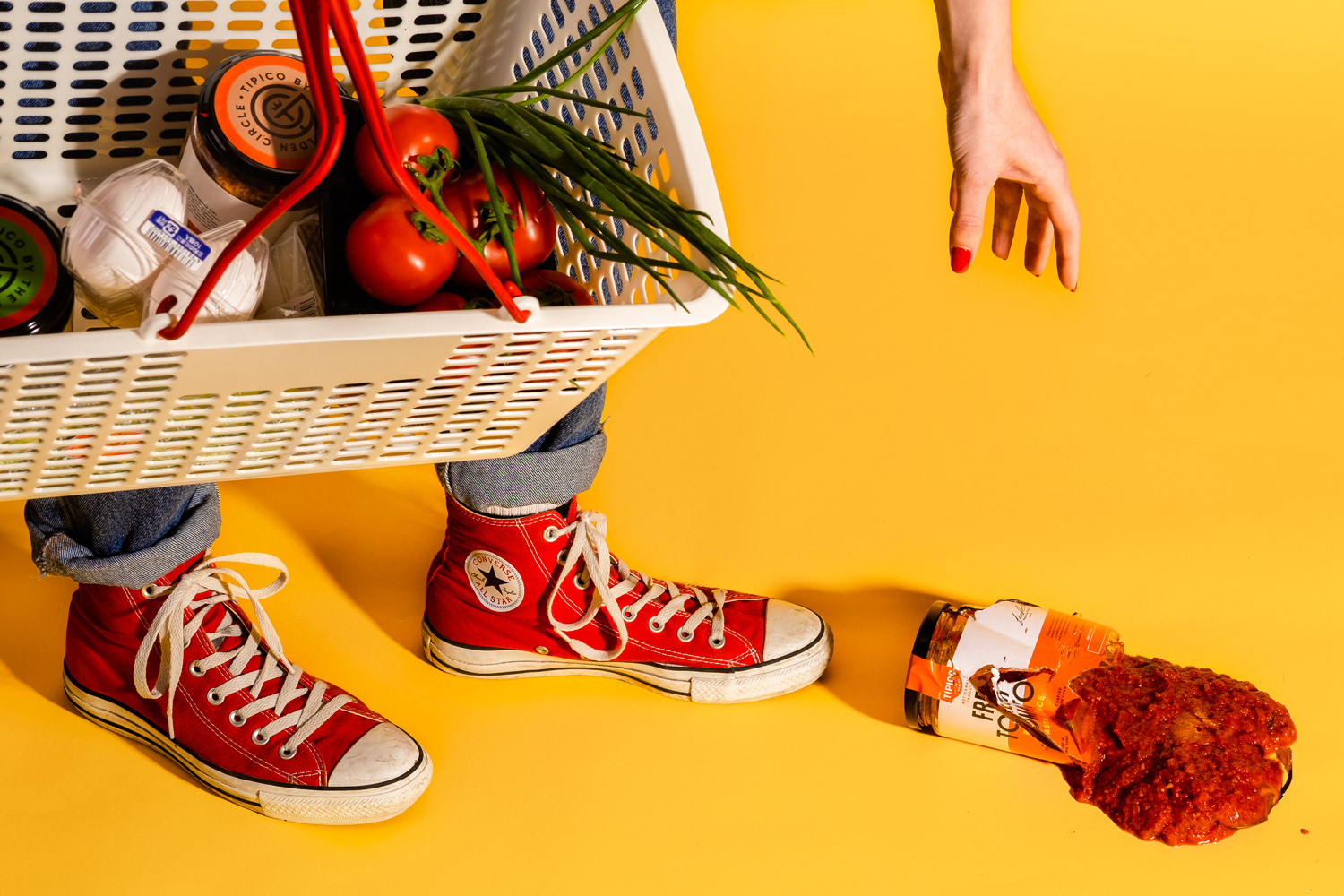
Inspiration for the brand's core colour system comes from the hues of the produce itself. What better palette to choose from than your local green grocer's shop front! The primary set of red, yellow, cream and black works really well to speak boldly in a positive, uplifting way. The secondary set of colours is used to differentiate between house made sauces.
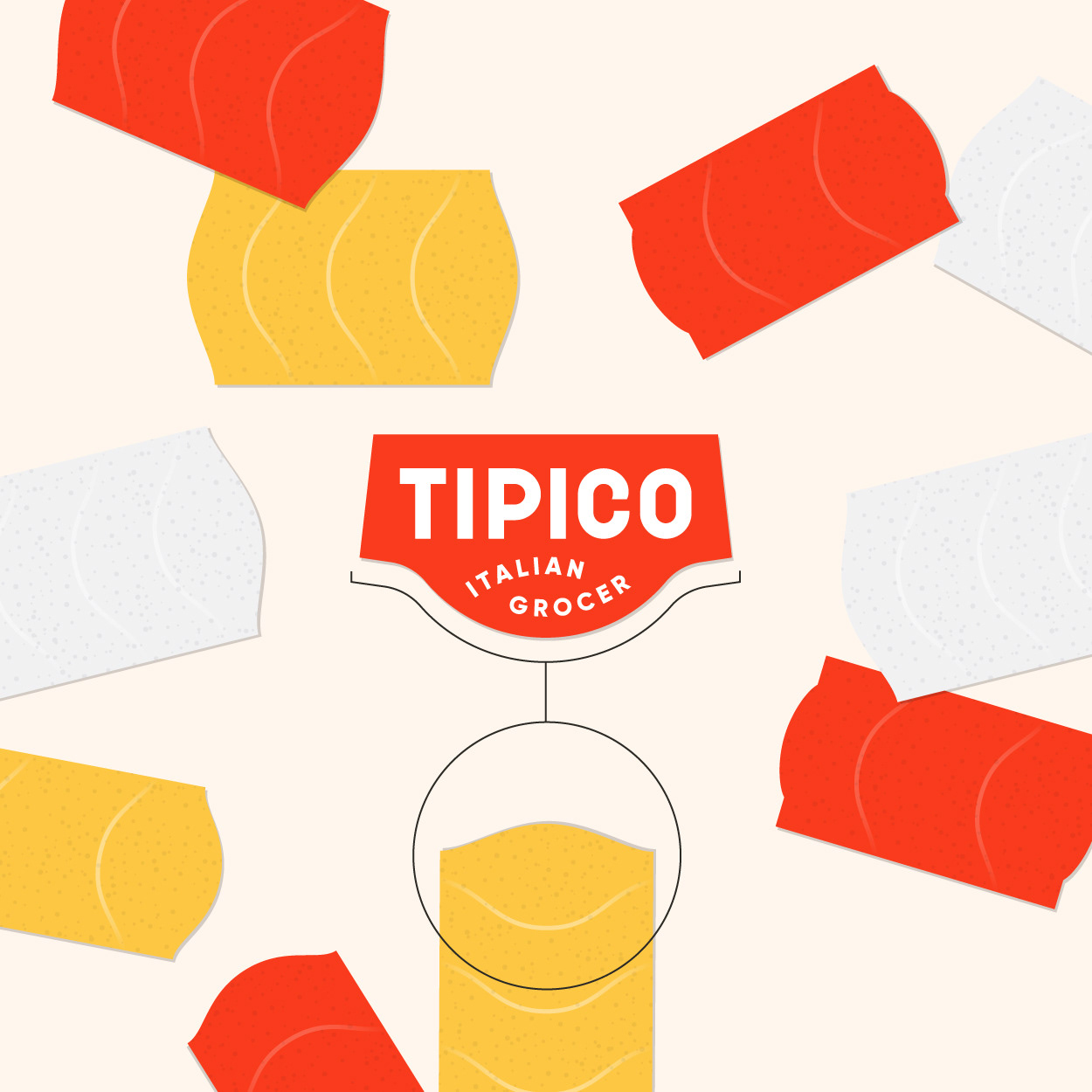
Conforming to the overall shape of the logotype, a device was designed to apply the logo on to items, such a labels and stickers. The device itself is reminiscent of a price sticker you might see in a traditional grocery store.
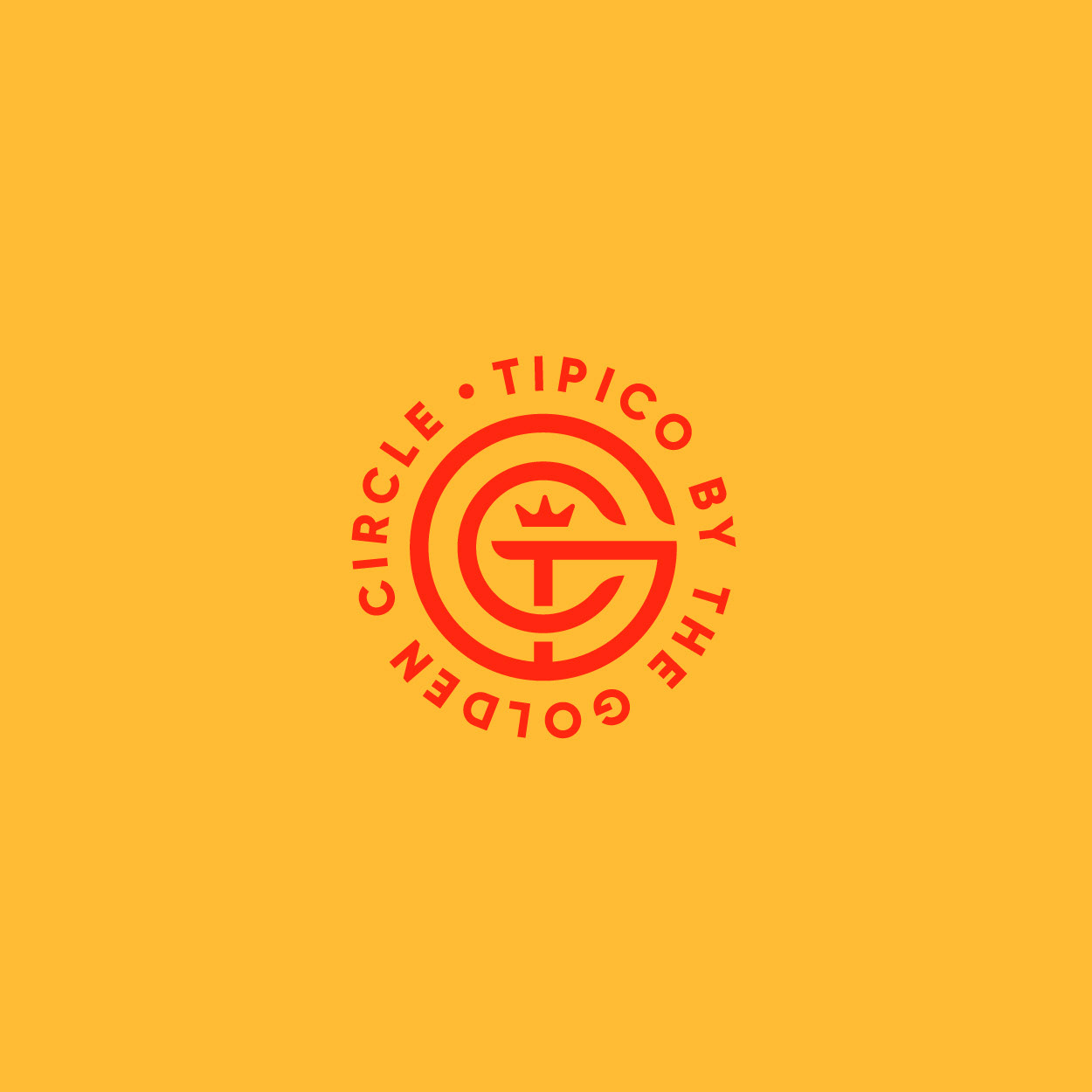
In addition to the primary mark, a secondary logo was design at the request of the client to function as a holding group logo that Tipico was to be the first born. The holding group, known as The Golden Circle is now represented by a monogram that interlinks a T,G and C.
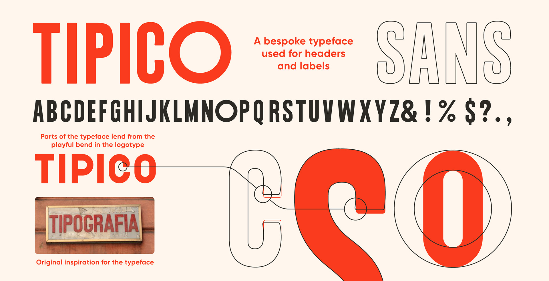
When it came to working on the type system, it was decided that honouring Zeno's memories of growing up in Verona with classic, bold typography adorning the fronts of all his favourite haunts would be in the best interest of the brand's story. A custom typeface, Tipico Sans, was designed to reflect nostalgia and to support the bold trustworthy feeling we were going for. Small, humanistic quirks found in the word mark served as inspiration for softening the bold condensed type.
Zeno also pointed some instances where kerning in traditional signage could be a bit inconsistent and O's seem to be borrowed from other fonts. This was all thoughtfully implemented while constructing the typeface that was paired with Gilroy medium, bold and extra bold for the purpose of sub-headers and body copy.
Once we were done with the building blocks of the brand, the final designs for packaging and collaterals could come together.
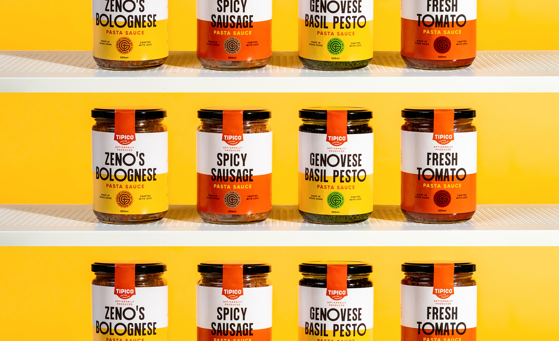
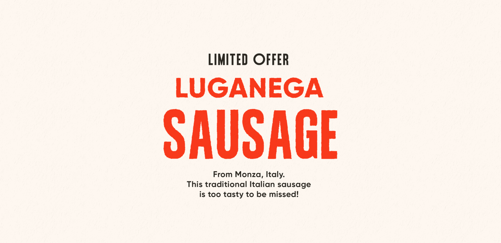
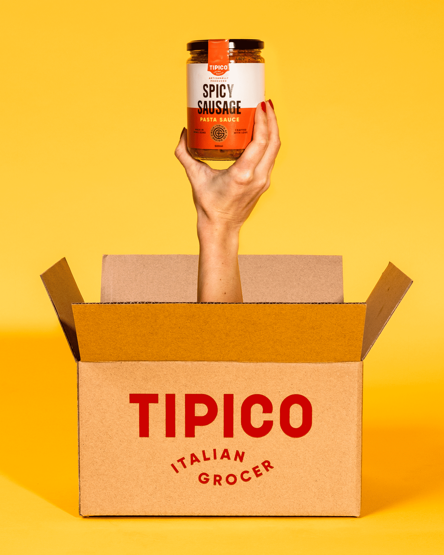
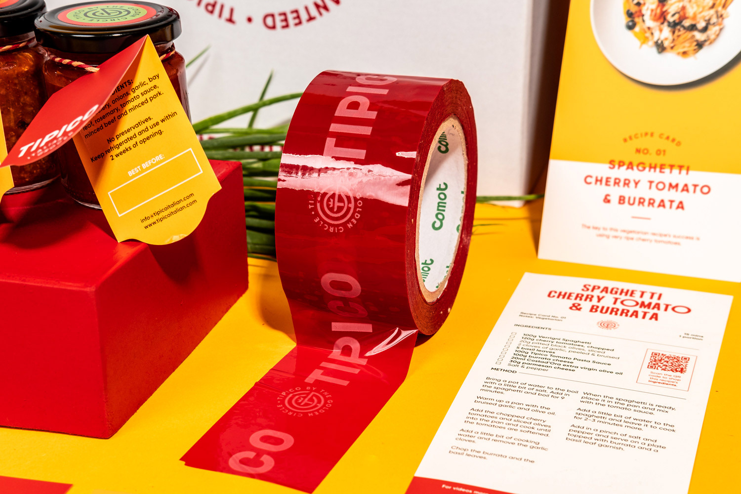
The first thing designed for Tipico was a range of sauce labels. Simple, clean and keeping with an own brand generic look and feel. The minimal layout is current, yet small details like the seal tab were kept as a source of familiar reassurance about the product.
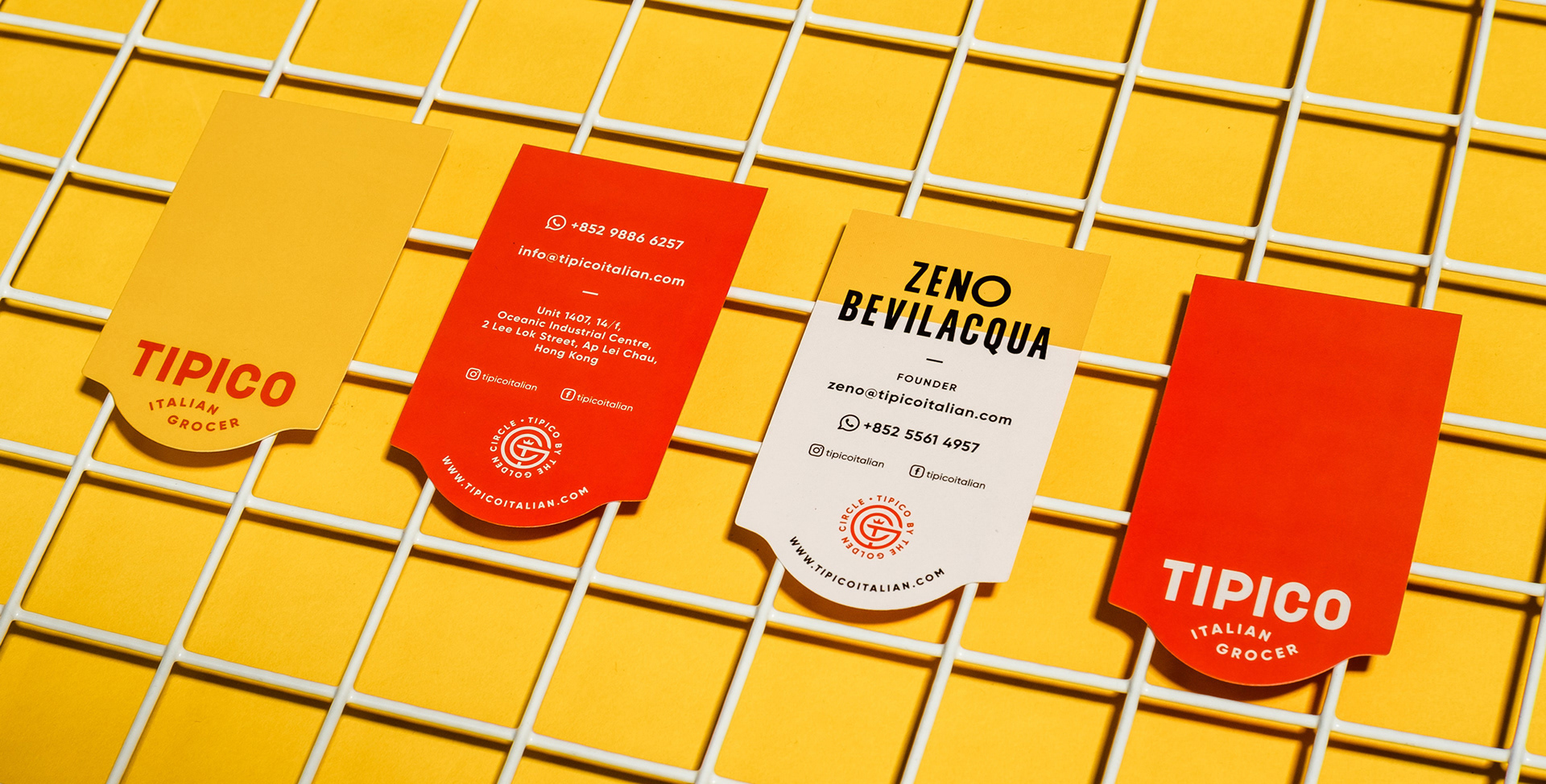
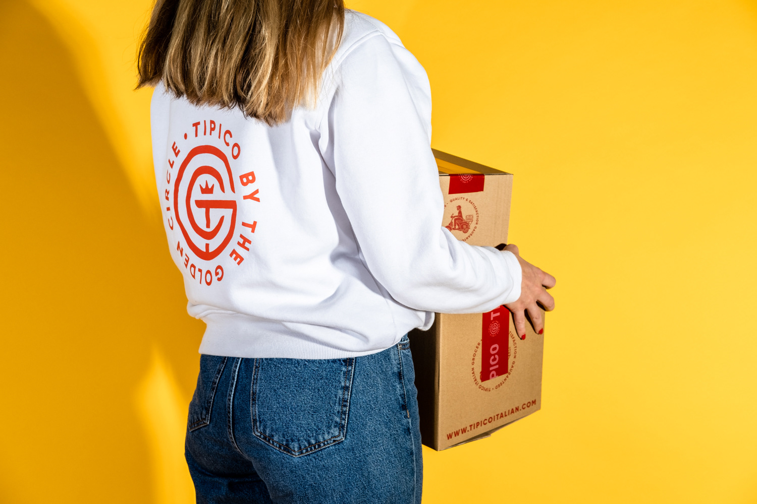
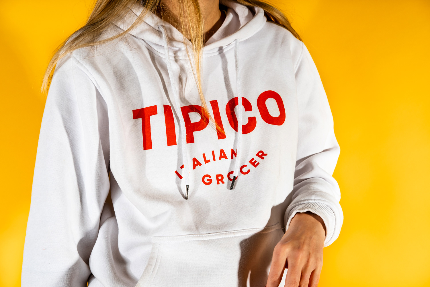
As with any other brand, basic collaterals and merchandise or uniforms are a necessary part of the branding system. The design was kept sleek and cohesive throughout the entire visual identity.
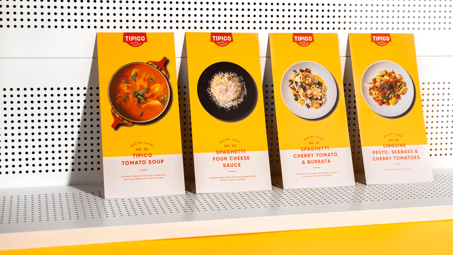
The recipe card designs above act as a form of calling card and means to promote the business. They are often handed out for free at markets and events where future Tipico patrons can be found. QR codes for each recipe take you straight to a bundle page where everything is ready for you to purchase in a few clicks!
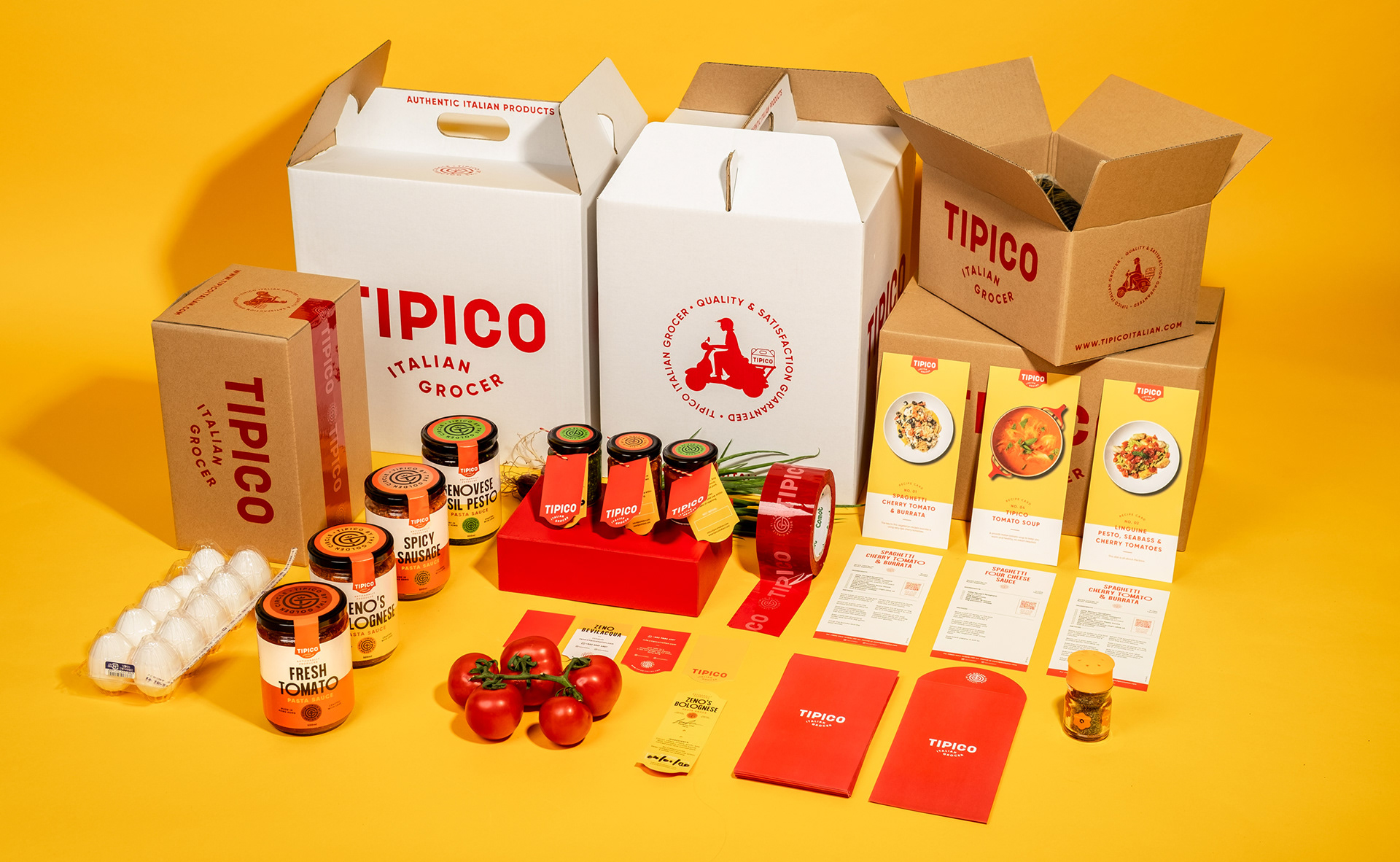
A larger overview of a few of the branded products, packaging and collaterals that are currently in use at Tipico Italian Grocer.
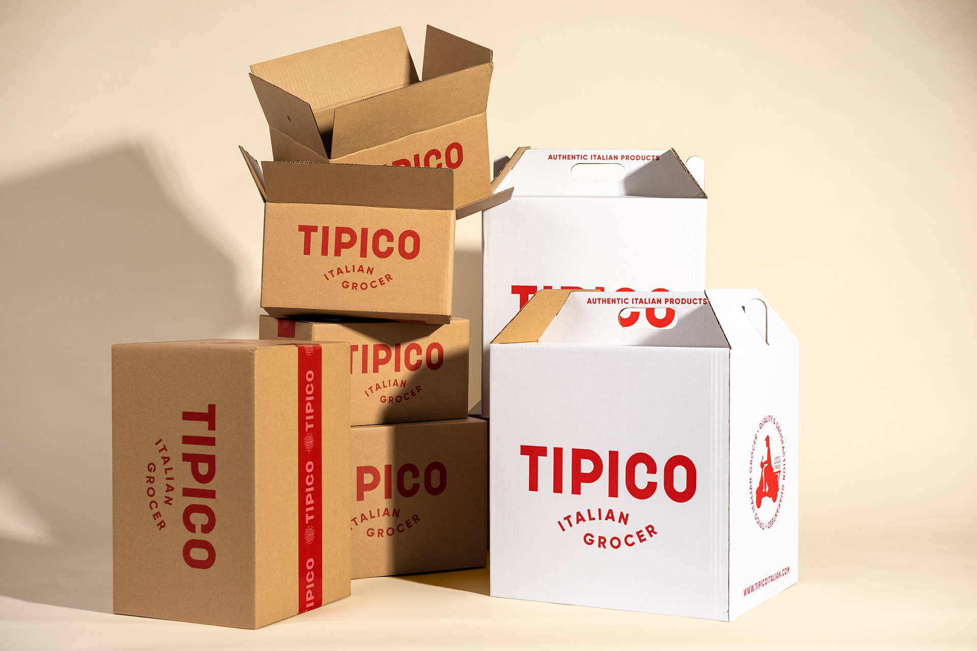
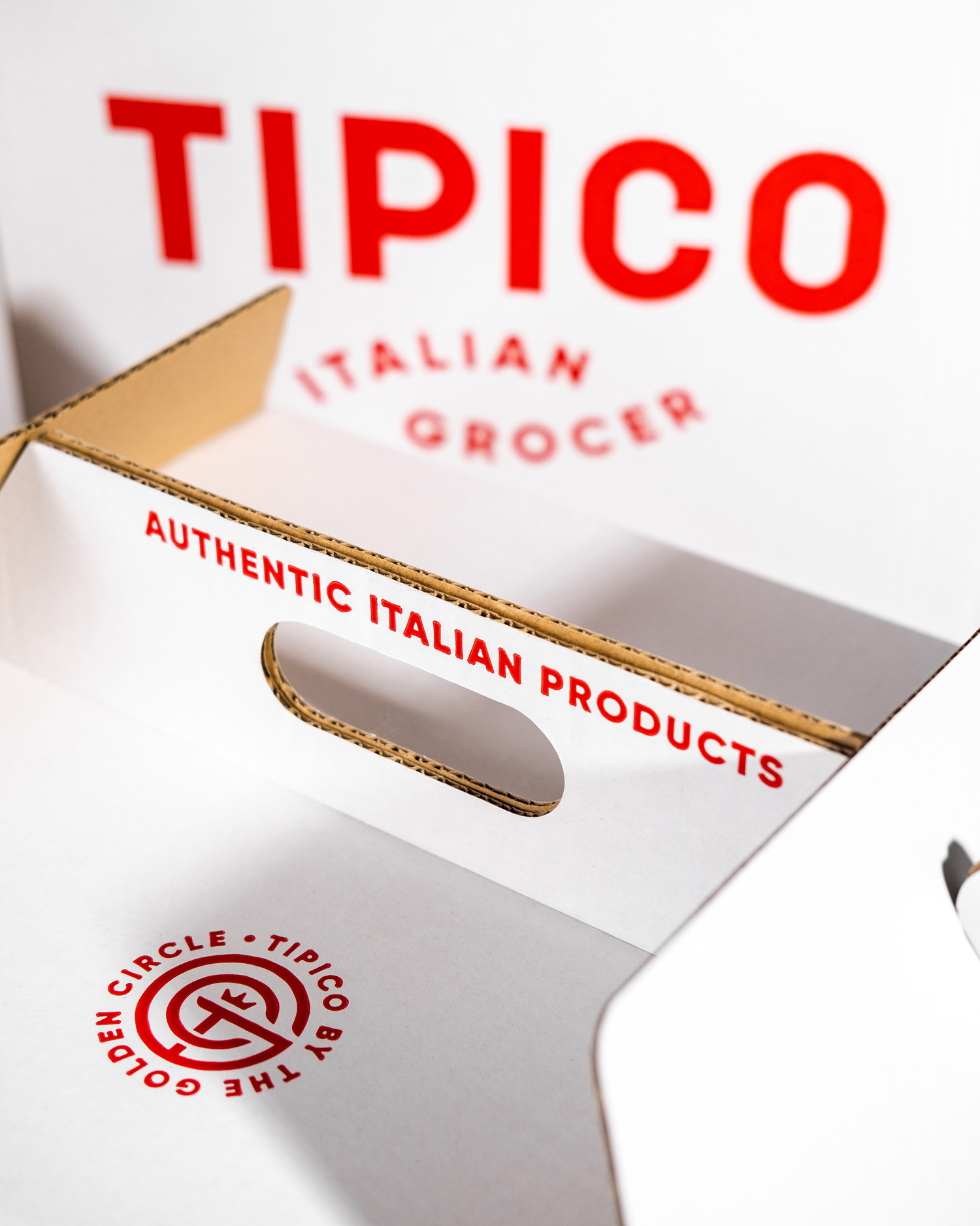
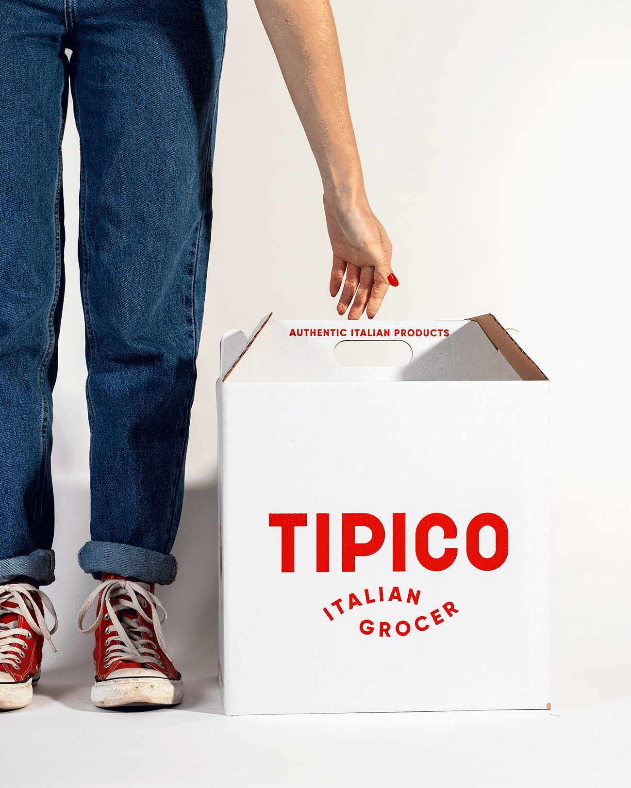
Once the collaterals and individual items of small packaging were finalised, a shipping system had to be established according to the rules and regulations of local shipping companies in Hong Kong. Rigorous research and a multitude of mock-ups were produced until we felt 100% certain about the sizes of the cartons and hamper packs. In the end we settled on 3 box sizes and a hamper box, the smallest only requires branded tape while the other two and hamper are branded with the classic Tipico red.

As a part of humanising a store that is predominantly online, a mascot type character was illustrated to remind the customer about the intimacy of Tipico as a business and that the grocer aspires to being as "mom and pop" as possible. The mascot was animated to appear on the website as well as numerous marketing materials.
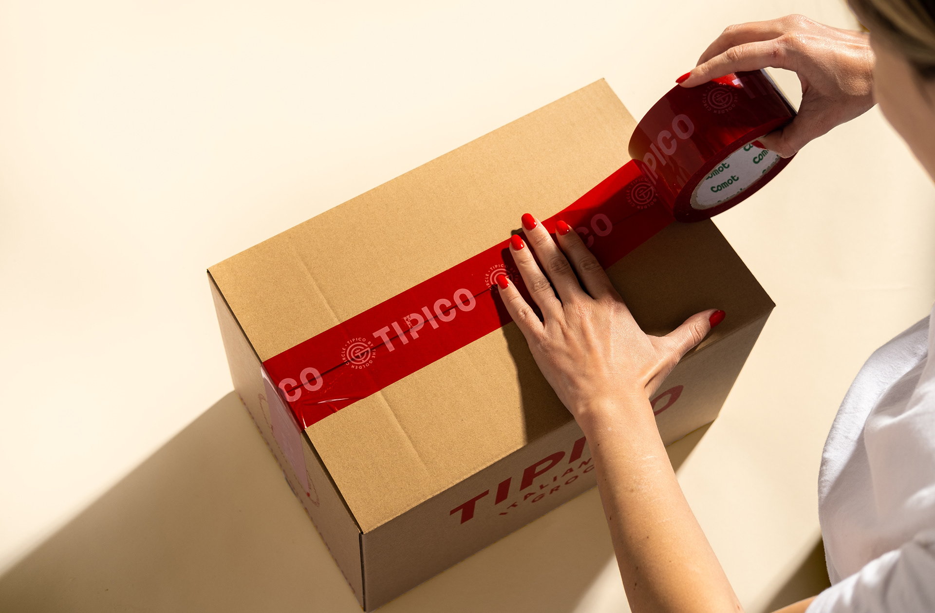
Tipico and The Golden Circle tape was designed to seal each shipment. Applying the brand to items such as this, once again, come from the perspective of the customer's desire for reassurance and trust from an online grocer.
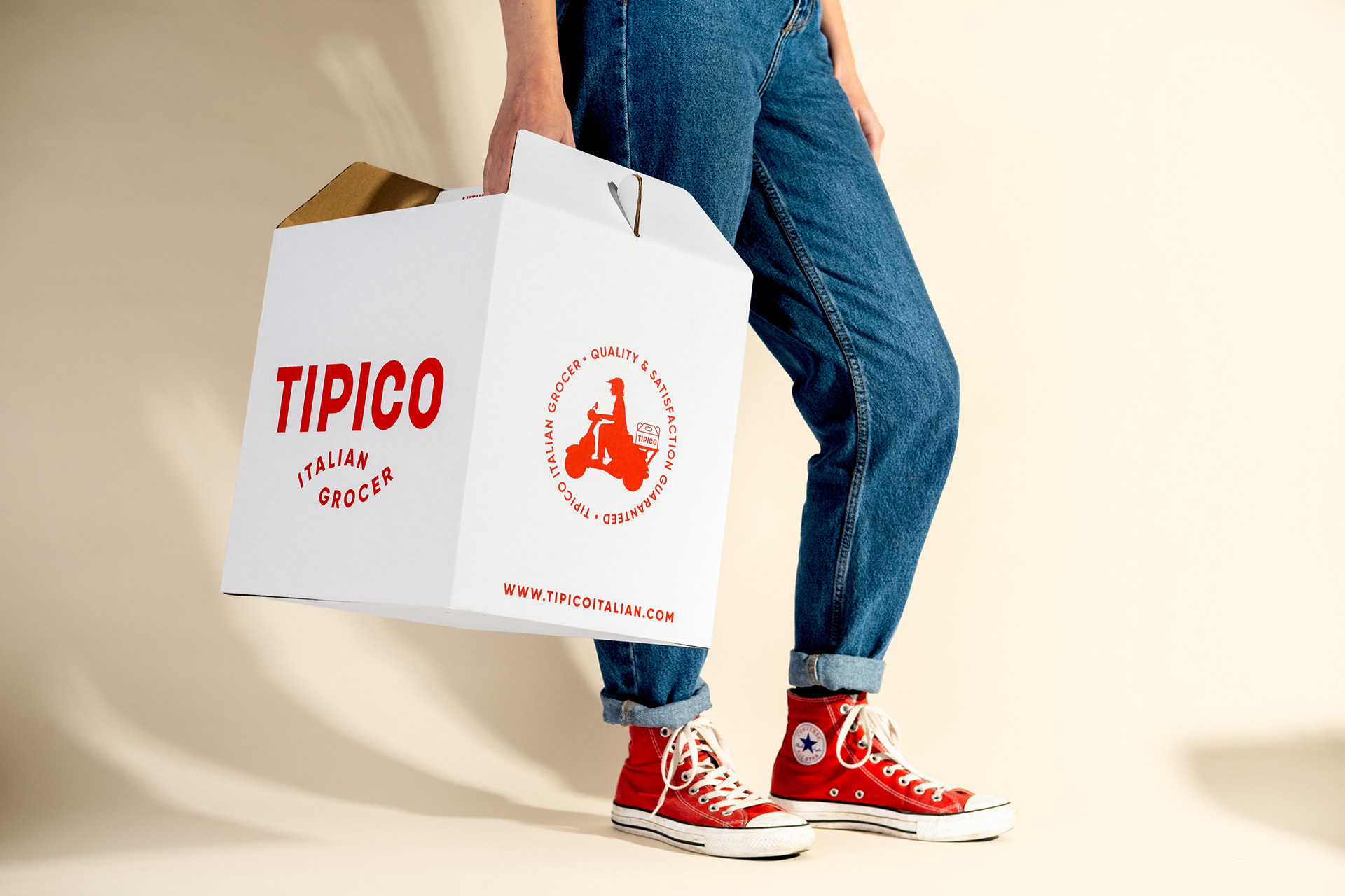
The hamper box was designed to be slightly more premium than the regular shipping boxes. Tipico offers seasonal hampers for all occasions. We felt like customers would enjoy a classier, yet still commercial, gifting option.
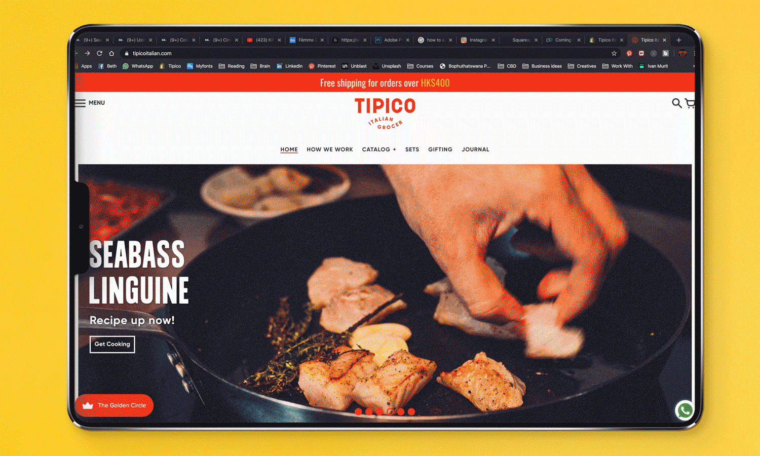
As with most projects, a website needed to be developed, however this time the site needed to be highly functional as a port of e-commerce. After months of development we were able to launch a website that carries just under 100 items, inclusive of custom built dinner sets, hamper sets, customisable delivery times and many other classic e-commerce bells and whistles.
visit the website here.
Thank you for looking!
Art Direction: Dustin Holmes
Graphic Design: Dustin Holmes, Jenna Tupin, Stephanie Handley
Animation: Dustin Holmes
Illustration: Dustin Holmes, Stephanie Handley
Photography and Post: Dustin Holmes
Project Management: Dustin Holmes
Packaging Production: Dustin Holmes
Web Development: Dustin Holmes, Stephanie Handley, Jenna Turpin and Peter Reynolds