I was fortunate enough to have worked under the creative direction of one of Hong Kong's elite design studios, Kith&Kin. I was hired to help produce a rebrand for bakehouse, a local and legendary bakery that has soared to great heights since its opening by Grégoire Michaud, in Hong Kong just a few years ago.
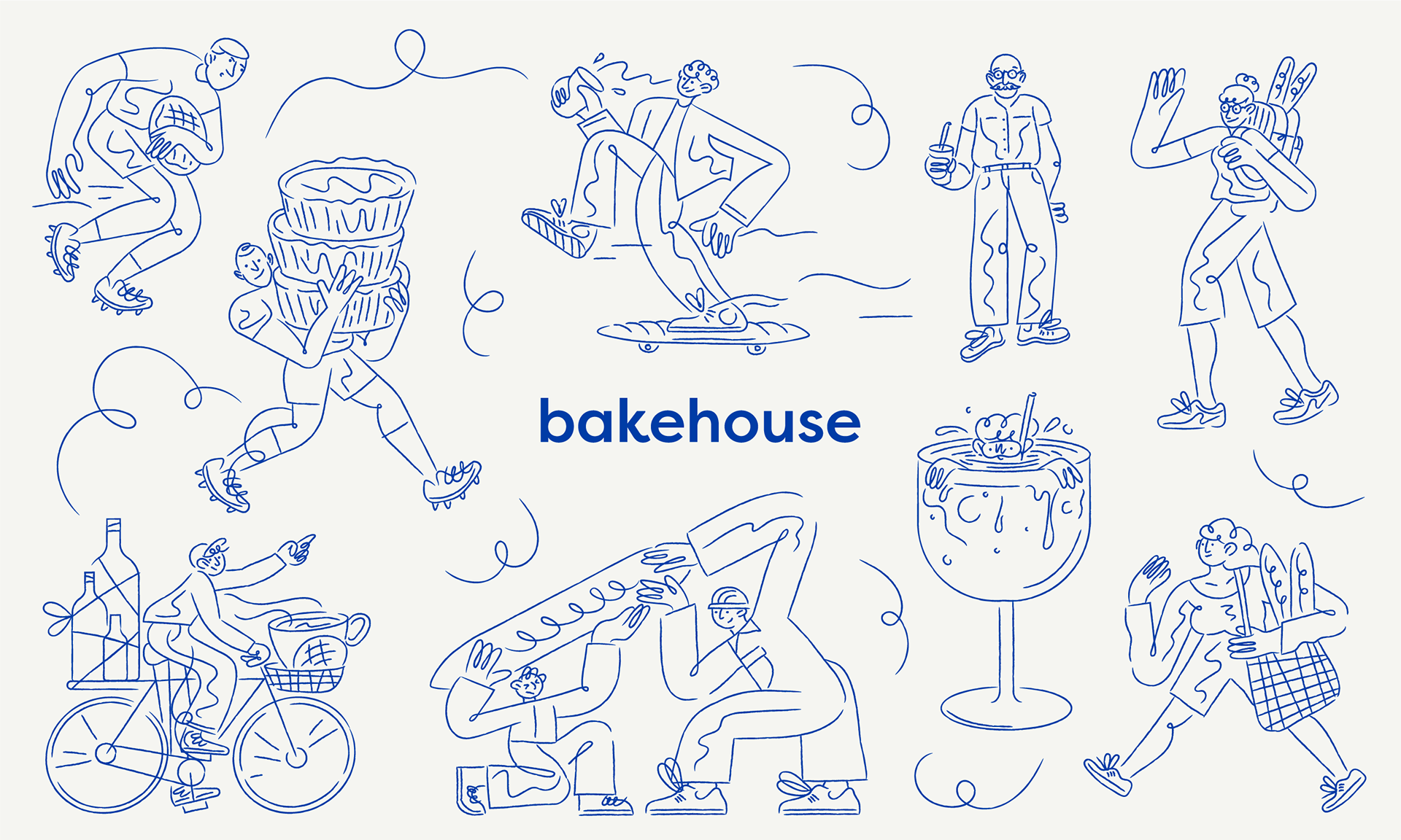
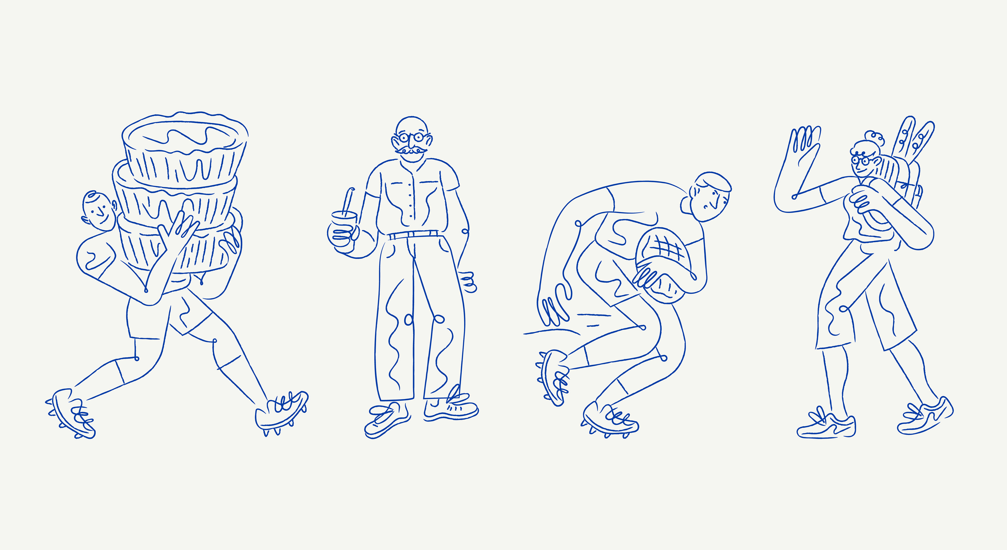
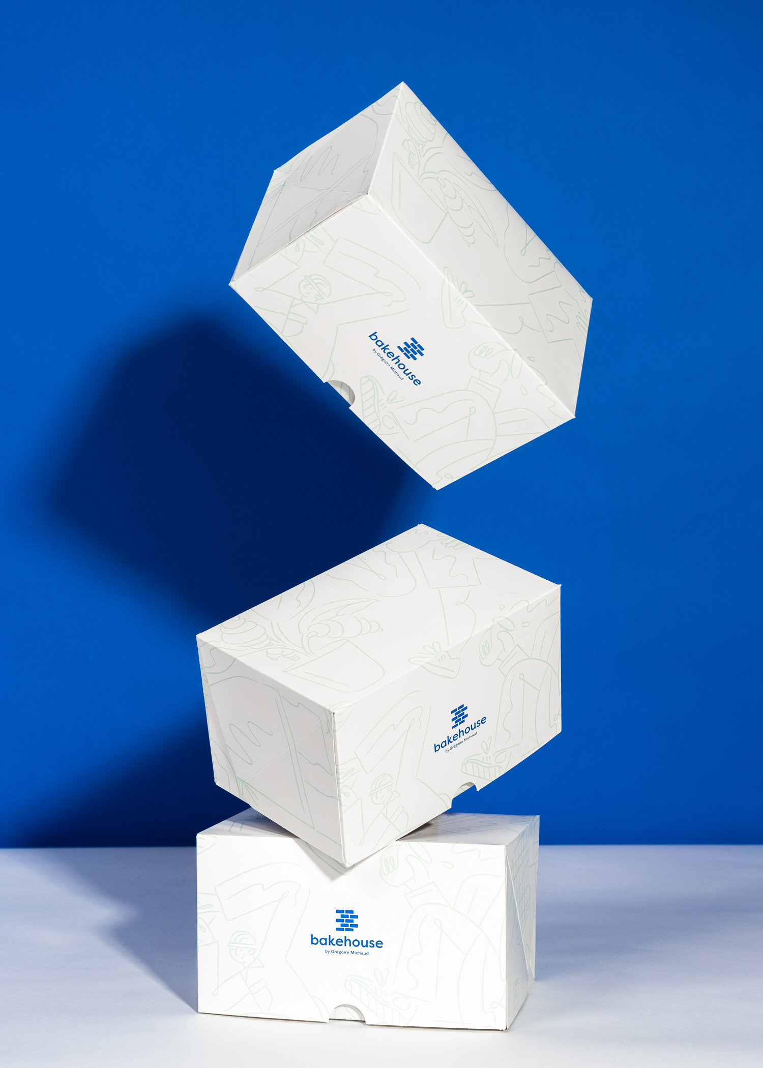
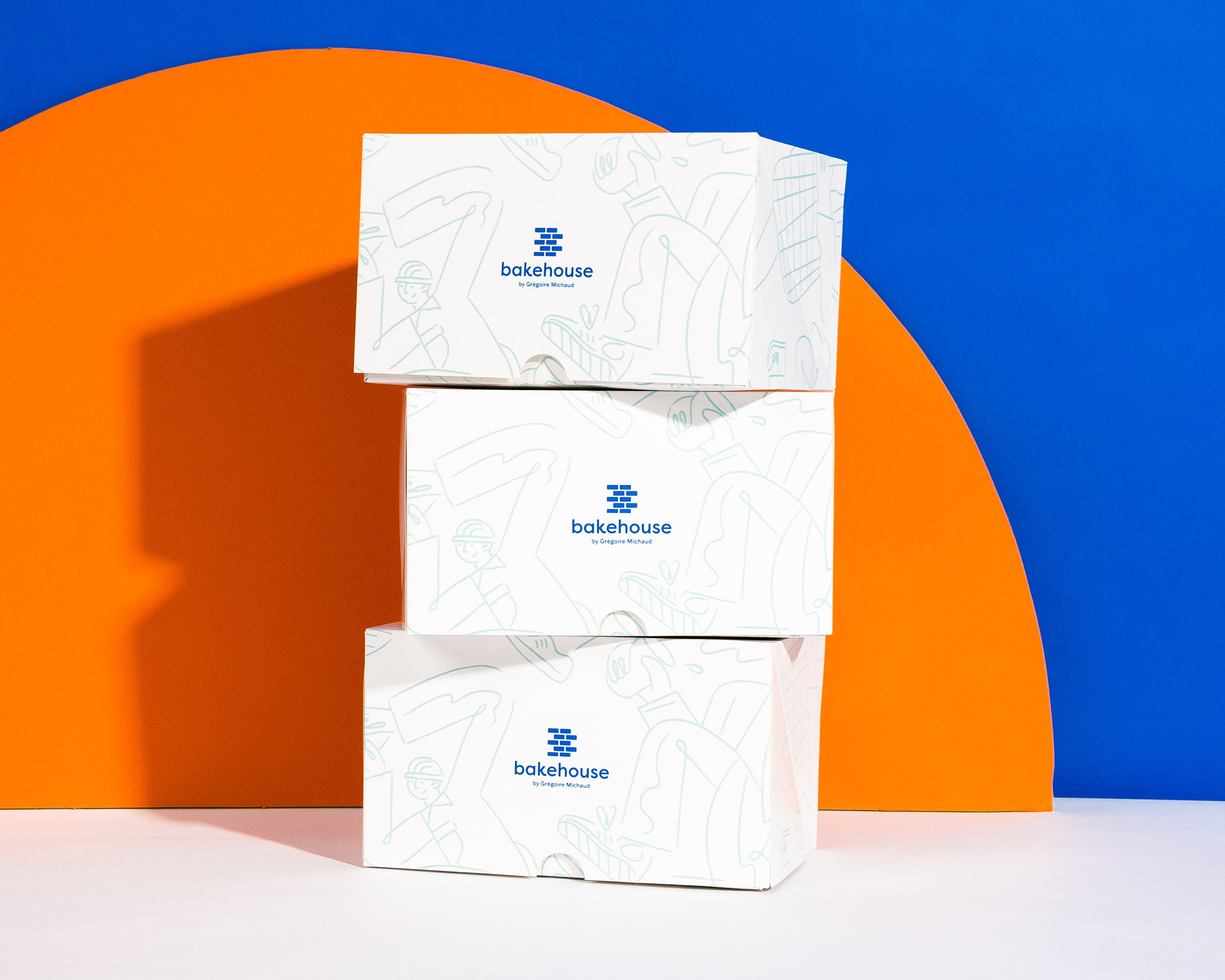
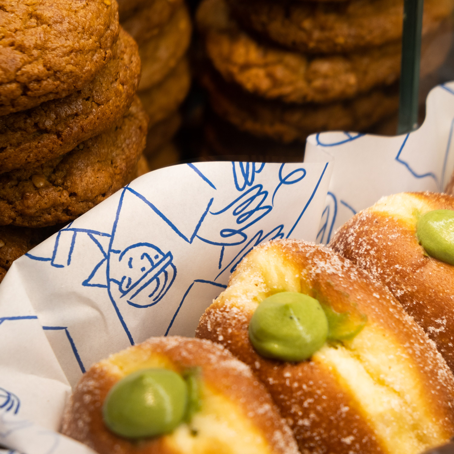
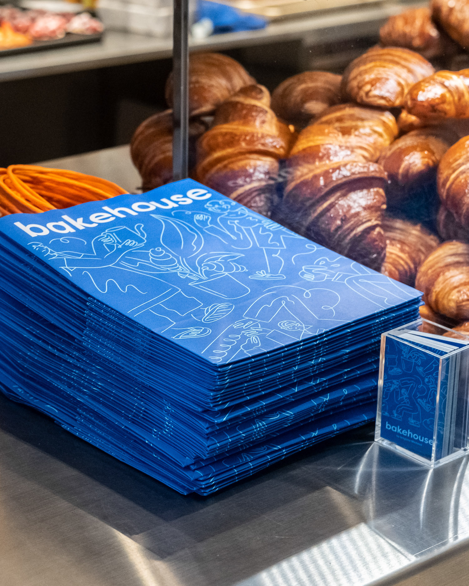
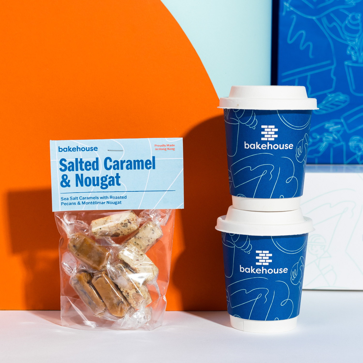
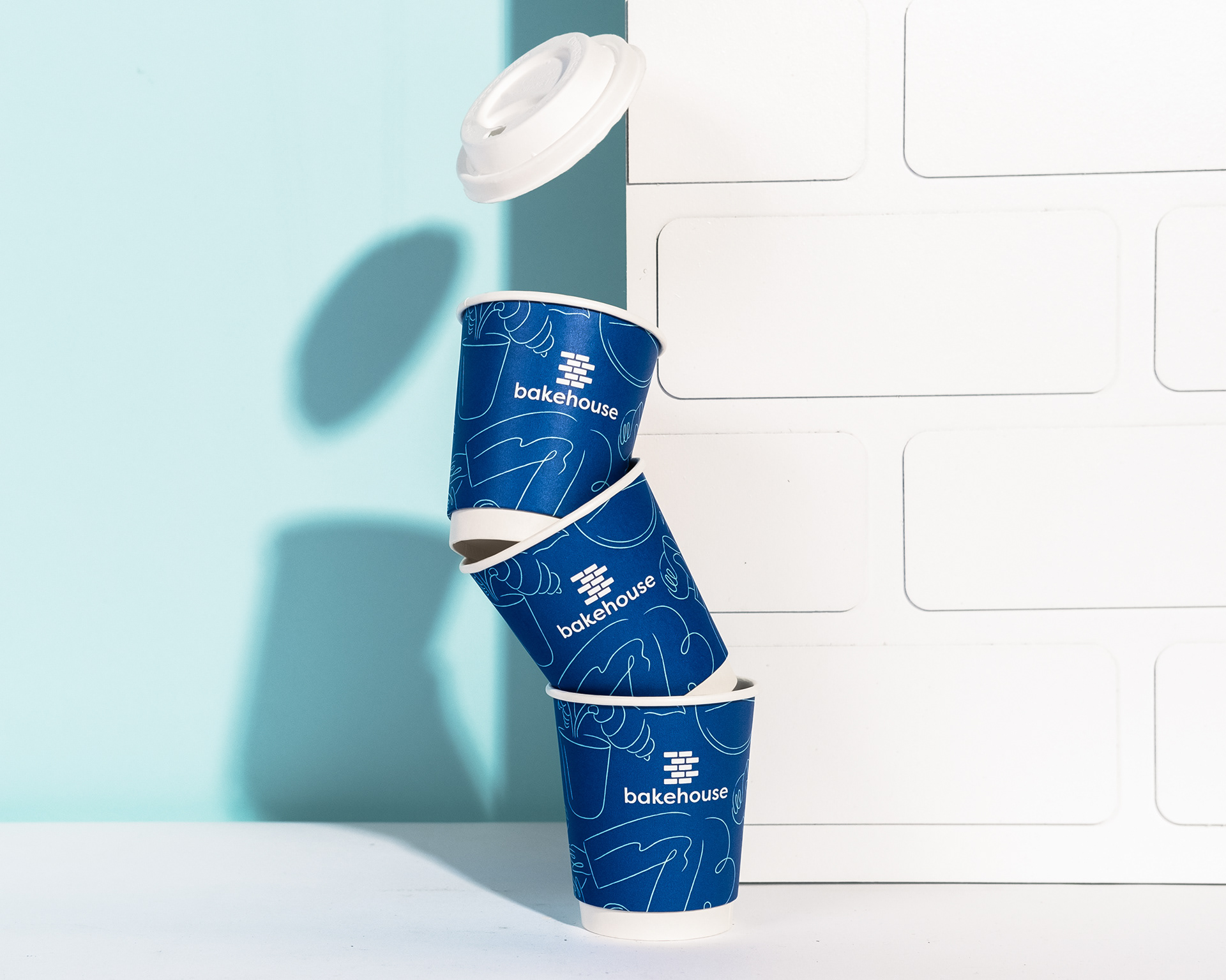
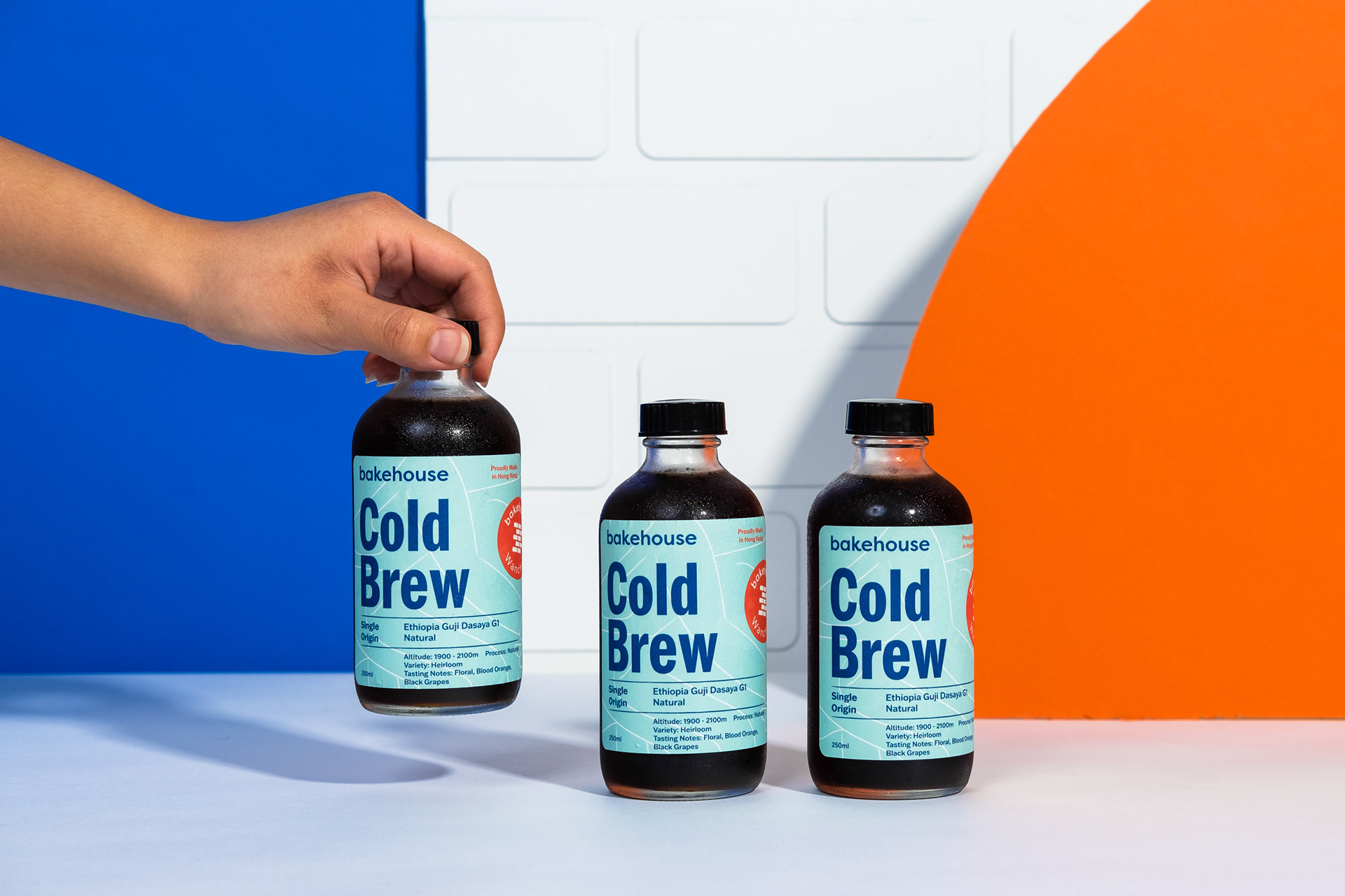
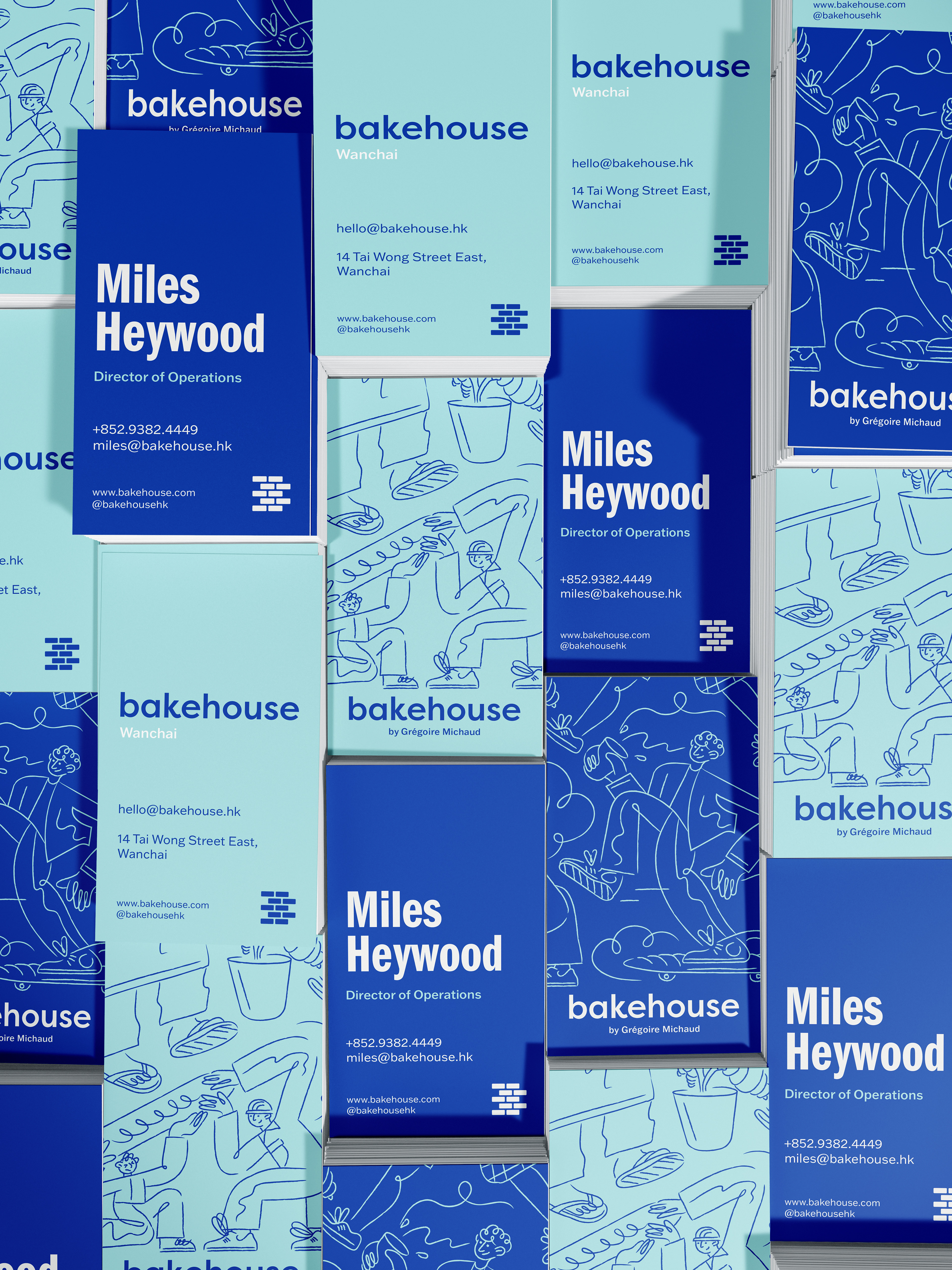
At the first stage of the project I helped create a new logo mark which informed many decisions about updating the colours, type, packaging and photography. Additionally I created illustrations that have been used across a significant scope of items within the visual Identity, including the packaging, merchandise, uniforms, menus and social media assets.
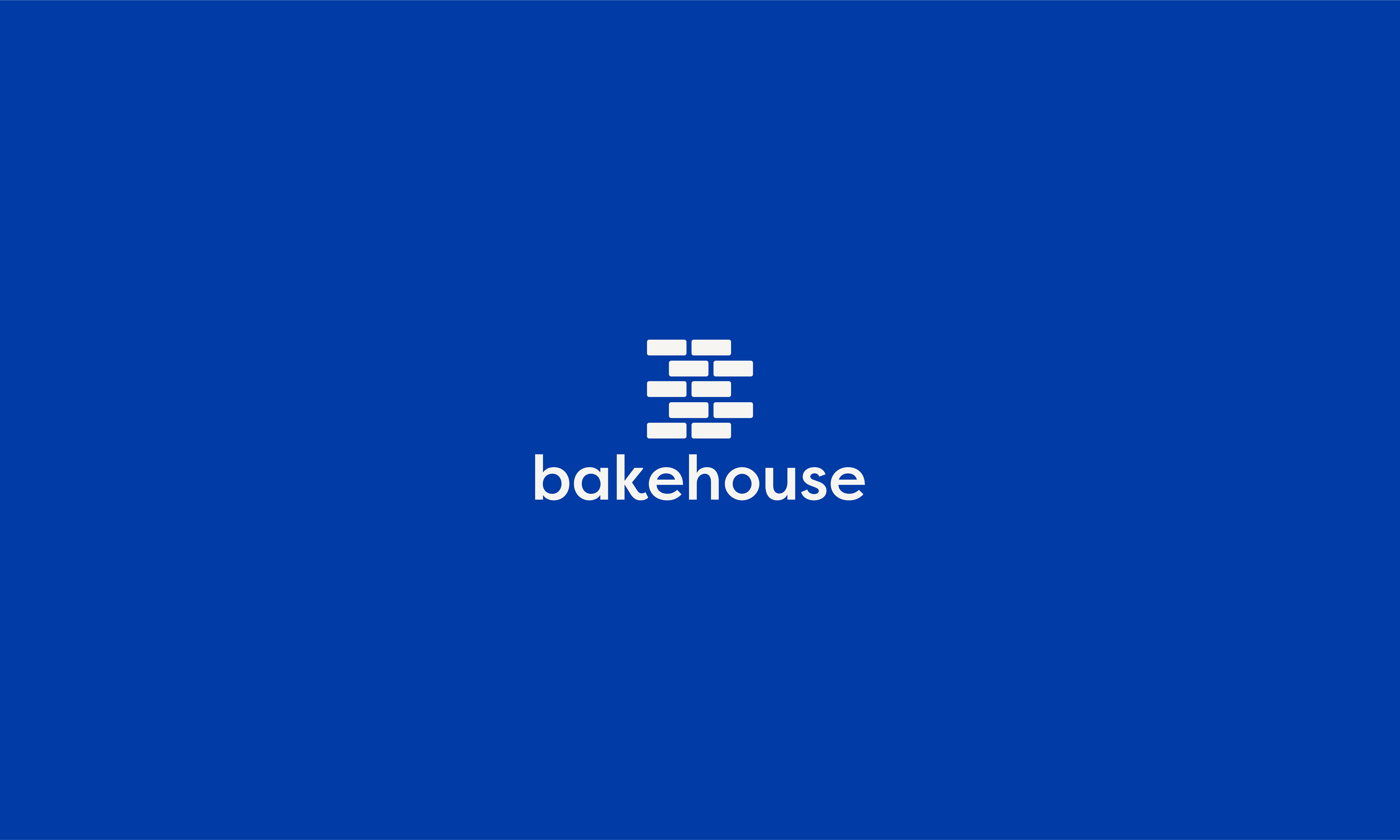
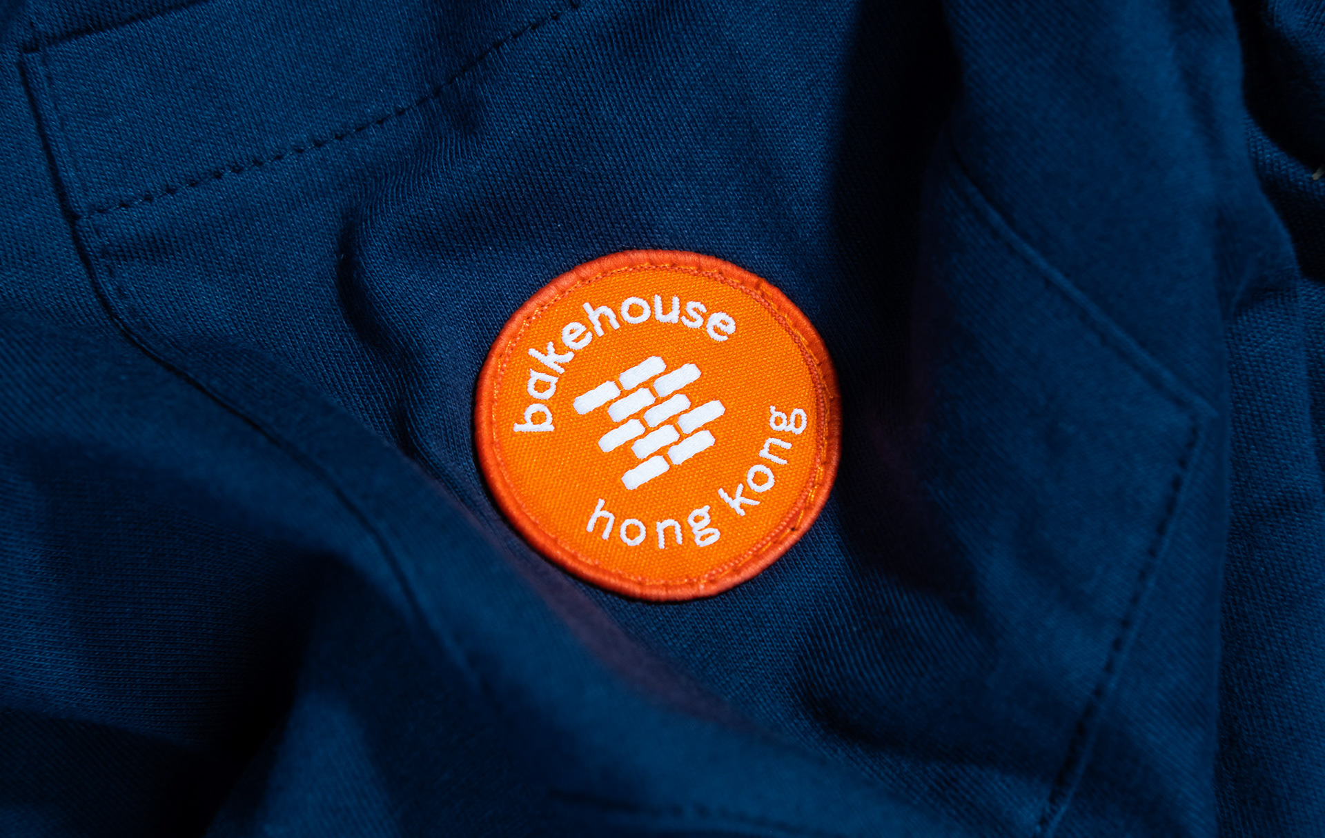
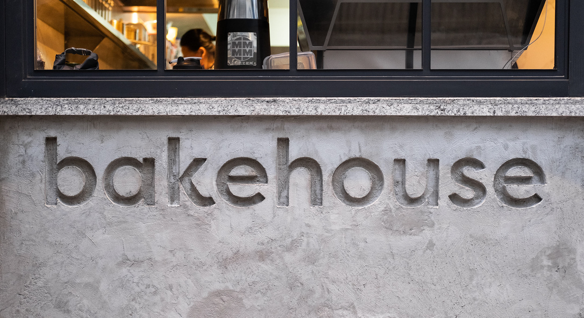
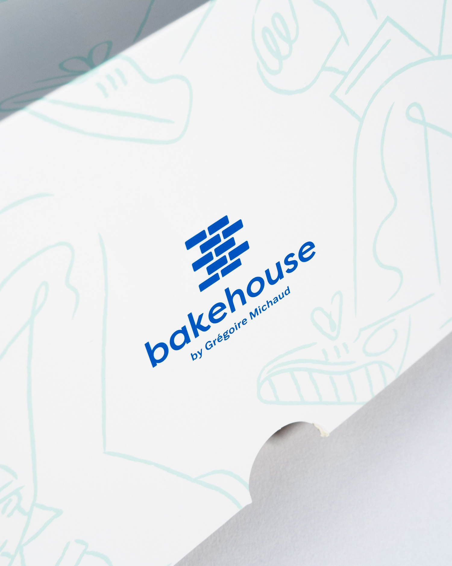
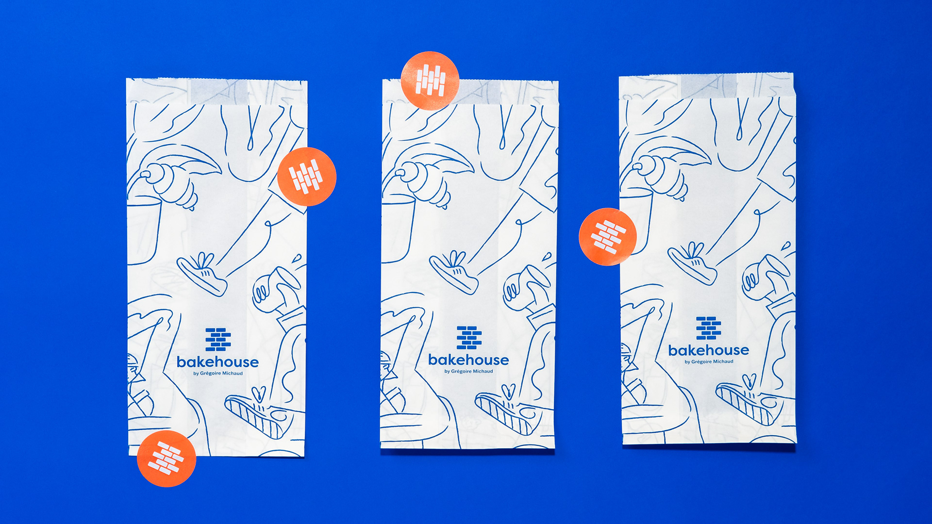
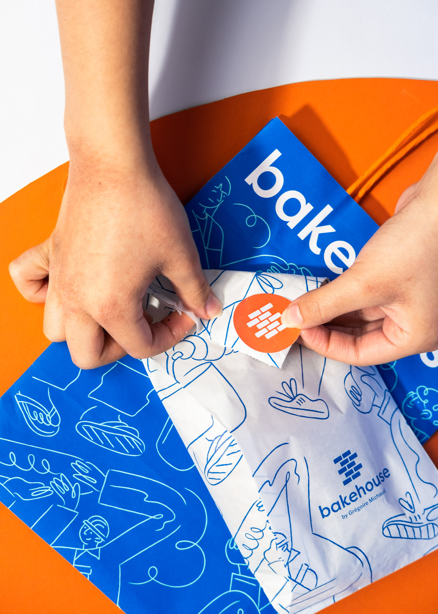
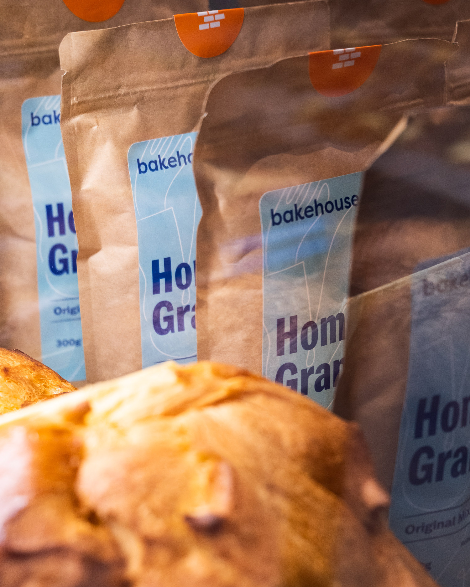
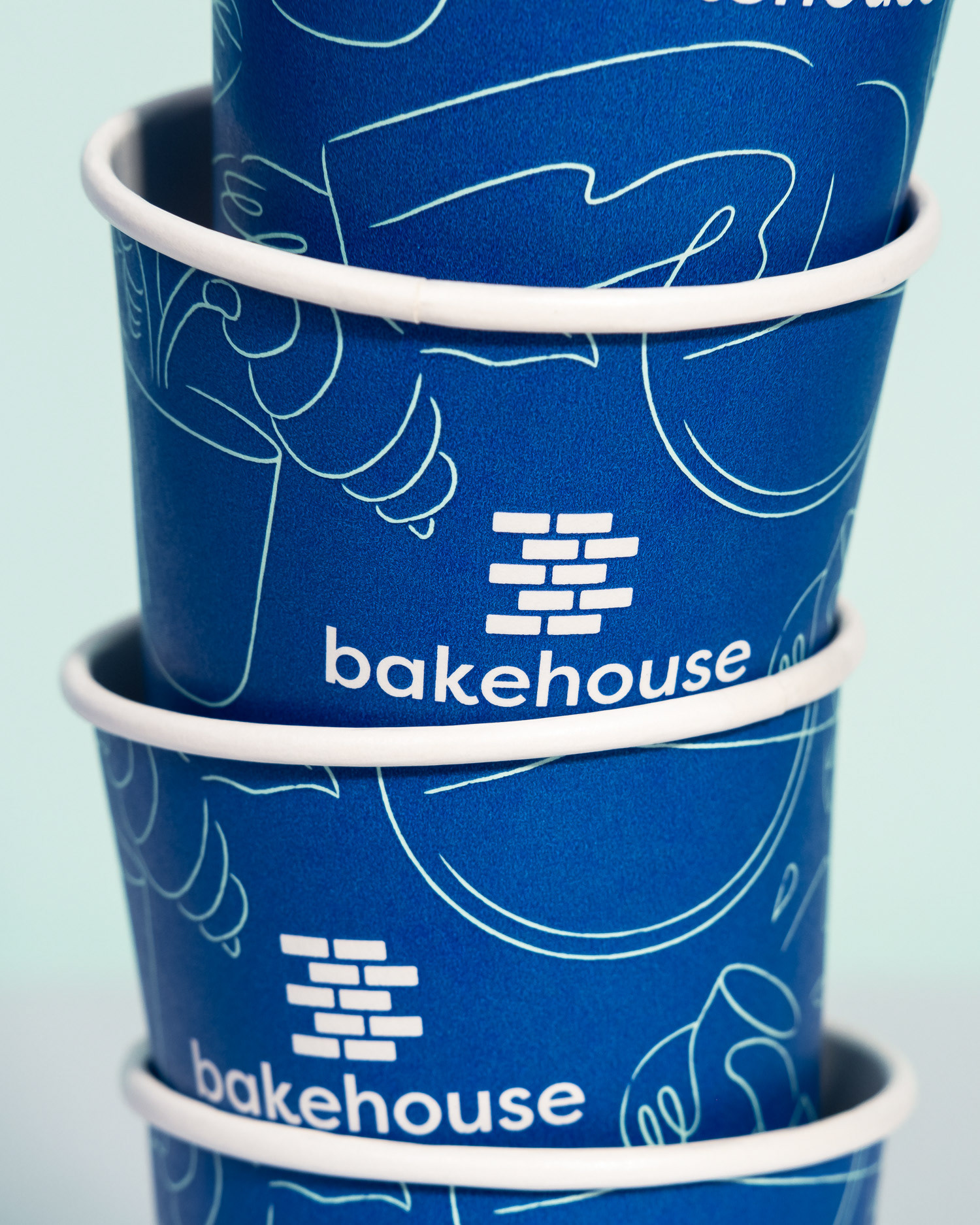
bakehouse was seeking a timeless "icon" that could grow to be recognisable without the bakery's name present. The brick "B" logo mark is inspired by the iconic brick facade from their Wan Chai branch, and a matching facade was subsequently carried over to their new store in SOHO. To further solidify the logo concept, we later discovered that fresh boules of sourdough bread have often been referred to as "brique", the french word for brick. The logotype was subtly reworked to include more quirk and energy in the letterforms, energy that was at the heart of bakehouse's decision to rebrand.
The rebrand launched in tandem with the opening of bakehouse's newest location in SOHO, Central Hong Kong, at the end of 2020.
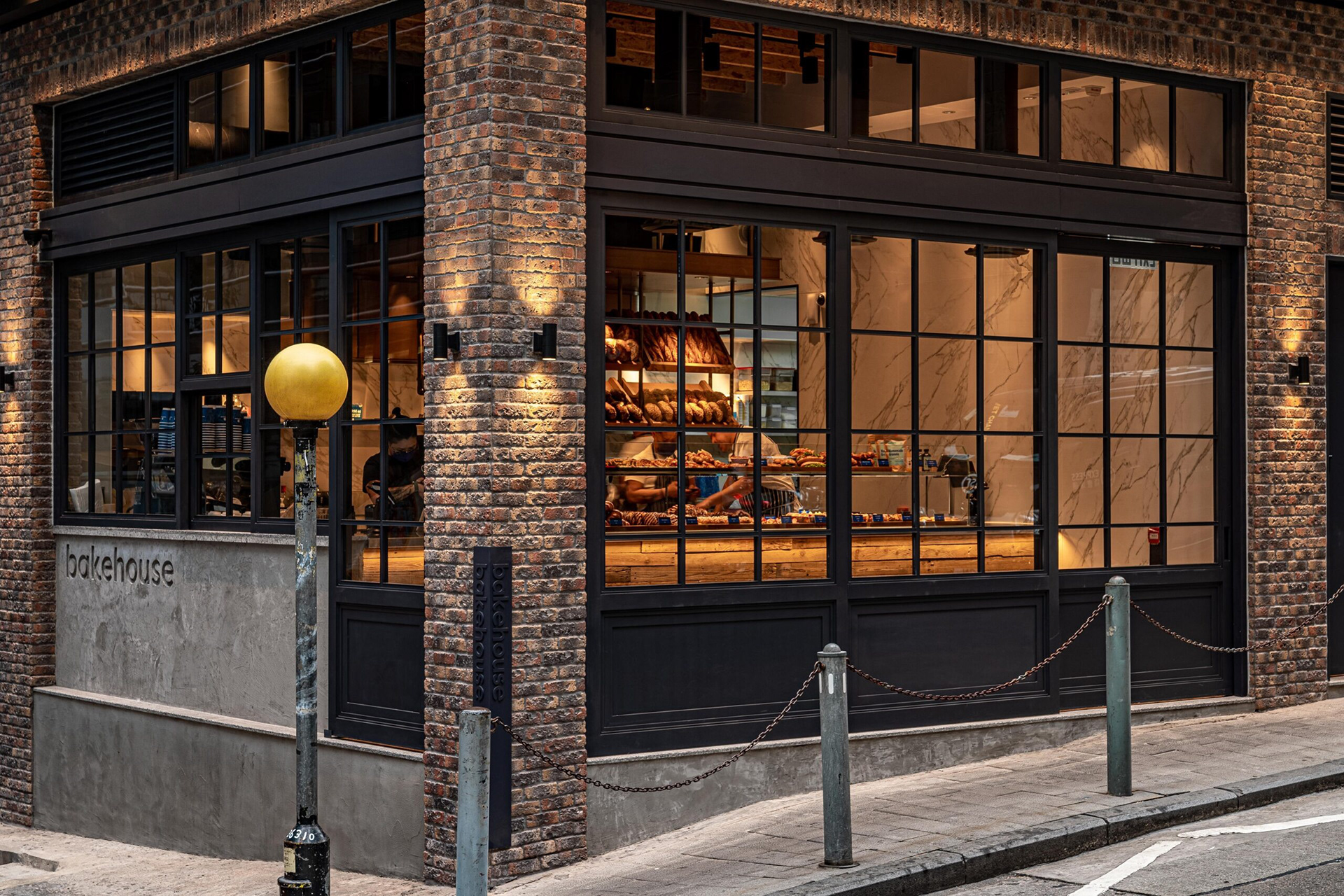
Above image courtesy of The Loop HK
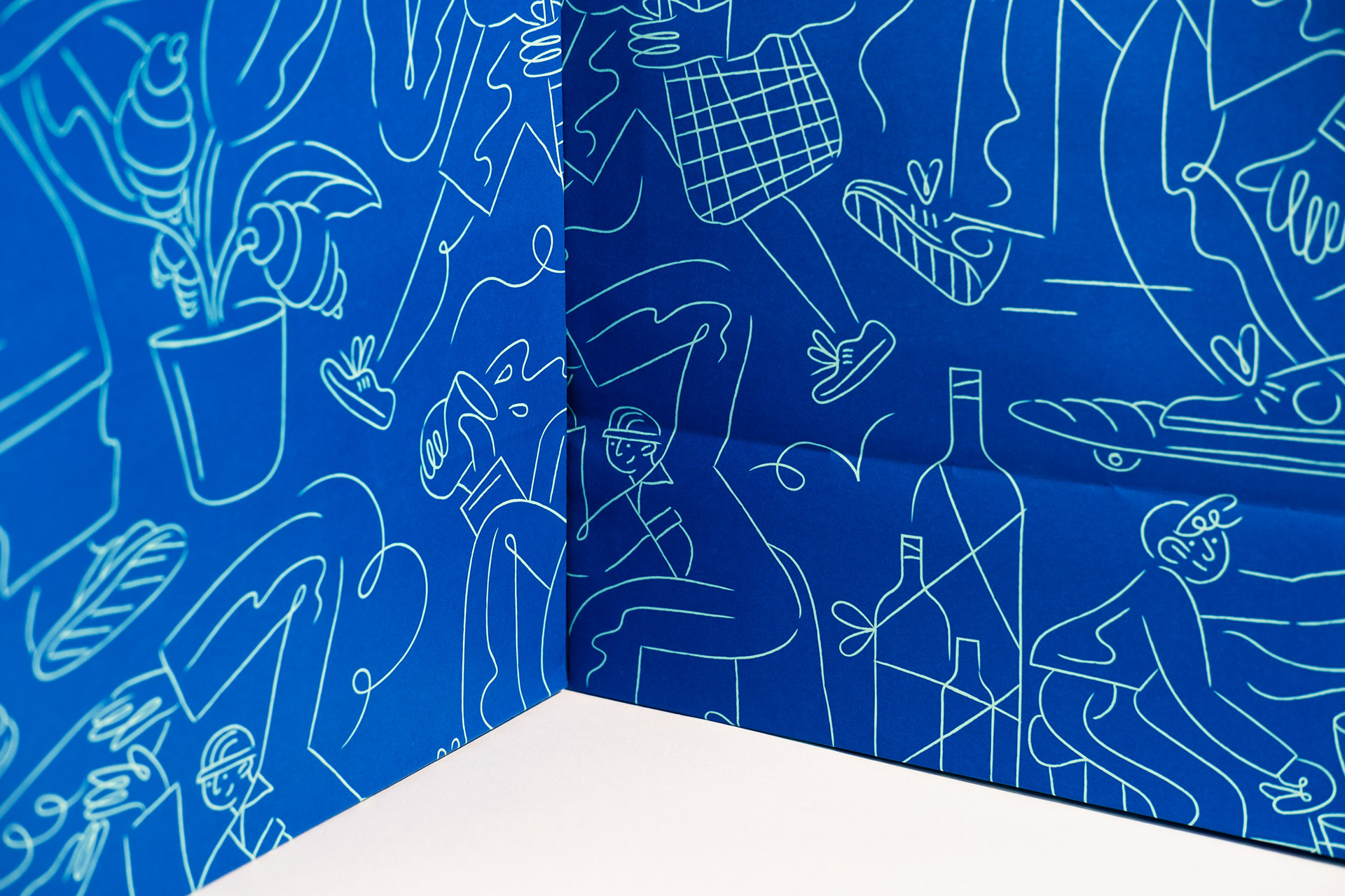
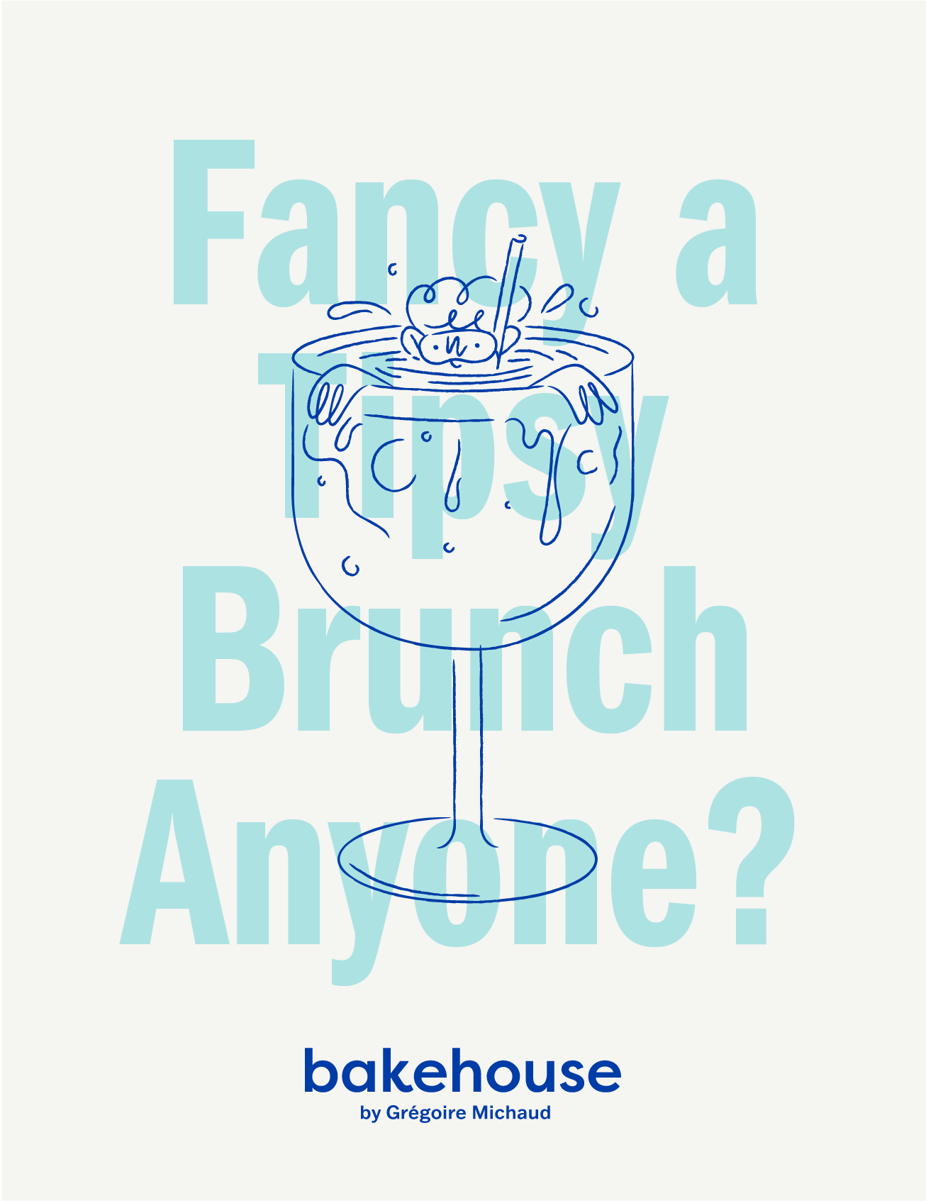
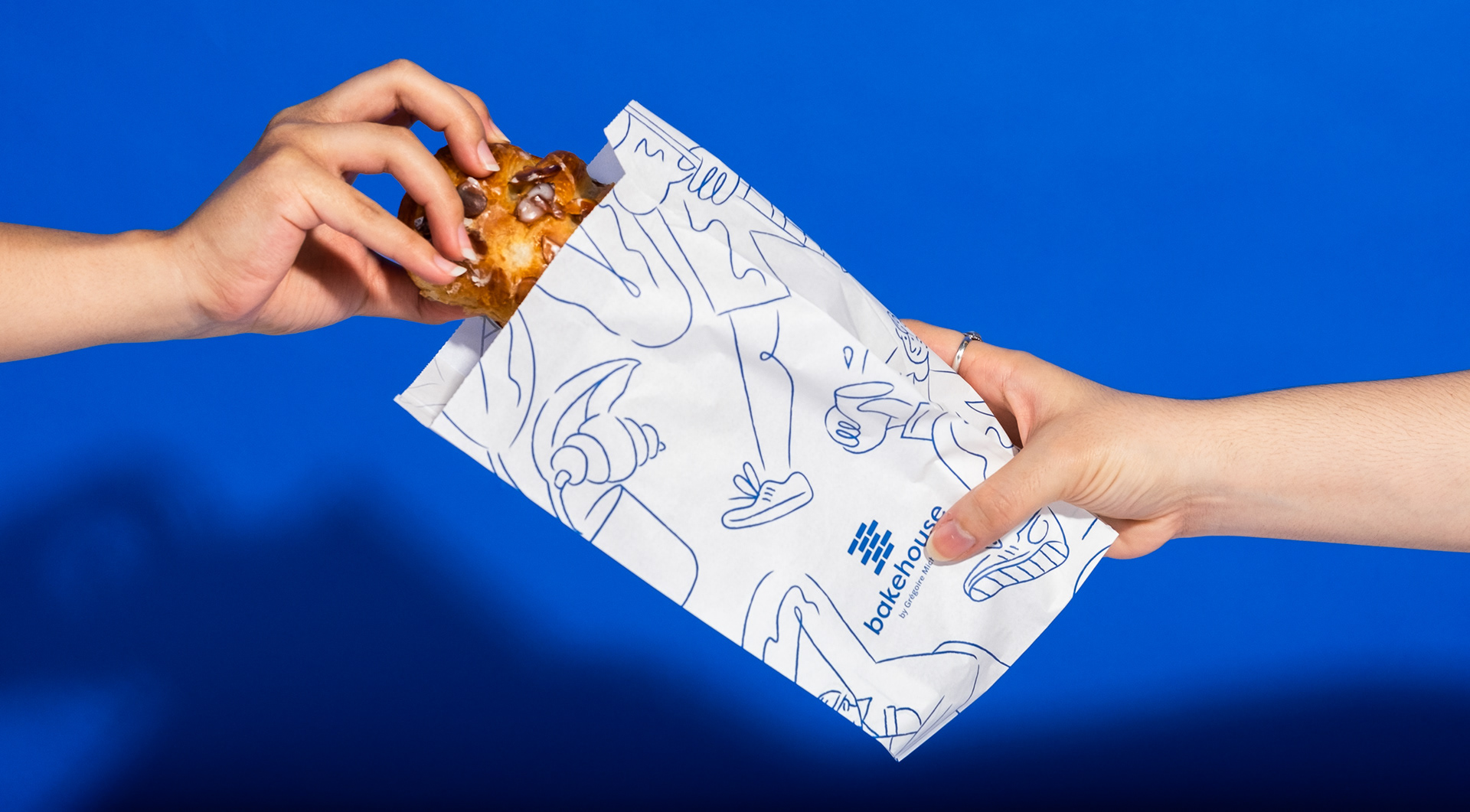
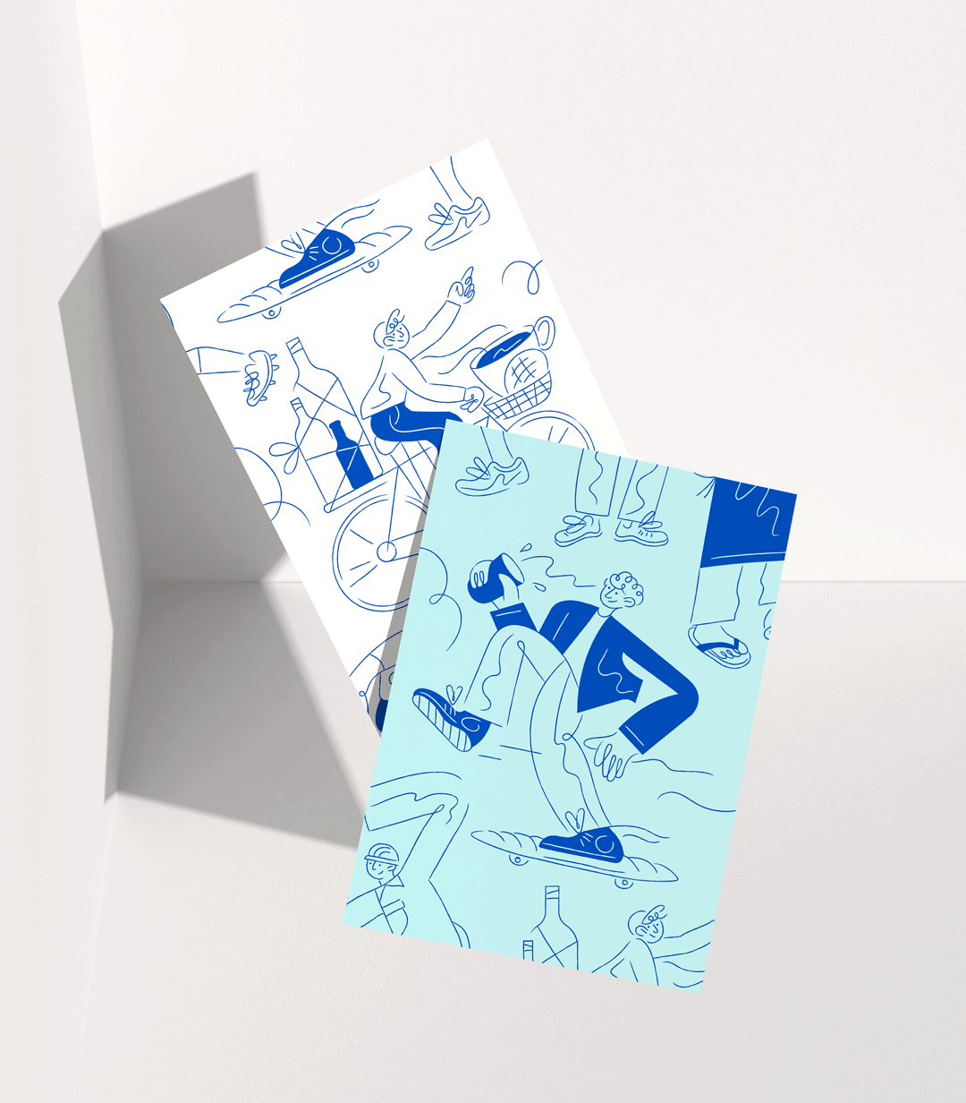
Along with drawing some classic neighbourhood characters, which include a gas delivery man, a skater on his way to Morrison Hill playground (famous skate spot nearby) and a local grocery shopper, some die-hard bakehouse regulars were developed and included into the set.
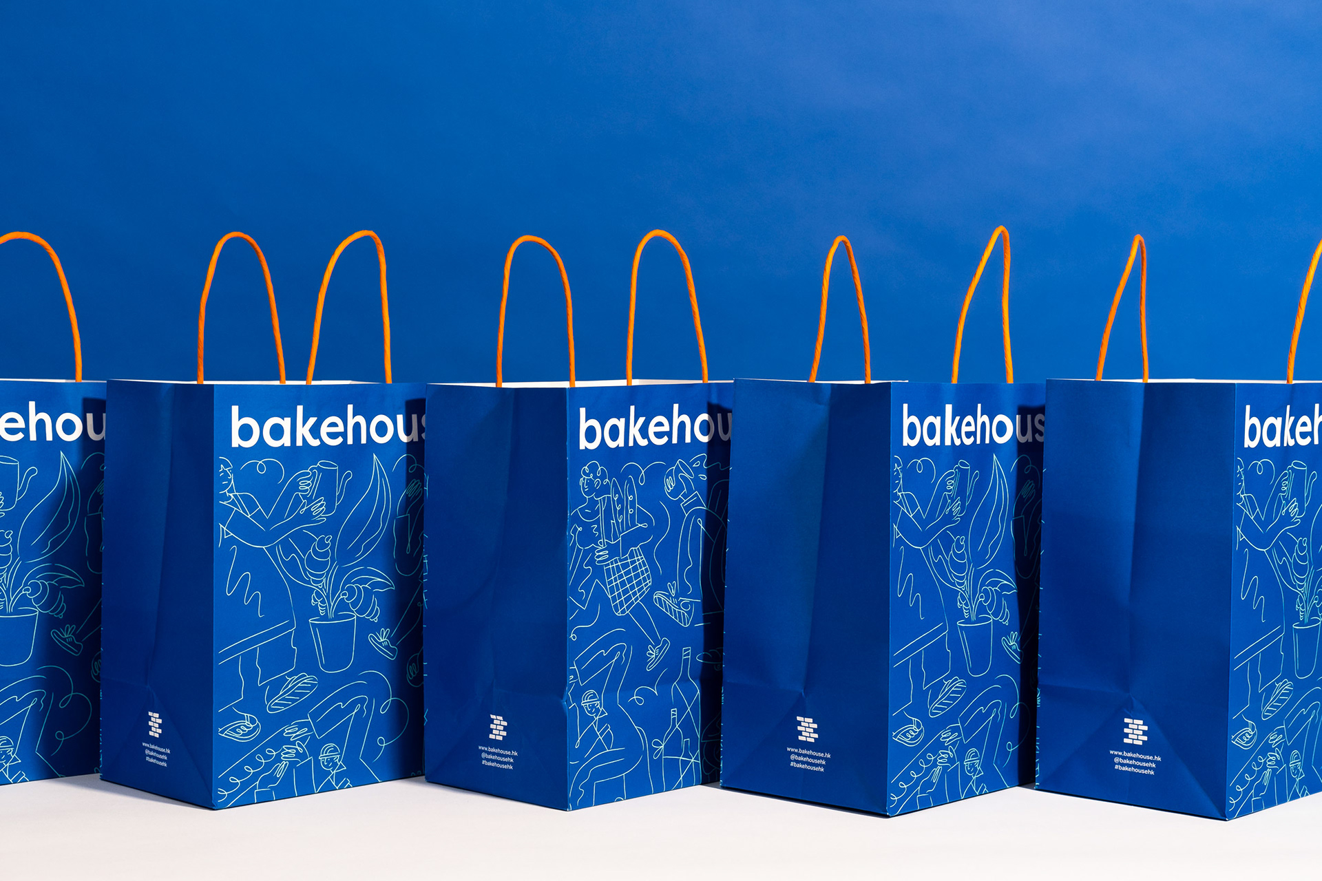
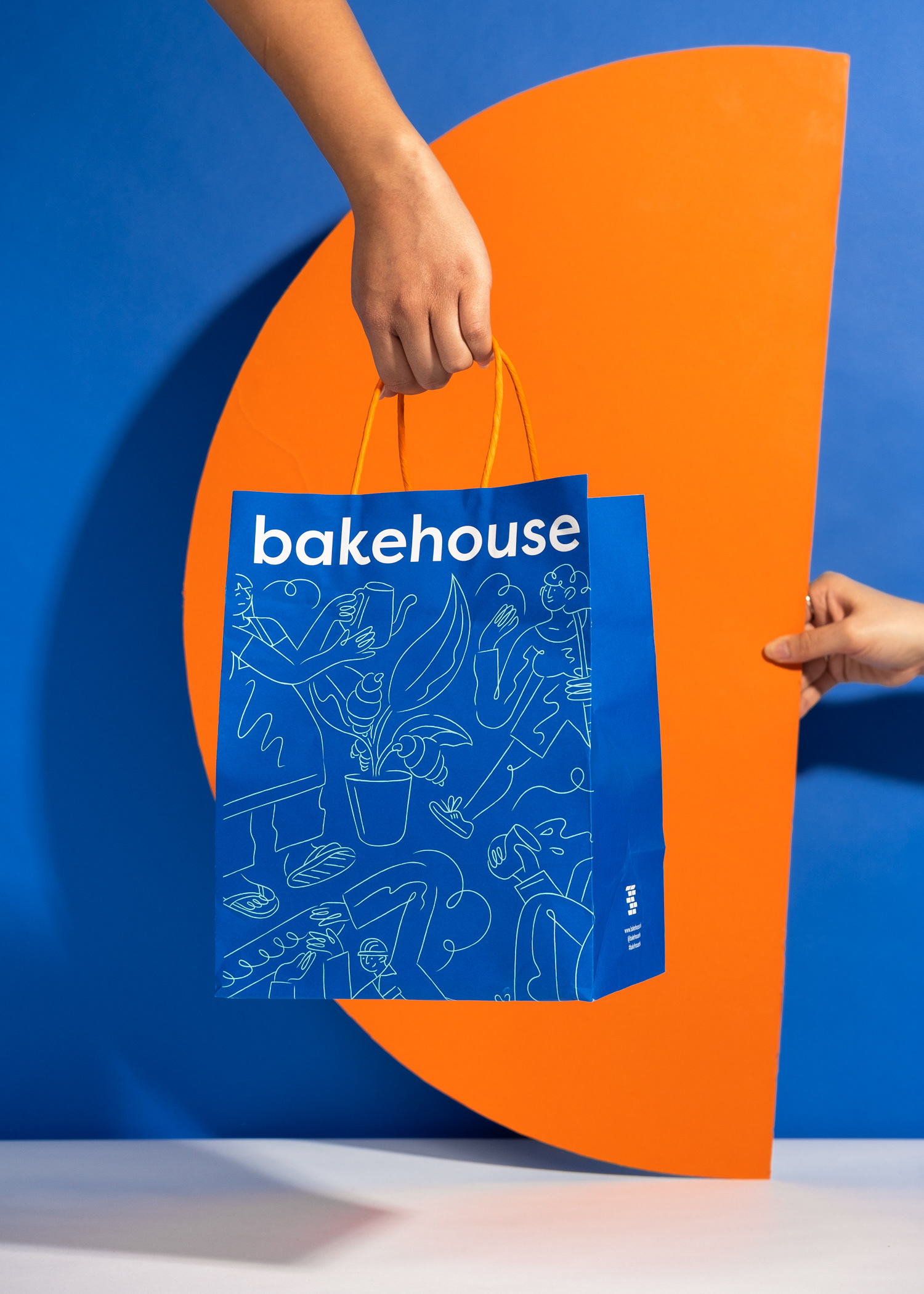
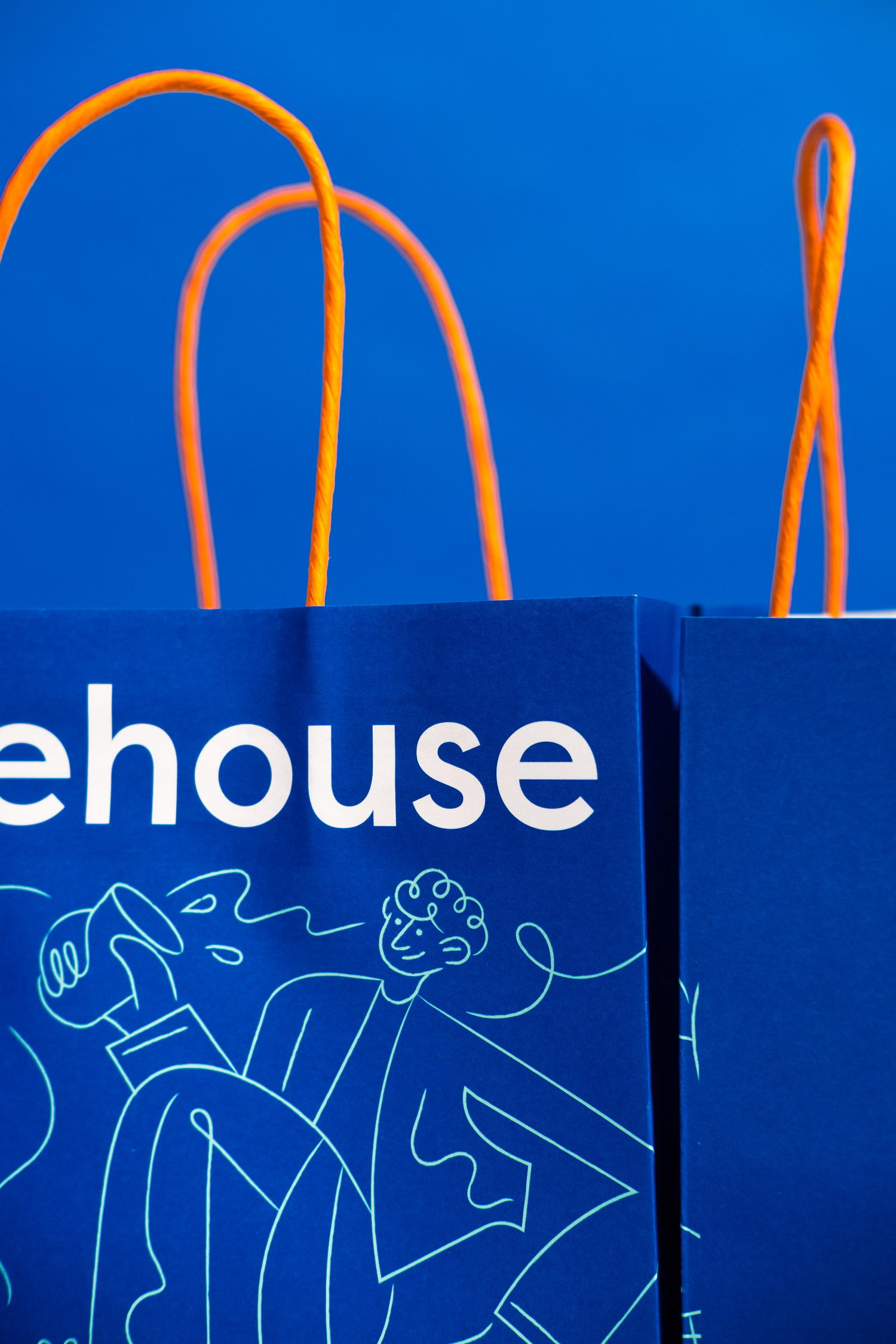
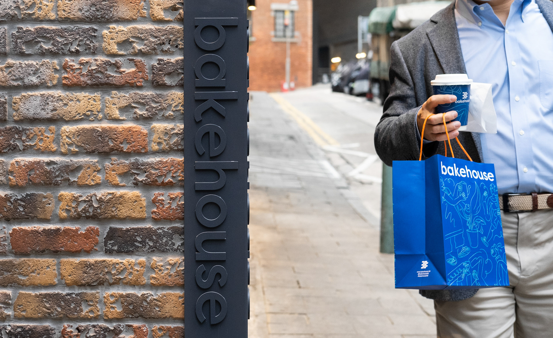
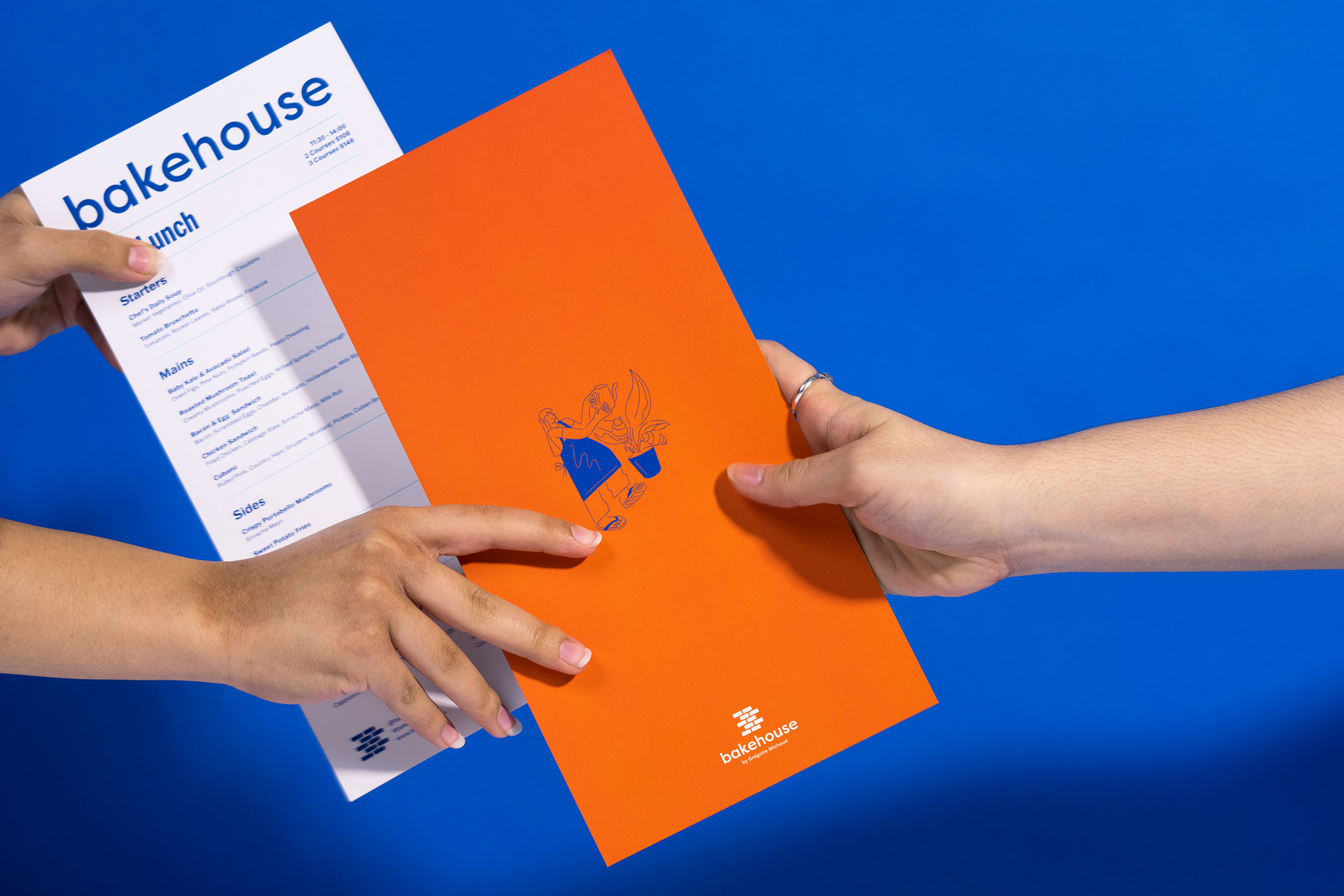
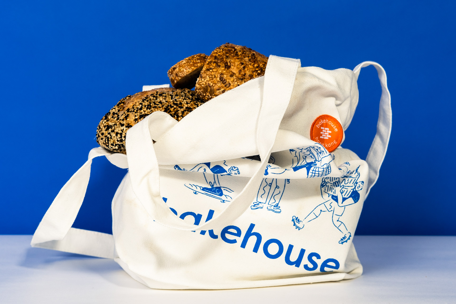
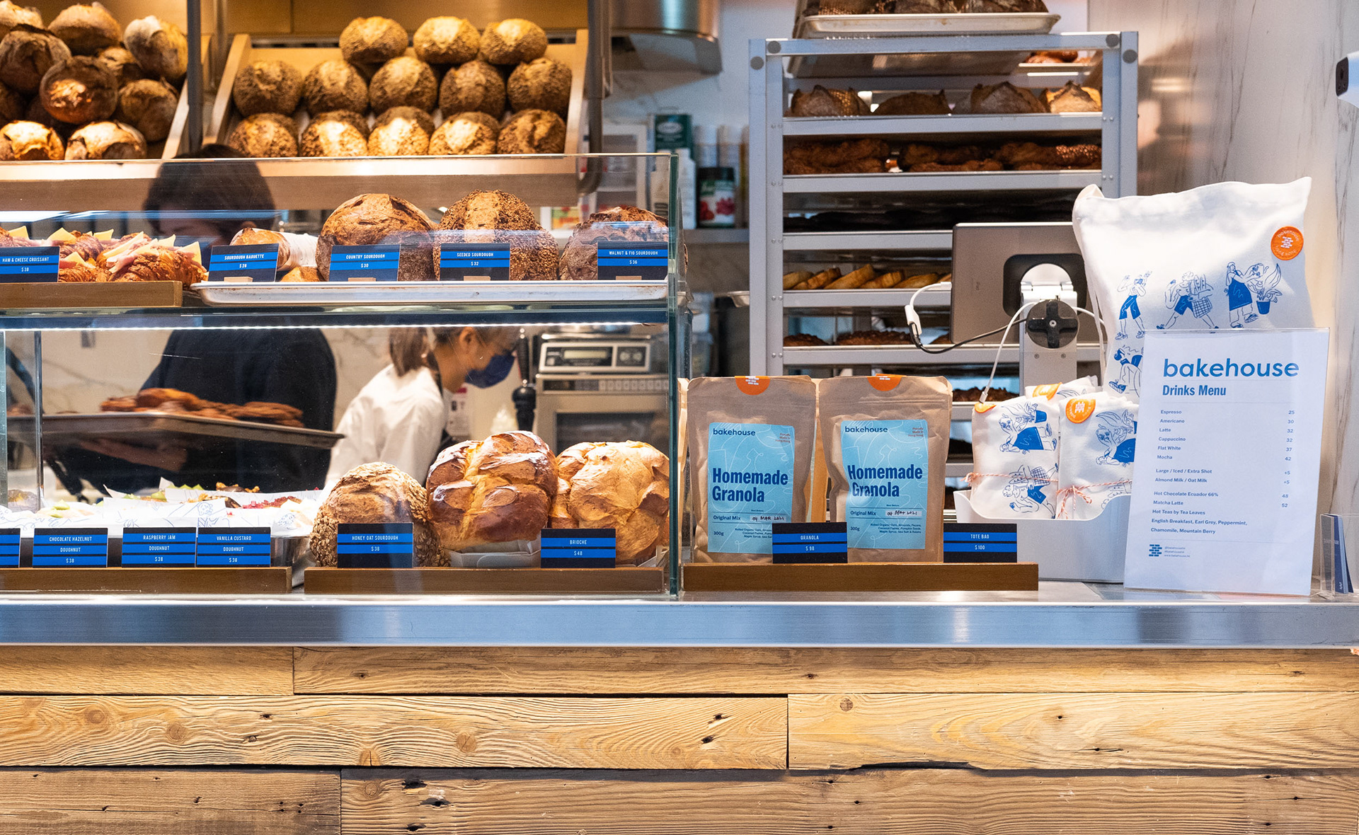
bakehouse's blue bag had already become somewhat of a "status symbol" of buttery deliciousness around town, so it was integral that this item was updated with a sense of duty and respect. The addition of the orange to the visual identity can be seen on the handle as a pop of zesty' flavour. The bag update has proven to be a hit with customers, and has made the item even more elusive and eye-catching around town, and can be seen boasted all over social media.
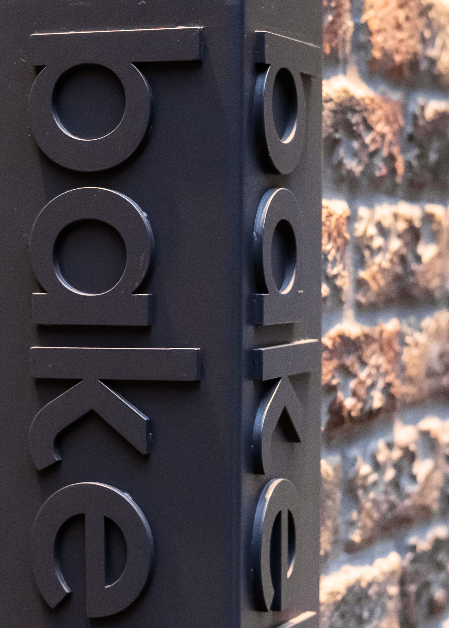
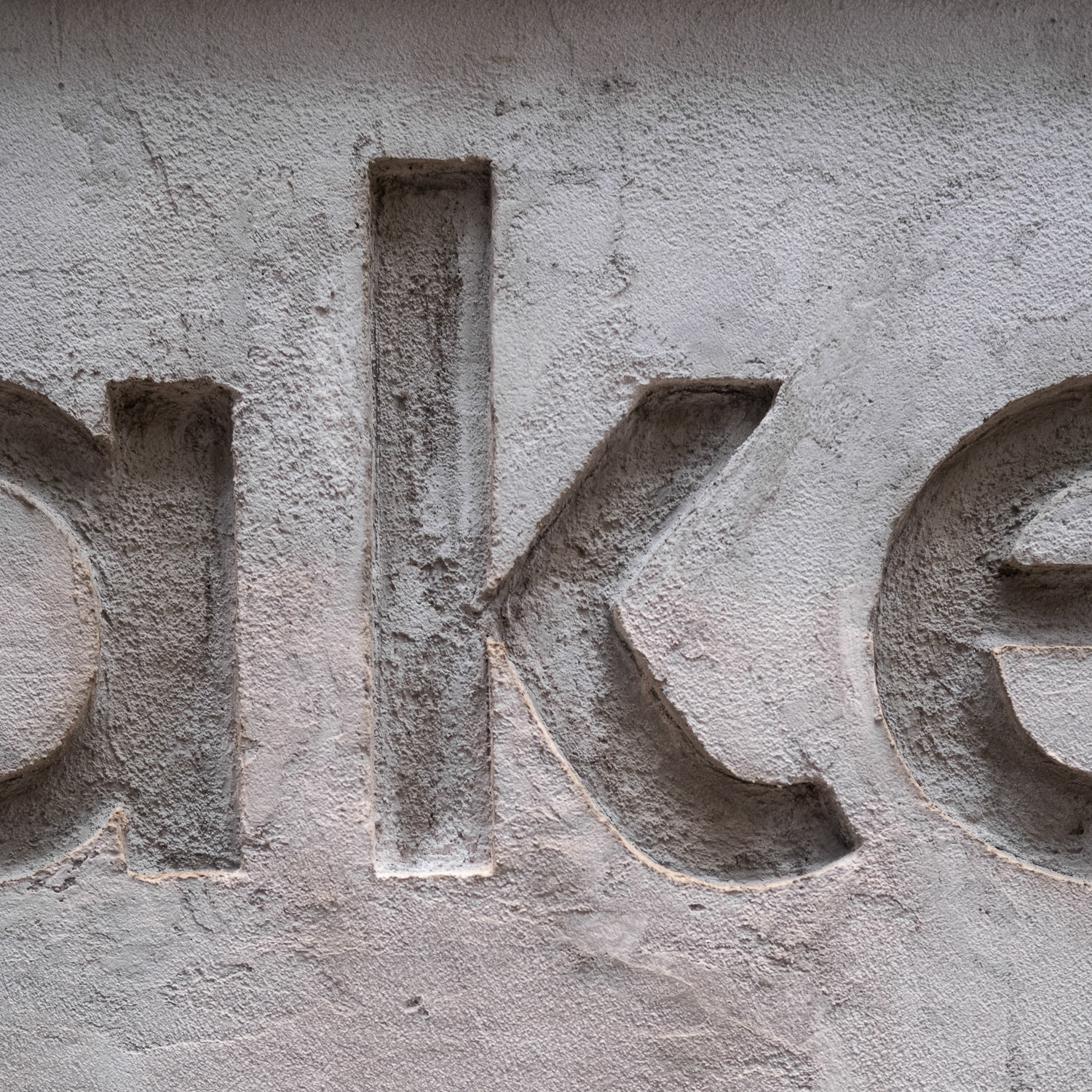
More examples of how the logotype has been applied to signage through the subtle use of solid, tactile materials.
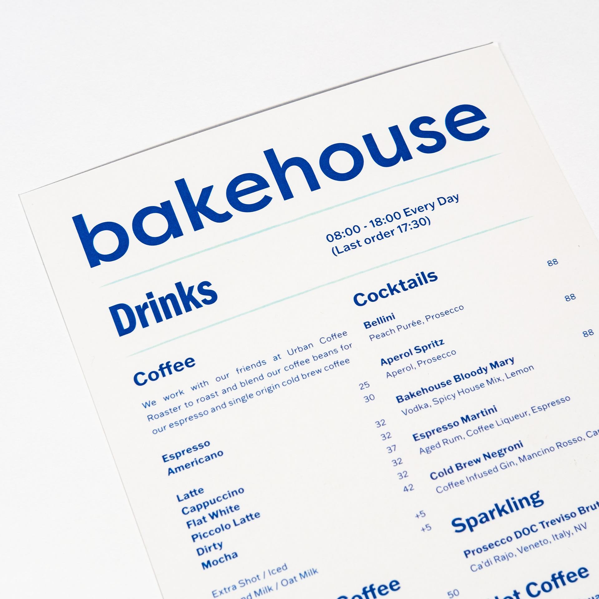
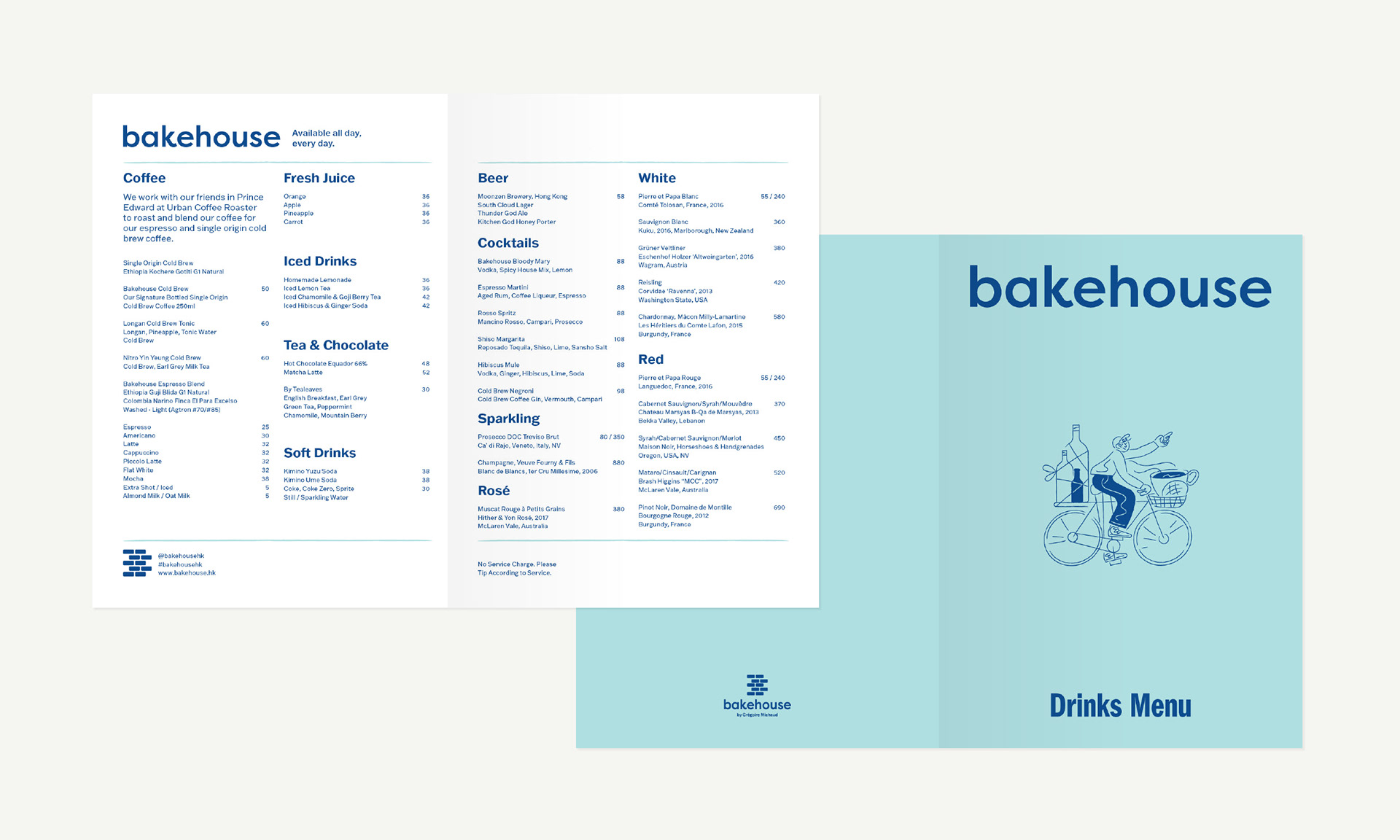
The menus were refreshed and had the same expression of colour, type and illustrative items applied to keep the update cohesive. Previously all the menus had been designed in the same format and with very little difference between Drinks, Lunch and All Day offerings. Here you can see how the menus are now clearly distinguishable through alterations of form, colour and clear labelling.
Special thanks to James Woodward and Rocky Yip for including me in this, and for all the amazing creative direction! Big thanks to the team at Kith&Kin (Ashley, Salla, Jasmine and Chloe) for all the teamwork and support through the process.
Also a huge shout out to Steph and Dani for helping me style and shoot all the studio photos.
Follow me on Instagram for updates. Thanks for looking!